Cover illustration

TheDaily Front

Issue No. 1 Friday, July 10 2026 #1 — FRIDAY, JULY 10, 2026
Signals through brick, proofs through silicon, and dark patterns dragged into daylight.
Friday, July 10, 2026 The Daily Front No. 1 — Contents
30stories
8,224points
5,310comments
296kllm tokens
Assembled with 31 model calls — 197,472 tokens read, 98,664 written.

Highlights

QuadRF can spot drones and see WiFi through my wall

A homebrew phased-array radio turns the invisible spectrum into a visible map of drones, WiFi, and walls.

GPT-5.6 Sol Ultra produces proof of the Cycle Double Cover Conjecture [pdf]

A claimed AI proof of the Cycle Double Cover Conjecture sends the commentariat straight to the referee’s desk.

An update on residential proxies and the scraper situation

LWN follows the trail from AI scrapers to residential proxy networks and the mounting strain on the open web.

New York City to ban deceptive subscription practices

New York City takes aim at subscription traps, junk fees, and the cancellation mazes that keep billing long after patience expires.

Train sim created by just one person is being called the best ever made

A one-person Japanese train simulator earns raves for the rare achievement of making precision feel poetic.

From the Editor

Today’s edition finds technology in a suspiciously lively mood: radios peer through walls, models claim theorems, bots wear residential disguises, and agents offer to teach the nursery. Yet amid the alarms, the old virtues still report for duty—good tools, clear code, patient learning, and one person making a train simulator with uncommon care.

  1. QuadRF can spot drones and see WiFi through my wall3
  2. Good Tools Are Invisible4
  3. In Emacs, everything looks like a service5
  4. Train sim created by just one person is being called the best ever made6
  5. The tech of 'Terminator 2' – an oral history (2017)7
  6. Late Bronze Age Collapse8
  7. Lost city discovered beneath Egypt's desert with ancient church9
  8. New York City to ban deceptive subscription practices10
  9. EU Commission: addictive design Instagram and Facebook in breach of the DSA11
  10. An update on residential proxies and the scraper situation12
  11. AI-generated videos to maximally drive a target brain region13
  12. GPT-5.6 Sol Ultra produces proof of the Cycle Double Cover Conjecture [pdf]14
  13. Inference Optimization for MiMo v2.5: Pushing Hybrid SWA Efficiency to the Limit15
  14. Apple Silicon Exec Explains Mac Mini AI Demand and On-Device Future16
  15. How the terrorist group Boko Haram uses frontier AI17
  16. After 7 years in production, Scarf has reluctantly moved away from Haskell18
  17. Write code like a human will maintain it19
  18. Successful companies go blind20
  19. Parental device use and the adolescent-caregiver attachment bond21
  20. A love letter to flashcards22
  21. Building a real-time AI tutor for 5-year-olds23
  22. Computation as a universal and fundamental concept24
  23. Show HN: Wyrm – Solve algebra by touch, built on an open-source soundness engine25
  24. The mathematical secrets of Barcelona's Sagrada Familia26
  25. Life with Hazard Ratios27
  26. Snails' teeth beats spider silk as nature's strongest material (2015)28
  27. Triple Dragon Fractal (2020)29
  28. My Story of 3D Realms / Apogee Part I (2020)30
  29. War Atlas: An interactive cartography of every named war in human history31
  30. Combustion engine web-based simulator31
The Daily Front Page 2 of 32
Friday, July 10, 2026 The Daily Front No. 1 — Signals Through Walls
article

QuadRF can spot drones and see WiFi through my wall

by speckx·▲ 711 points·224 comments·jeffgeerling.com ↗
If the open source community can come up with something like this, just imagine what governments are capable of.

Jul 10, 2026

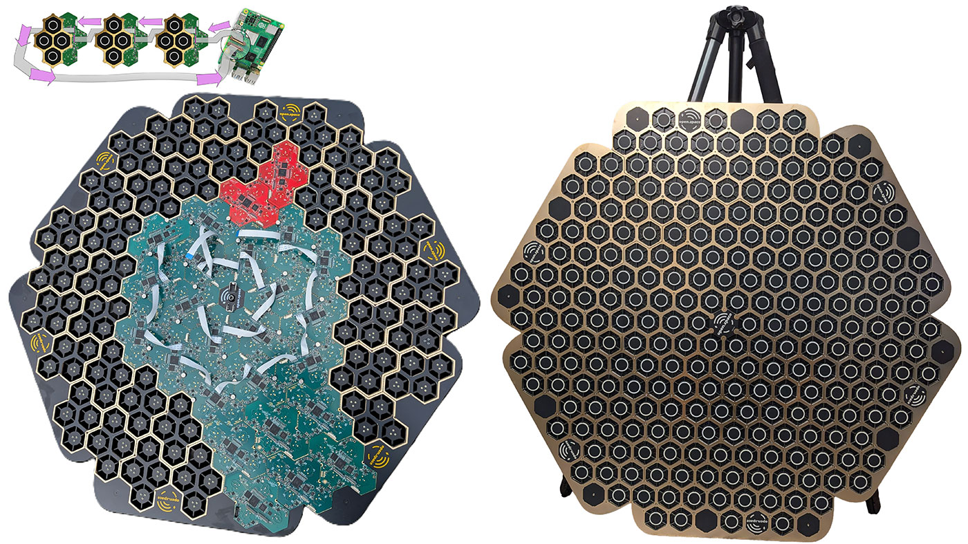
QuadRF antenna array from front

The QuadRF (pictured above) a phased-array radio built around a Raspberry Pi 5 and an FPGA board with picosecond-level timing. It does advanced signal processing and beamforming.

It can see WiFi through walls and track drones in flight.

If the open source community can come up with something like this, just imagine what governments are capable of.

When you plug a computer into a network, tools like Wireshark can show all the hidden traffic you might not even know is there. WiFi packets are the same, but those travel through the air, allowing snooping without physical access.

The QuadRF has built-in software that can stream and decode RF, and you can pipe it out to a more powerful computer for things like WiFi traffic analysis.

I mention this not to scare you—governments have had tools like these for years. It's just better to know what's possible and expose bad security practices than to ban useful tools like these. So if you're in the CIA, don't get any ideas.

To the Moon

ScaleRF Moon Array with large apeture

After spotting QuadRF on Hackaday, I reached out to Martin McCormick, who's been working on QuadRF as part of a bigger project: a Moon-scale antenna array, capable of EME (Earth-Moon-Earth) radio experiments and radio astronomy.

I think Martin took inspiration from Dishy, SpaceX's original Starlink terminal. (Makes sense, since Martin worked at SpaceX on the team that built Dishy!)

Instead of locking this phased array antenna system into a proprietary satellite system, licensed operators will ideally be able to chain multiple QuadRF modules together for interesting radio experiments, with up to 1.15 MW EIRP—basically, a massive amount of directional antenna gain, for high power RF fun.

But QuadRF is scaled down to handheld-size, and while it isn't powerful enough to send a signal to the moon, it's still quite useful in local SDR applications and visualizing the RF environment—at least in its frequency range of 4.9-6 GHz.

Testing QuadRF

But I specifically asked Martin if he'd be willing to send over a prototype QuadRF for my Dad (a retired broadcast radio engineer) and I to test.

I had already placed a pre-order on Crowd Supply (where a basic kit is $499), but I wanted to see if QuadRF was really as useful or intuitive as it seemed from the videos ScaleRF posted.

Spoilers: it's still a little rough in the UI department, but I was blown away by how well it works. Especially considering everything's running on a Raspberry Pi 5.

When you turn it on, the Pi boots up and creates a WiFi hotspot. You connect to that, and visit http://quadrf/. That page runs a VNC session in your browser, where you can launch apps from GNU Radio to SDR software, and even their custom AR (Augmented Reality) RF visualizer.

The AR visualizer is the most interesting included software, despite being less useful for real-world SDR applications.

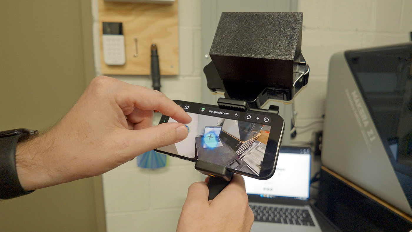
QuadRF showing augmented reality WiFi signal overlay on laptop

The UI is a little rough, but you can adjust the alignment between your camera and the phased array, and the gain of the receiver.

Then it will visualize frequencies from 4.9-6 GHz as colorful 'blobs'. The scale is not shown on the display in this early version, but from my testing around the studio, my 5 GHz WiFi network (which was running on Channel 100, or around 5.5 GHz) showed up light blue. Neighboring WiFi networks were showing up red or green.

If you order the Mobile Expansion Pack, it incorporates a battery power pack, and a handheld phone mount, so you can walk around analyzing part of the C-band in real-time.

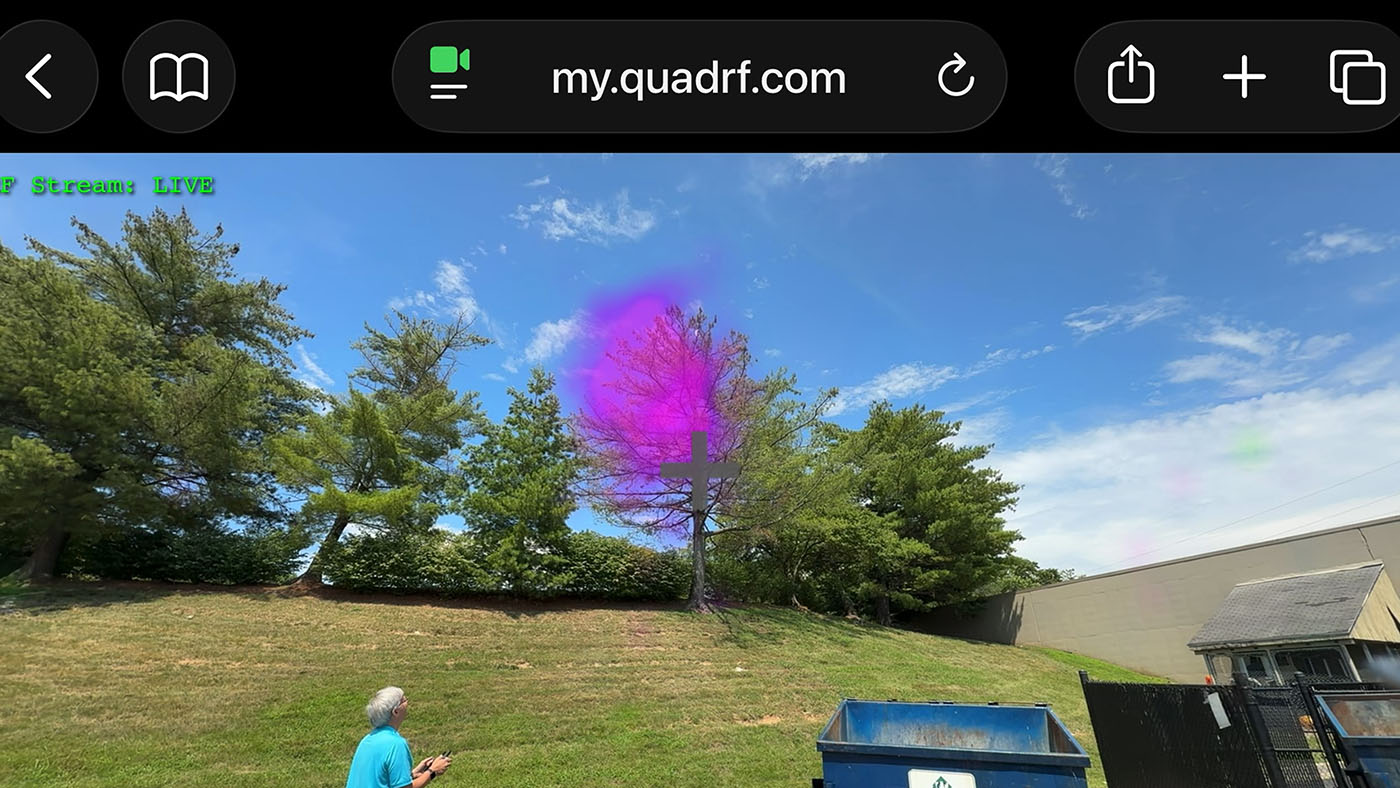
QuadRF showing 5 GHz signal over drone in augmented reality mode

My Dad and I flew his DJI Mini Pro 4 behind the studio, and the QuadRF had no trouble picking it out of the sky. As it flew away, I had to increase the gain to keep seeing it; it would be nice to have AGC or an easier gain control as the UI was a little clunky when carrying around the contraption.

It sounds like the crowdfunding campaign is already beyond expectations, and they'll be switching the enclosure to an injection mold (the version I have is 3D printed).

Raspberry Pi 5 MIPI for high-bandwidth RF

QuadRF open showing Raspberry Pi 5 and MIPI connection to FPGA antenna board inside

One aspect that intrigued me was the use of the Raspberry Pi's MIPI lanes for low latency SDR streaming I/Q (In-phase/Quadrature) at data rates over 5 Gbps. From the QuadRF Documentation:

The novel approach of streaming I/Q over the Pi’s camera and display FFC MIPI connectors has many benefits. MIPI can handle >5 Gbps, low-latency, full-duplex data transfer through the Pi’s RP1 chip. It is simpler and more reliable than USB, adds almost zero hardware cost to the RF board, and can sustain hundreds of MSPS of I/Q with no hiccups or sample loss. Considering cameras and displays are the ultimate form of high-bandwidth signal streaming, it makes sense their standard digital interface is a great match for SDR! We think the industry should adopt it more widely!

It sounds like they had to reverse-engineer the MIPI protocol used on the Pi 5 to do this (since it goes through the RP1 chip), and the way it's architected, you can daisy-chain multiple QuadRF modules together, letting each module calculate its own phase shift.

I'm not sure how that will work in practice, but it sounds pretty neat. PCIe could probably work in a pinch, too, but this implementation frees up the PCIe connector in case you want high speed storage or even higher speed networking than the Pi offers.

Conclusion

As with all pre-production gear I test, take everything I've shown with a grain of salt. And with any crowdfunding campaign, if you back it, don't expect the QuadRF to show up on your doorstep overnight.

I was initially skeptical about how useful and fun this little handheld phased array could be, but after using it for a week, I can't wait until the one I pre-ordered ships!

The Daily Front Page 3 of 32
Friday, July 10, 2026 The Daily Front No. 1 — Tools and Their Shadows
article

Good Tools Are Invisible

by theanonymousone·▲ 524 points·238 comments·gingerbill.org ↗
I don’t want my tools to be “fun”. I want my tools to be invisible.

2026-07-10

TL;DR: A good tool is and ought to be invisible—striving to make such tools is the goal of a toolmaker.

One habit I see a lot, and have to push back on, is taking a tool’s shortcomings and reselling them as a “puzzle game” which is “fun” to solve.

I don’t want my tools to be “fun”. I want my tools to be invisible.

Text Editor Wars

Let’s take vim as an example  This is just an example, and applies to other editors too.. I constantly see some people praise it not for what actually makes it good, but by taking the things it’s bad at and turning them into a puzzle to have “fun” solving.

I’ve had people tell me how “fun” it was to build a macro to handle some one-off text-refactoring problem. But when I looked at what they were doing and how long it took, my honest reaction was: I could have done that in Sublime in a minute with multiple cursors, or just written a quick script.

To be clear, I’m not saying text editors don’t matter to your workflow. I’m questioning the near-religious devotion people have to a tool because it gives them a “hacker vibe”—which is basically the whole appeal for newcomers to vim or emacs.

That’s what I mean by “invisible tools”. When you’re proficient with your editor of choice—whatever it is—it disappears into the background. But the moment it cannot handle something easily, it stops being invisible. What baffles me is that so many people treat that friction—the effort of working around a tool’s limitations—as the “fun” part, and then advertise it as evidence that the tool is great.

I know plenty of things wrong with my own editor of choice: Sublime. I don’t dress those flaws up as fun little puzzles to solve. I just get annoyed that it lacks the tools I actually need, forcing me to write a plugin or reach for a separate program to write to transform text the way I want.

I’ve been using Sublime for 15 years now. It’s my editor of choice for a few reasons: its shortcuts are a superset of the graphical OS environment (which minimizes the mental context-switch when moving between applications), multiple cursors really are better than macros 99.999% of the time  I think I’ve only “needed” a macro in Sublime twice in the past decade, and in both cases, setting up the macro took longer than if I just wrote a script to do the same thing. (since they give direct visual feedback), and it leaves me with the fewest “puzzles” to solve in my text-editing workflow. I’ve found something like vim to be better at basic editing but worse at bulk operations—and I don’t mean grep-like operations—which is why I’ve stuck with Sublime for so long. I never found vim motions to be that much more productive than my Sublime workflow either, and that wasn’t just down to lack of trying or familiarity  To be honest, I have forgotten most of my “vim motions” knowledge over the years, because I don’t regularly exercise it, nor do I need to.. And since I virtually never write code in a terminal, my need for a terminal-oriented editor is effectively nonexistent.

If people find vim, emacs, or whatever genuinely good and productive, I’m not going to criticize them for using it. People are most comfortable with what they know. But for the people I am discussing, that same familiarity blinds them to their tools’ flaws, and leads them to celebrate those flaws, flaunting them as games.

Tools as an Identity

Part of why these debates turn religious is that a tool choice becomes a flag you plant—it says something about who you are. The “hacker vibe” isn’t a mere aesthetic; it’s tribal signaling, and that’s the real trap. Once your identity is invested in a tool, admitting its flaws starts to feel like admitting something about yourself. So people don’t just tolerate the flaws—they defend them, and eventually flaunt them. You cannot have an honest conversation about a tool with someone who’s decided the tool is part of their personality.

Feeling Productive versus being Productive

The text-editor-macro anecdote I mentioned is really about a gap between feeling productive versus being productive. There’s a sensation of cleverness that comes from solving a fiddly problem, and it’s easy to mistake that feeling for actual output. A tool that makes hard things feel heroic and clever feel like an achievement can register as “powerful” while quietly being slow. The honest test isn’t how engaged or clever you felt, it’s wall-clock time and how many mistakes you made getting there. A lot of the tools people evangelize would lose that test.

If productivity is actually the goal, actually question your own views on this, and try to see what makes you more productive. You will be surprised when you do.

Terminal UIs vs GUIs

Another example in this same vein is when people advocate for terminal apps over GUIs. If you’re stuck in a terminal all day, then I completely get the obvious advantage, but most programmers aren’t stuck in a terminal all day.

From those people who generally advocate for a TUI over a GUI, one of the criticisms of GUI apps tends to be: “I cannot navigate them with the keyboard alone”.

Okay? That doesn’t make GUI apps inherently bad. It just means the GUIs people build aren’t good enough to be keyboard-navigable. There’s nothing inherently impossible about making a GUI navigable with a keyboard, rather it’s just that most toolmakers never bother to implement, and usually because they don’t realize how much more productive keyboard navigation is than reaching for the mouse a lot of the time. If the argument was that a specific TUI app is better than the other alternatives which are GUI based, then that is a fair argument, but arguing that TUIs are inherently better than GUIs is very misinformed.

And this is the common mistake: people look at the current state of a category of tools and assume its current limitations are inherent/essential, when really no one has put in the work to make those tools better.

Linux’s (Lack of) Popularity as a Desktop

The year of the Linux  I know I am going to get people saying “Linux is the Kernel, the OS is the [insert distro name]”. I’m sorry but that’s not how most people talk about Linux, and I don’t really care too much for your pendantry which aids nothing. Especially since to critique it, you clearly had to understand what was being said about it. desktop still isn’t upon us (in 2026), and part of the reason why it has taken so long to get to that point is fundamental: a lot of the people who use Linux love fiddling with configuration files to reshape their system—it’s their idea of “fun”, their puzzle game.

I went through that phase myself. But after a while, I just wanted things to work. Spending hours (if not days) configuring everything isn’t something I want to do any more. I want the defaults to be good and just work, and when I do need to tweak something minor, it should take seconds.

Maximal configurability shouldn’t be a tool’s goal, it should be an option for when it’s actually necessary. Designing an ergonomic tool is fundamentally about having good defaults, while still allowing escape hatches where they’re possible/needed.

The appeal of accidental  Characteristics that an object has contingently and can change without altering the object’s essential identity. complexity is something a lot of programmers/techy-folk love, giving them a weird sense of security.

Having good defaults is fundamentally a toolmaker’s responsibility. We as toolmakers have a tendency to put the burden on the user: to configure it, to tweak it, to learn it. A lot of that burden is really a designer declining to make a decision. “Highly configurable” is often just an excuse for shipping no opinion at all and calling the resulting work your problem. Good defaults are a form of respect for the user’s time: the toolmaker does the thinking once so a thousand users don’t each have to. And part of designing a tool is to allow for some escape hatches tool; those escape hatches are there for the genuine minority who need something unusual; they should not be a substitute for getting the common case right.

Steep Learning Curve as a “Feature”?

Another defence I’ve seen is that the difficulty is the whole point, it filters out the uncommitted, and once you’re over the hump you’re rewarded for life. But a learning curve is a cost, not a virtue. It could hypothetically be absolutely a cost worth paying, but the payoff has to be genuine productivity, not the satisfaction of having paid it. Too often the reasoning is just sunk-cost dressed up as merit: “I spent months learning this, so it must be worth it, and you should copy in my footsteps too”. That’s the puzzle game again, only now the puzzle is the tool itself.

Conclusion

None of this is an argument against any particular tool. It’s an argument against a way of thinking. Use vim, use emacs, use Sublime, but use whatever disappears into the background and lets you get on with the work. That is the whole test, and it’s a personal one. What I’m pushing back on isn’t the choice, it’s the storytelling that grows up around the choice: the reframing of limitations as features, the effort of working around a flaw sold as the reward, the tool quietly promoted from the thing-you-use to the part-of-who-you-are.

The clearest sign a tool is serving you is that you stop noticing it—it becomes invisible. You don’t celebrate its flaws because you’re not turning them into a hobby, rather you just get mildly annoyed and route around them. You don’t defend it because nothing about your identity is riding on it. And you don’t mistake the feeling of cleverness for the fact of productivity, because you’ve bothered to check the difference.

So by all means, enjoy your tools, for the joy of programming itself. Just be honest about which parts are genuinely good and which parts you’ve talked yourself into loving. The best tool isn’t the one with the best story. It’s the one you forget you’re using.

A good tool is and ought to be invisible—striving to make such tools is the goal of a toolmaker.

The Daily Front Page 4 of 32
Friday, July 10, 2026 The Daily Front No. 1 — Tools and Their Shadows
article

In Emacs, everything looks like a service

by kickingvegas·▲ 247 points·106 comments·yummymelon.com ↗
Emacs’ built-in access to OS system services coupled with the ability to run other programs makes it routine to improvise client behavior within it.

09 Jul 2026  Charles Choi

A common refrain is that Emacs is an operating system (OS). This isn’t true, but what invites comparison to an OS is its ability to orchestrate applications and utilities above the OS kernel level. The diagram below suggests a truer picture of how Emacs’ relates to an OS and its capabilities.

img

Emacs’ built-in access to OS system services (file system, network, etc.) coupled with the ability to run other programs makes it routine to improvise client behavior within it. Because of this, Emacs users are able to accomplish many of their computing needs from the different client modes that have been made for it. This gives credence to the notion of “living only in Emacs.”

In this post, we’ll examine some of the ways Emacs lets you build a client. By the end of this post, you’ll hopefully be convinced that from within Emacs, everything looks like a service.

Client-Server Model

Let’s first provide some definitions.

The Client–Server model is a common computer interaction pattern where a task is partitioned between the provider of a resource (the service) and the requester of that resource (the client). The client issues a request to the server, and the server in turn returns a response as shown in the diagram below.

img

Depending on the implementation, the transaction (request + response) can occur over a network or be local to a system. Client-server models using a network has been most elaborated upon with REST-style software architectures. Shown in the sequence diagram below is a common implementation pattern for REST-style client server architecture.

img

Emacs as a Client

From the diagram above, there are three concerns the client is typically responsible for:

  • UI: User interface (if any).
  • Client Edge: Sub-system concerned with communication with the service. For networked clients, this is the network sub-system.
  • Local Database: Representation of data that is exchanged or synchronized with the server. How this data is managed is up to the implementation requirements.

For the above concerns, Emacs provides numerous libraries both built-in and third-party which can implement a client. Listed below are some built-in libraries with their respective links for further reading:

Requirements dictate the amount of complexity required to implement the Emacs client. If there is an existing command line utility that can do the “heavy lifting”, said utility can be reframed as a “service” that can be accessed via a shell call.

img

Elisp

All the libraries mentioned above are accessed through the Emacs Lisp (Elisp) programming language. Elisp is a dynamic programming language which allows for a high degree of improvisation during run-time. This capability allows for complex orchestration of any behavior that is available to Emacs, from Elisp functions to shell commands.

Example wttr.in client

wttr.in is a console-oriented weather forecast web-service. It supports JSON output so we can build an Emacs wttr command which will prompt for a location, make the HTTP request, process the JSON response and display the result in the mini-buffer.

The top-level command wttr is shown below.

(defun wttr (location)
  "Show weather conditions for LOCATION from `https://wttr.in' in mini-buffer.

Result is also stored in `kill-ring'."
  (interactive "sWhere (default: local): ")

  (condition-case err
      (let* ((url (wttr--request-url location))
             (jsondb (fetch-json-as-hash-table url))
             (msg (wttr--report-message jsondb)))
        (kill-new msg)
        (message "%s" msg))

    (error (message "ERROR: %s" (cdr err)))))

The wttr.in URL is constructed by the function wttr--request-url shown below.

(defun wttr--request-url (location)
  "Construct wttr.in URL with LOCATION."
  (let* ((base-url (url-generic-parse-url "https://wttr.in"))
         (encoded-location (string-replace " " "+" location))
         (query (format "/%s?0&format=j1" encoded-location))
         (_dummy (setf (url-filename base-url) query)))
    (url-recreate-url base-url)))

We can subsequently pass that URL into fetch-json-as-hash-table which does the heavy lifting of retrieving the URL and parsing the JSON response into an Elisp hash-table.

(defun fetch-json-as-hash-table (url)
  "Fetch URL with expected JSON response and return a `hash-table'."
  (let ((data-buffer (url-retrieve-synchronously url)))
    (if (not data-buffer)
        (error "Failed to fetch data from %s" url)
      (unwind-protect
          (with-current-buffer data-buffer
            ;; Move point past the HTTP metadata headers
            (goto-char url-http-end-of-headers)
            ;; Parse the remaining JSON buffer into a hash-table
            (json-parse-buffer :object-type 'hash-table))
        ;; Always kill the downloaded network buffer to prevent memory leaks
        (kill-buffer data-buffer)))))

Finally we can extract the desired values from the JSON response (jsondb) to populate the message that will sent to the mini-buffer.

(defun wttr--report-message (jsondb)
  "Generate weather report message from JSONDB."
  (let* ((area-buflist ())
         (nearest-area
          (wttr--get-first jsondb "nearest_area"))
         (area-name
          (map-elt (wttr--get-first nearest-area "areaName") "value"))
         (region
          (map-elt (wttr--get-first nearest-area "region") "value"))
         (country
          (map-elt (wttr--get-first nearest-area "country") "value"))

         (current-condition (wttr--get-first jsondb "current_condition"))
         (temp_c (map-elt current-condition "temp_C"))
         (temp_f (map-elt current-condition "temp_F"))

         (weather-description
          (map-elt
           (wttr--get-first current-condition "weatherDesc") "value")))

    (mapc (lambda (x)
            (if (and x (not (string-equal x "")))
                (push x area-buflist)))
          (list area-name region country))

    (format "%s: %s°C, %s°F %s"
            (string-join (reverse area-buflist) ", ")
            temp_c
            temp_f
            weather-description)))

wttr.el source

Closing Thoughts

At this point, hopefully you are convinced of the title assertion that from Emacs, everything looks like a service. Furthermore, many of the APIs offered by Emacs work at a high-level of abstraction. Consider that the lines of code for wttr.el weighs in at 67. (Result using the cloc utility.)

If that’s too much, then imagine an alternate implementation where the actual network request and JSON processing is done in a Python script called weather. Then the Elisp command to invoke it is just the code shown below.

(defun weather (location)
  "Call weather script with LOCATION and show result in minibuffer."
  (interactive "sWhere (default: local): ")

  (let* ((weather-cmd "weather")
         (cmd (if location (format "%s %s" weather-cmd location) weather-cmd))
         (result (shell-command-to-string cmd)))
    (kill-new result)
    (message result)))

With the above implementation, the shell command becomes effectively the “service” to make a request to.

As Elisp is a dynamic programming language, it can allow for integration of Elisp libraries with command line utilities in an improvised fashion.

This capability is compelling to users who recognize the opportunities it can offer.

The Daily Front Page 5 of 32
Friday, July 10, 2026 The Daily Front No. 1 — Craft, Simulation, Spectacle
article

Train sim created by just one person is being called the best ever made

by oumua_don17·▲ 843 points·342 comments·kotaku.com ↗
I paid the game the highest possible compliment.

Steam reviews are blowing up for gorgeous Japanese train driving simulator Running Train

A blue train under cherry blossom.

A blue train under cherry blossom. © Novatetsu Games / Kotaku

I spent a rather embarrassing amount of time trying to match up Running Train‘s hyper-realistic train lines and Japanese terrain with the real world. And in doing so, I paid the game the highest possible compliment. This extraordinarily realistic sim made by one-person development team Novatetsu Games is in fact set in a fictional region of Japan, but is created so lovingly that you’ll believe it’s real life.

07 Running Train

© Novatetsu Games / Kotaku

I’m not exactly a train enthusiast, nor indeed particularly au fait with the range of train sim games previously available, but in Running Train I’ve found something absolutely captivating. And most bizarrely, I’ve found that quality not by actually playing it, but rather by letting it play itself. While the game encourages you to master the reasonably simple controls of its range of perfectly crafted engines, you can also just set it to play itself and then take over the free camera as it does. Doing so has brought me so much pleasure.

Played properly, Running Train asks you to carefully control your speed, braking, and prompt, safe arrival at train stations, and rewards or penalizes you accordingly. By turning off in-game guides and even the UI, you can earn higher scores and more credit, contributing to your overall rating for each of the 42 different routes it currently features. These routes feature ten 12-minute routes on the fictional Fukugawa Line, and a further 32 of hugely varying length on the equally made up Sankai Main Line. They can be as short as six minutes, or as long as 44, each set at different times of day.

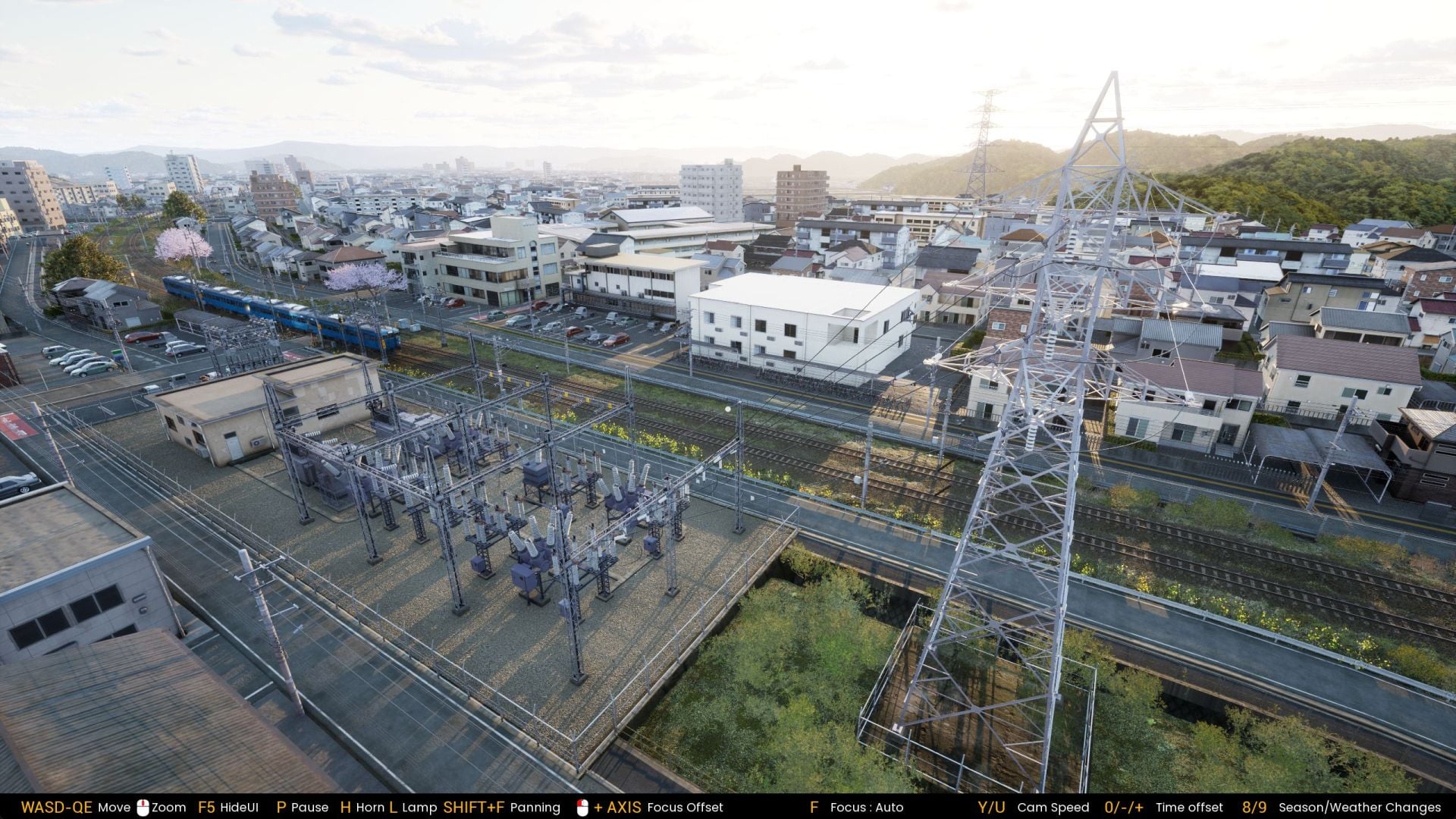
And oh my goodness, it’s so pretty. Vast stretches of imagined Japanese towns and countryside have been created (40 kilometers of track, apparently), and it’s not just randomly placed assets. Jumping into that free camera, I couldn’t believe it when I noticed that even powerlines are logically placed, with wires beginning at substations, then stretching across pylon networks. Roads are filled with traffic, cars are parked in bays outside apartment buildings, Shinto temples sit on hillsides, ferries bob on the sea while waves lap onto shores.

02 Running Train

© Novatetsu Games / Kotaku

The key thing about all these details is that…you don’t see most of them from the train! If you stuck with the driver cam, you’d miss almost all of it. It’s so much effort that the developers could easily have gotten away without, but it adds so much by being included. It’s also possible to play any of the routes in different weather conditions, from sunny days to torrential rain, or indeed in either spring or winter, with optional blizzards covering the entire game in snow.

09 Running Train

© Novatetsu Games / Kotaku

Zoom out far enough—and for some reason it will let you—and you see the tiles, the roads that don’t line up, and the various tricks and techniques that allow it to look so realistic from low down. But don’t do that! That’s silly. This is a train sim, not a plane sim, you’ve no business in the sky.

From those who know what they’re doing, Steam reviews could not be more glowing. “Honestly, I really, really do not know what to say,” begins one, before adding, “Hands down the most beautiful train sim that has been released on the market thus far. The modeling is top tier. The environment details, the clouds, the lighting, the weather effects all of it is just absolutely insane!”

12 Running Train

© Novatetsu Games / Kotaku

Another says, “Best train simulator game so far!” while a third compliments the solo dev for including support for the Zuiki MASCON, a bespoke peripheral for train driving sims.

This is all for the Early Access release, and there are still big plans to make the game far more detailed. The developer wants to add a passenger system (currently the trains run empty) and a conductor mode, and the ultimate goal is up to 100 km of track. The hope is to have that all done by the end of next year.

As it is, you can absolutely enjoy it as a top-notch train sim, but for me the experience has been about letting the model railway run itself as I swoop about in the camera. It’s a rare pleasure.

Running Train is out now in Early Access on Steam for $18.

The Daily Front Page 6 of 32
Friday, July 10, 2026 The Daily Front No. 1 — Craft, Simulation, Spectacle
article

The tech of 'Terminator 2' – an oral history (2017)

by markus_zhang·▲ 251 points·88 comments·vfxblog.com ↗
ILM had to basically invent new ways to realise the CG ‘liquid metal’ T-1000 shots.

T2_BARS_V1

Illustration by Aidan Roberts.

Ever since James Cameron’s Terminator 2: Judgment Day was released in 1991, I’ve been reading about the many ways ILM, led by visual effects supervisor Dennis Muren, had to basically invent new ways to realise the CG ‘liquid metal’ T-1000 shots in that film, of which there are surprisingly few. Tools like ‘Make Sticky’ and ‘Body Sock’ are ones that I’d heard referenced several times, but I’ve always wanted to know more about how those pieces of software were made.

So, over the past few months, leading up to the re-release of Terminator 2 in 3D, I’ve been chatting to the artists behind the technology who were there at the time. This was when ILM was based in San Rafael, and when its computer graphics department was still astonishingly small. Yet despite the obvious challenges in wrangling this nascent technology, the studio had been buoyed by the promising results on a few previous efforts, including Cameron’s The Abyss, and by the possibilities that digital visual effects could bring to modern-day filmmaking.

For this special retro oral history, vfxblog goes back in time with more than a dozen ILMers (their original screen credits appear in parentheses) to discuss the development of key CGI tools and techniques for the VFX Oscar winning Terminator 2, how they worked with early animation packages like Alias, and how a selection of the most memorable shots in the film – forever etched into the history of visual effects – came to be.

Gearing up the computer graphics department

Tom Williams (computer graphics shot supervisor): I actually worked full-time for both Pixar and ILM for most of T2. Then I realised that was really dangerous. I would fall asleep, driving home once, and freaked myself out and realised you can’t really do that. So towards the end of T2 I went over to ILM full time. The way I got there originally was, I got invited by [visual effects producer] Janet Healy and [visual effects supervisor] Dennis Muren because I had worked at a company called Alias, which did modelling and animation tools.
t2cgteam

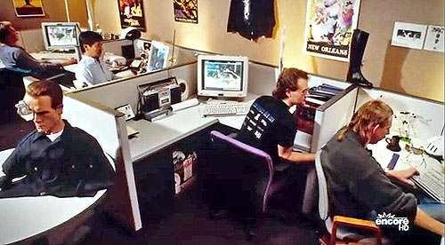
This still from the documentary ‘Industrial Light & Magic: Creating the Impossible’ shows ILM crew members at work on Terminator 2.

George Joblove (computer graphics shot supervisor): Each single gig at ILM was a small step above what we’d done before. And we were fighting with the limited computing resources we had at the time. We had done The Abyss which was a big step forward in a couple ways. First of all, in demonstrating what was possible and achieving it. Second of all, working for Cameron who had that great vision for how it could be used in The Abyss. With that film, had we not been able to pull it off, there would have been ways to work around it. But I don’t think there was any such opportunity in T2.

Eric Enderton (computer graphics software developer): Terminator 2 was my first big movie. I saw The Abyss in the SIGGRAPH film show and thought: I want to work for those guys. Fortuitously the CG group had decided to hire their first tools writer. They had lots of software but it was all being written by the same people who were doing the shots. I was the first ‘software-only’ person in ILM computer graphics, which obviously was a huge learning experience and just an amazing time.

Jay Riddle (computer graphics shot supervisor): I was working at ILM for several years and had learned how to animate by sitting with John Lasseter when he was in the Graphics Group, which was part of the Computer Division of Lucasfilm at the time. They were using this vector graphics display that they used with their own in-house software that they’d written, and they had this frame buffer. They were still in our building, and then they moved out to one of the other Lucasfilm buildings while they were trying to spin off and get their own place, which they eventually did. And just as they left were doing The Abyss, and then they were kind of fully gone by the time T2 came around.

Doug

Visual effects art director Doug Chiang, in addition to sketching many incarnations of the T-1000 at different stages, also performed digital manipulation fix-its to final shots. Image via ILM Facebook page.

Michael Natkin (computer graphics software developer): I showed up at ILM in a suit, which was hilarious. I remember Eric Enderton and George Joblove and a few other folks took me up to the Ranch for lunch and showed me around and I was like, ‘Sure. Hell, yeah. I’ll do this. Let’s make it happen.’ I knew a lot about computer graphics, but nothing about movies whatsoever, so there was quite a learning curve.

Jonathan French (computer graphics animator): The process of even starting at [ILM] was kind of novel. I landed in SFO at 11am and after finding an airport car rental agency that would rent to someone 23 years old I drove straight to ILM in Marin. I think after I signed the NDA they immediately handed me the script to read, a small stapled booklet on ILM film terminology and tools, and then about ten people on the team kindly took me to lunch at an Afghan restaurant, which I am pretty sure was the only Afghan restaurant in Marin. The next morning in dailies I got introduced by Douglas Kay to the team in the screening theatre and everyone turned around and applauded. Three things go through your mind at that point: one, how supportive these people are, two, I better live up to my own expectations, and three, I better live up to theirs. It worked out ok.

Steve ‘Spaz’ Williams (computer graphics animation supervisor): I was at Alias and had been pushing for VA – video animation – but Alias was into the ID which stood for industrial design. At the time, VA was this very small budding thing. Then ILM called and they had purchased a cut of Alias, and so they first thing they had me do was a ride they were doing at Epcot Center called Body Wars – it was a fly-through of the heart. Then James Cameron came to ILM with The Abyss and from there we went on to Terminator 2.

“I’d point to a page and say, ‘Oh, well that looks interesting. How are you going to do that?’ And they’re like, ‘Oh, we don’t know yet.’” – John Schlag

Stefen Fangmeier (computer graphics shot supervisor): My role on T2 was as a technical director. Meaning that I would concentrate on rendering and compositing rather than modeling and animation. Back then, TDs really needed to have programming experience and since I have a computer science degree, these tasks were a natural fit for me. My tasks were to support the animators in technical areas which included writing C-shell scripts for frame to frame processing. Many of the features for doing this are now included in commercial software packages, but back then, most of the procedural, frame-by-frame batch processing had to be created from scratch.

Geofff Campbell (computer graphics animator): [I was at MPC] in the summer of 1990 when I received a phone call from ILM who wanted to set up a telephone interview regarding a new film they were starting work on. It turned out that Steve ‘Spaz’ Williams had reviewed my portfolio and had asked for the interview. The phone call came one morning at 2am and woke me out of my sleep catching me completely off guard. I remember slurring my speech while standing at the bottom of the landing freezing in my underwear. That was also before satellite phones and the static and delay of the transatlantic connection was almost comical.

Everyone on the ILM side were asking me serious questions about my abilities, schooling etc. but every now and then Steve would chime in with a question asking me things like did I have any pets? I told him I had a cat back in Toronto, and his follow up question was getting into specifics like my cat’s name and what type of cat food I served him. A week later I got the job and started working on Terminator 2 on Halloween day. Looking back I realized that Steve was serving me up a short hand during my London interview. I had already gotten the job and the interview was just a formality.
image

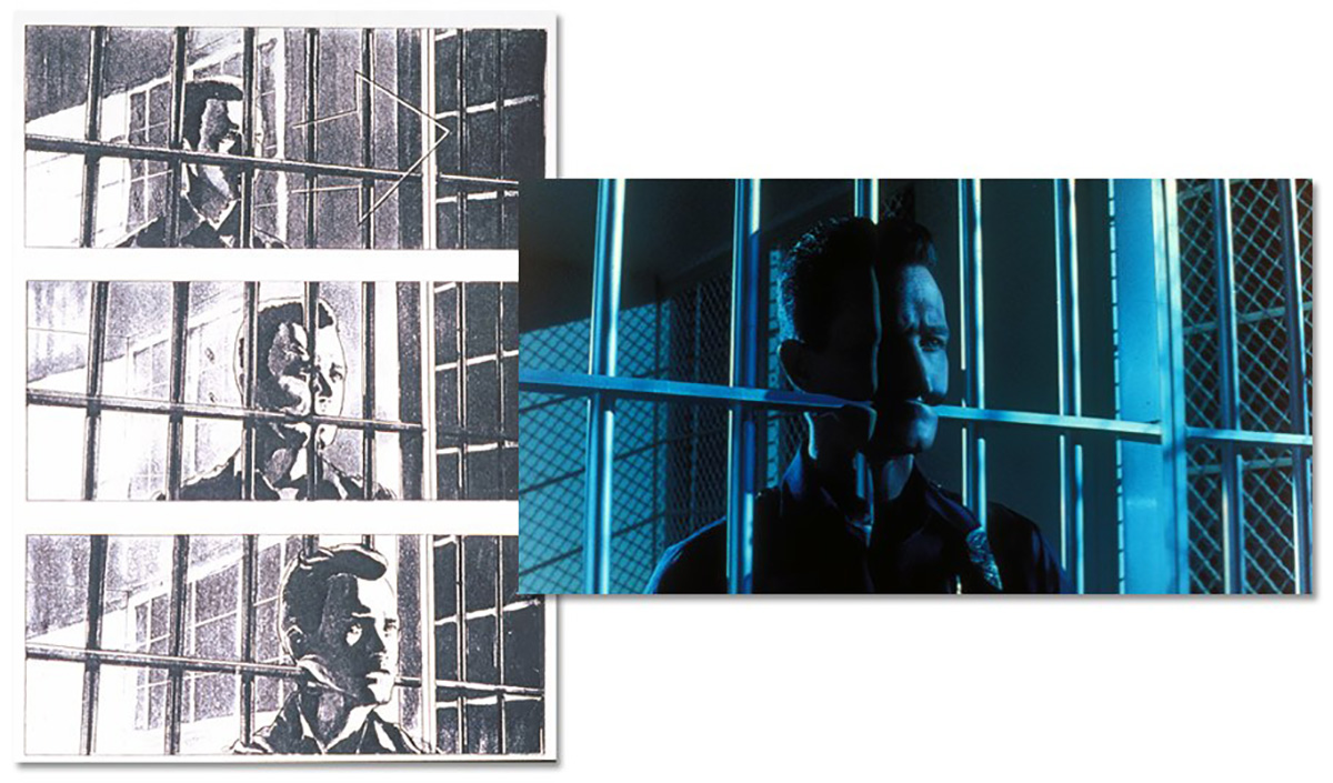
Storyboard example of ‘Head through bars’ shot, and the final result.

Tom Williams: When I came onto the show, ILM had all the storyboards up because there’s some particularly tricky shots that they were mulling over. They were just stuck. They were all color-coded. I was looking at them, and was like, ‘Oh yeah, the greens, I could do those and the yellows, that would be fun. I think I know how to do that.’ Then there was the blacks. I was like, ‘Wow.’ There was ‘head through bars’, and some of the stuff where the surfaces would merge with each other like when the T-1000’s hook hand gets stuck in the car and then melts back into his shoe. And ‘head through floor’. They said, ‘We want you to help us with the black ones and all the things with a black dot on it.’ I was like, ‘Awesome.’ When someone says, ‘Yeah, we’re not sure how to do this,’ you can’t do worse. My failure was to meet their expectations, I think.

John Schlag (computer graphics software developer): On my first day at work, I came in the door, they sat me down, and they showed me the storyboards, and they went through this binder. And I’d point to a page and say, ‘Oh, well that looks interesting. How are you going to do that?’ And they’re like, ‘Oh, we don’t know yet.’ I’m like, ‘You people are batshit! You’ve got to be kidding me! You bid this job, and it came in, but you don’t know how to do the work?’ So that was a big wake-up call on my first day at work in real visual effects, to realise you know, you make this Hail Mary bid, and lo and behold it comes in, and you’re celebrating, and then terrified.’

image1

From left: Steve ‘Spaz’ Williams, Stefen Fangmeier and Mark Dippe.

Michael Natkin: Actually, I also remember on my first day on the job, George Joblove took me down to watch them blow up the practical warehouse for Backdraft, which was amazing. It was a really neat time at ILM because it was right as the transition was happening from everything practical and optical to everything digital.

Jonathan French: The machine room which acted double duty as a night time render ‘farm’ was downstairs, near the Pit. The Pit is now a part of ILM folklore, but it was essentially Spaz’s space he shared with Mark Dippe and I think at various times Wade Howie, Jim Mitchell, and others. It was a fun place whenever I had reason to go down there, all 70’s scotch-stained shag carpet, hockey sticks and music posters, and sound proofed to the rest of the building. So you’d go in there and Stompin’ Tom Conners or Thin Lizzy would be on at full volume. I mean the kind of full volume where you open the door and your hair blows back. It was sort of as if the famous Horseshoe Tavern Bar in Toronto had been converted into a basement rec room.

“I give Cameron a lot of credit, the pseudopod from The Abyss and the liquid metal man in T2 are the same principle – they are what I would call the classic, perfect digital character.” – Mark Dippe

Anyway, on one of my first Friday nights working in the large graphics room I actually heard what I thought was bagpipes coming through the floor of the large graphics room. I asked Geoff Campbell, and he said, “Oh, ya that’s Spaz. He always plays bagpipes Friday nights.” That Spaz would later purchase a drag car, a tractor, a welder, and a working tank for his personal use also made total sense to me. For all these reasons the place and the people in it, and the work environment are probably not going to be replicated today. People who made things with their bare hands in their spare time.

I worked on an upper floor of C-building, along with a mix of people. The teams were often mixed across the building, which was actually good even if it wasn’t intentional. Alex Seiden worked on shaders a few feet away, John Schlag was writing new tools in a side room, Joe Letteri had just started a few weeks before me, Annabella Serra worked across from me, Christian Hogue on the Death Squad worked behind me, all from different teams. Joe was even on a different show. I think later I ended up down in the large graphics room downstairs, with Geoff, Stefen, John Berton, Doug, Lincoln Hu, the great and sadly missed Rich Cohen, Sandy Ford-Karpman, and others there. That was again a mix of teams, which was good.

Wait, can we actually do this?

George Joblove: I think we had cautious optimism. It just felt like we should be able to do it. We knew that there were going to be some tough challenges to solve but at the same time if felt like a really fun project that would be a great challenge and would be a great thing to accomplish.
JamesCameron

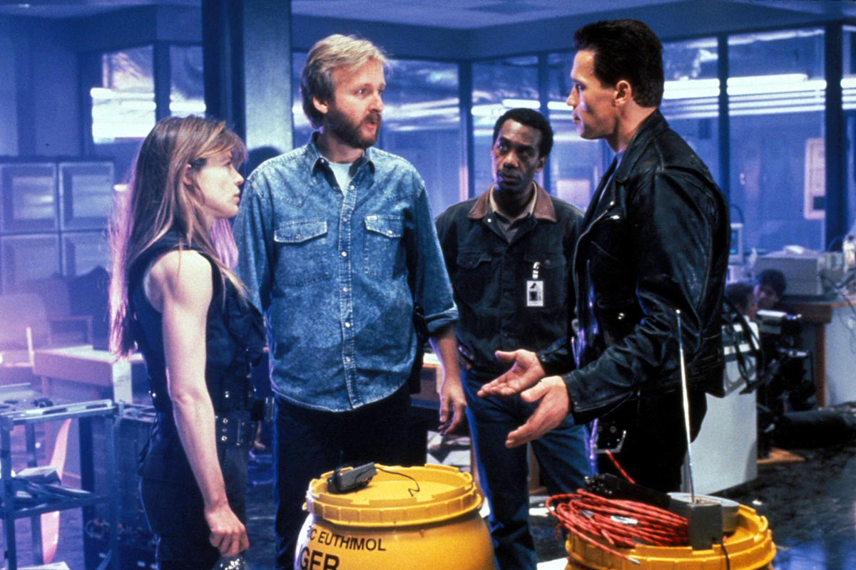
James Cameron discusses a scene with actors Arnold Schwarzenegger, Linda Hamilon and Joe Morton.

Eric Enderton: Terminator 2 was this huge show because it had like 50 shots. I mean, today you can’t get out of bed for less than 300 shots.

Jay Riddle: When Robert Patrick is the actor playing the T-1000, it looks like one thing, but when we’ve got this chrome and poly-alloy character moving around, it’s like something weirdly different, right? And they had to kind of flow into each other, and re-form.

Jonathan French: For the majority of the show I was on a team comprised of Stephen Rosenbaum and John Nelson, and George Joblove helping keep us moving forward on our separate shots. The tools were evolving so rapidly it became a moving target for all of us to keep track of them, to be honest. The throughput of the software team was enormous, given their tiny size. All the developers were mega on the keyboard, but in all that time since I’ve never seen anyone type faster than Eric Enderton. I figured in future shows he’d be like guitarist Johnny Greenwood from Radiohead, wearing some custom wrist braces to keep his hands intact in front of a crowd of awestruck fans.

George Joblove: Chrome, in those days, was something that, you know, that computers did well. The idea of making it liquid, making it walk like a person, integrating it into a live action scene completely convincingly – those were all real challenges. But making a chrome character was going to be a lot easier than making a furry one would have been.

Doug Smythe (computer graphics shot supervisor): At that time, too, the staff at ILM for doing computer graphics was pretty small. It was like a dozen or so people, and we had to grow the department very quickly, so there was a lot of hiring that had to be done. We had divided up the shots and the teams.

“It was Terminator 2 where I thought, ‘Oh my god, we’re going to buy a million dollars worth of computers for this – what a staggeringly large number.’” – Eric Enderton

George Joblove: Hardware and software back then was so expensive. I think if you look at the hard drive storage in 1990, a gigabyte of storage was $9,000. This was also still the age of SGI boxes because they made computers that were specifically optimised for doing graphics work and with the most bang for the buck that you could get. We had a network of SGI machines that included some large servers and then a bunch of work stations.

Doug Smythe: The tools that we had at the time, well, some things were inherited from Pixar when they split off. But we kept copies of the tools, or at least some of the tools that were developed at Lucasfilm, and then we had some sort of deal back and forth with Pixar, including to use RenderMan, because we would keep in touch with the guys and they were still next door for a while. And we collaborated to the degree that our separate businesses and legal departments would allow.

Jonathan French: I think on my first overnight take for dailies I consumed several extra CPUs in the render room that we had downstairs. They were basically jammed with 240 VGX and 340 VGX SGI machines, along with other older SGI boxes. But as a result I think someone else’s shot didn’t finish that morning. I think around that time maybe it was Brian Knepp or someone else on the software team wrote PA (processor allocator) which was a nice simple GUI that allowed you to allocate or release CPUs from your allotment for your overnight renders. I’m not sure if that had been around before, but to my knowledge it wasn’t in commercial software at the time, like you can get now with RenderPal, Deadline, et al.

StanWinston

Filming a practical make-up effects scene at the home of Miles Dyson. ILM’s CG work would ultimately work hand-in-hand with that of Stan Winston Studio. Image via Stan Winston School of Character Arts.

Eric Enderton: It was a really rare situation where you knew the film was going to be big. That hardly ever happens. We worked on stuff that we thought was going to be terrible and it turned out to be great, and then some things that went more the other direction, but this was one you just knew it was going to be big. I got to read the script and  I just thought it was great. And it was Terminator 2 where I thought, ‘Oh my god, we’re going to buy a million dollars worth of computers for this – what a staggeringly large number.’ Those 50 shots took us something like six months. I mean, that was all we could do. When I got there the CG group was 12 or 15 people and we had our meetings in the upstairs kitchen in C building. Then by the time I left it was almost the whole company – ILM had grown to 300 people and the great majority of that was CG.

George Joblove: Everything was done step by step with a lot of tests along the way guided by Dennis Muren who had great faith in what we could do. He was also excited about the prospects of being able to do things that hadn’t been done before.

Jonathan French: The VFX roles weren’t really segregated like they are now. Sure we had specialists, but I basically got given a shot and I figured, oh, ok I’m supposed to model, animate, procedural animate, texture, light, render, and comp this shot using all these tools and this proprietary shell compositor I’ve never seen. It never occurred to me I was only supposed to do one or two of those things. It was a real DIY vibe.

Mark Dippé (associate visual effects supervisor): I give Cameron a lot of credit, the pseudopod [from The Abyss] and the liquid metal man in T2 are the same principle – they are what I would call the classic, perfect digital character. It has all the aesthetic elements that a digital system can be, and excel at.

Out from under The Abyss

John Schlag: ILM’s big splash before Terminator 2 was The Abyss. You know, the water creature, the pseudopod. They called it, internally, ‘the water weenie.’ And they had this single monolithic software that created the creature. You make a spine curve and a series of edge, profile curves. They would lock those. And then you can provide it with a Cyberware face, and it would stick that on the end. And then there were water ripples that it would add throughout the whole thing. It was like everything that you needed to do that one creature in one programme. And the programme did only that.

So one of the first things I did on T2 was get my hands on that, and started disintegrating it. Like, pulling bits of it out and turning them into separate tools. There are some places in T2 where the T-1000 gets shot, and you can see liquid metal under the police uniform, and it is sort of rippling and healing. I made a tool to do that, with [computer graphics animator] Jonathan French for the bullet hole healing, for example, which came out of pulling apart the different tools.

Mark Dippé: The pseudopod from The Abyss was an abstract alien creature that had no relationship to humanness or even livingness. But for the T-1000, the big question was, how can you make it move and behave as if it’s a human inside, whatever you wanna call it, even though Robert Patrick in this case is not a human, he’s a T-1000, he’s a machine, but that was the big concern.

“We even originally included a limp Robert Patrick had from a football injury. I noticed it in the initial test that we shot with him.” – Steve ‘Spaz’ Williams

Jay Riddle: I’d been working at ILM in the camera department before getting into digital effects. For our animation tools, there were a number of visits to Wavefront Technologies. Initially, Alias was kind of being ruled out, because it was considered a toy and not really a legitimate contender.

Part of that was because there were some personal relationships between the people that worked at ILM and Wavefront, so it felt like, ‘Oh we know them’, so if something goes wrong or we need something fixed or changed, they’ll respond to us, and as soon as we signed the Wavefront deal, that person who was at Wavefront left! So, it kind of took away the whole argument of why that was the great advantage. And in fact, from an artist standpoint, which I was doing in modelling and animating, Alias was much easier to use.

abyss

Members of ILM’s team consider the pseudopod from The Abyss. Image via Lucasfilm website.

Wavefront was definitely the industry leader at the time, and had a lot of great features, and a huge community around it, and a lot of people that were good at it, and so ILM choosing to go the Alias route was kind of, well, people just kind of went, ‘What? You’re going with Alias?’ But it really legitimised Alias as a piece of software.

And really, what we did with Alias was, we hired Steve Williams from Alias itself for The Abyss, and he animated a spine moving around, and all of the little cross section circles along the path of the spine, and then Mark Dippé had written some software to kind of place those along the path, and make sure they were skinning properly and not twisting, and things like that, and Scott Anderson was also involved in that, as were a bunch of other people.

From real to digital

Steve ‘Spaz’ Williams: We had five separate categories of shots for Terminator 2. Now, we had what was called the pseudopod team, so we could re-purpose the data from The Abyss. But as opposed to refracting, the T-1000 was reflecting. Then we had the morph team, you know, which was the more two-dimensional transformations. Then we had the death team, that was the whole death sequence at the end. And then we had the [The Human Motion Group] team.

We had Robert Patrick come up to ILM and we painted a grid on him, a four inch by four inch grid all over his body, and he was like in a crucifix pose. We had him run, and he ended up running so much on a rubber mat that we had that he ended up blistering his feet, to the point where we had to cover his feet up.

So, there was no real motion capture at that time, at all, so we shot him with two VistaVision cameras exposing simultaneously. One from the front on an 85mm lens, and one from the side on a 50mm lens, and they’re firing simultaneously. So I can look at frame one from the front, and that would match frame one from the side. From there I basically rotoscoped Robert’s walk.

Mark Dippé: It was really through hand digitization not only of his body data but of his movement data that we created a database with a virtual character. It was all hand-built.

Steve ‘Spaz’ Williams: We even originally included a limp Robert had from a football injury. I noticed it in the initial test that we shot with him. So I had to try and correct that in the bone walk. So when I went and I reanimated CC1 for real when we got the plate photography I made a lot of corrections to that, because he was supposed to walk like a machine.

Mark Dippé: It is one of those things where it’s a little subtle, but you can see it, and it just came out of the rotoscoping.

robert-patrick-t1000

Robert Patrick with the grid painted on him.

Steve ‘Spaz’ Williams: So, we had what we called RP1 through to RP5. Robert Patrick – RP – that was the actual naming convention.

Mark Dippé: RP1 is the blob, an amorphous blob. RP2 is a humanoid smooth shape kinda like Silver Surfer. RP3 is a soft, sandblasted guy in a police uniform made out of metal, and RP4 is the sharp detail of the metallic liquid metal police guy, and then RP5 is live action.

Steve ‘Spaz’ Williams: Now, to get to all those RP versions, we had to break it all down. In the script it said he migrates from the blob version into a fully clothed version. That’s Cameron’s idea – so we had to translate that. So we thought, okay, we’ll break it into four stages. Let’s just do that in data, but the control vertices have to actually share the exact same properties. But they migrate in time. That’s essentially what the MO was at that point.

“Spaz was so good at it that he could literally click ahead of the menus appearing.” – Michael Natkin

Mark Dippé: We chose those ones because we felt, first of all it was hard to do any of this, but we felt those five stages were sufficient enough for us to achieve all the story ideas that were required. You know, he’s a formless blob, oh, he’s kind of a soft humanoid form. Oh, he looks kinda like a policeman. He is the policeman, to Robert Patrick.

Steve ‘Spaz’ Williams: If you look at Robert Patrick and what we call the RP4, which is just before it becomes the real guy, all that data of his head we collected using a cyber scanner. Then what we had to do is write an equation to actually smooth it all down and make it stupid, make it essentially like ice cream for RP2. So the data all had to be the same. You were not changing the amount of control vertices in the actual data. You had to run a smoothing algorithm over it.

robertpatrick

Reference stills of Robert Patrick in police uniform.

Michael Natkin: Spaz was so good with Alias. Now, Alias was quite slow back in those days, and it had all these menus that you had to use. You’d click the bottom of the screen and a menu would pop up. Then, you’d look through it for the item you wanted, and then you’d click on that. Often, that would launch a submenu, and then you type in a couple numbers and press return, right? But it was super slow. It would do some operation. Spaz was so good at it that he could literally click ahead of the menus appearing. So he would click on the bottom of the screen, then click where the menu item was gonna be, then click where the submenu was gonna be, then type in the numbers, press return, then turn around, chat with you for a minute, and turn back around, and the screen would have done what he wanted.

Steve ‘Spaz’ Williams: In the script, the T-1000 is going to walk out of the fire and he’s going to, the term people used was ‘morph,’ but in fact it was model interpolation. He’s going to interpolate into the fully clothed version of Robert Patrick. So [the shot was called] CC1 where he migrates from RP2, which is what we call the ‘Oscar’ version, a smoothed-down T-1000, but he shares the exact same dataset or control vertices as RP4. And RP4, again, is the fully clothed version with the wrinkles and buttons. What I did is I hid all the buttons and the badge and the gun, I hid it inside his body cavity, and grew it out in time. The press called it morph. In fact, it was called model interpolation.

Geoff Campbell: Steve [Williams] had brought me on to work primarily with him on the T-1000 and I believe my first task was to take his detailed Robert Patrick model and make a smooth ‘Oscar’ like version for the liquid metal transitions. Today in just about any software that task would be a twenty minute job with a smoothing brush, but in those days the software was very limited and even a sophisticated package like Alias was ridiculously crude by todays standards. We were also using NURBs with overlapping control vertices so modeling was a very complicated process. Also there wasn’t a shaded GL mode when sculpting and on top of that you could only move one control point at a time.

ilm_terminator2

A final frame from the fire sequence.

They had something revolutionary at the time called Prop Mod which allowed you to select a cv and type in a number of cv’s in the surrounding u and v direction that you wanted to move with a fall off, but to use it you had to click down on the cv and wait for 5 seconds before you could drag your point to it’s new location. It was so slow I never bothered to use it. So for me sculpting was the tedious task of moving one point at a time. I used to joke that it was as intuitive as sculpting with chicken wire. The hardest part was sculpting those points in wireframe and not seeing the shaded form. You could only see the results of your sculpting if you clicked on the ‘quick shade’ option where your screen would go black for 5 minutes and then start building your image on the screen one line at a time. That was reserved for when you were close to finishing your model and you needed to see what the hell you had done all day. It also forced you to take a coffee break.

My first animation on T2 was of John Connor’s foster mother body transitioning back into the T-1000 and stepping over John’s dead foster father. We didn’t have inverse kinematics or constraints so you had to keep track of all your body rotations and when you overshot a particular joint’s rotation it could affect the whole arm or leg so animating was much more time consuming than it is today. Match moves were also not as accurate so you often had to cheat the feet sliding to a ground plane in order to make them appear to be locked to the floor one frame at a time.

Doug Smythe: In the hallways of ILM, we still have the little maquettes that were made of the five stages of the T-1000 and it starts from this very amorphous blob, which was actually just key frame pose of a spline surface to do whatever it needs to do, to different stages of levels of detail of Robert Patrick as silver, and then finally the live action actor.

ilm_maquettes

The various T-1000 maquettes on display at ILM.

But we didn’t have any way to go from the first to the second, or from the fourth to the fifth. So any one time went from blobby to the low-resolution humanoid version, that involved the morph. We got it as close as we could just in animation and then you let the morph take over. I think we had some sort of mesh dissolve thing so that we could take the higher resolution mesh, smooth it, and project it onto the smaller resolution mesh so we could actually transform from, we do a cut from one to the other. We may have used some morphs to help that, but I think we could do a geometric transformation as you get sharper and sharper silver detail.

Alex Seiden (computer graphics animator): One of the things I coded was an interactive lighting editor (called ‘led’) that would help artists position reflections. I rendered a ‘geometry buffer’ – pre-computed surface normals and positions – so that shading parameters and reflection planes could be re-positioned and quickly re-computed without having to do a full render. There were also some features that would allow you to place a reflection or specular highlight by clicking where on the image you wanted it to appear.

Sock stories

Steve ‘Spaz’ Williams: We were using Alias version 2.4.1. I had come up with a method to build using separate four sided b-splines for the T-1000. Then we hired a guy out of Toronto – Angus Poon who was an excellent code writer. If you have 4 sided b-spline patches and the character is breaking, well, he basically came up with ‘Sock’ [which would be revised and called ‘Body Sock’], a piece of code that stitched things together where it was all breaking.

Michael Natkin: Later, this kind of thing would be done with NURBs, but before that they were just b-spline patches. The process would be that they would make a still model that was perfect, all the surfaces were blended. Then, they would make the skeletons, and they would animate the skeletons. Of course, when you animate the skeletons, the splines would separate, right? If you imagine that your body is made up of plates of rigid armour, and then you reposition the arms and legs, or whatever, the armour plates are gonna separate, and, or overlap.

What Body Sock was doing was giving us a way to blend those patches back together. There’s certain parts of the body, particularly one of the biggest ones is the crotch area – all of these surfaces had four edges. They were rectangular, but the geometry of where the legs come together into the torso, there’s just not really a great way to do that with four-sided patches. Body Sock would basically let you specify different kinds of blends.

“A TD had to know much more of what went on ‘inside’ the software/computer then in order to achieve the desired results efficiently.” – Stefen Fangmeier

Eric Enderton: I worked on Body Sock, and Carl Frederick, Mike Natkin and Lincoln Hu were also a big part of it. The way to think about, imagine somebody’s knee. As you bend the knee there’s going to be a separation. If you just have a rigid upper leg and a rigid lower leg, you bend the knee, there’s going to be this break. Either that or interpenetration, or something funny is going to go on. The question was, how can we do that skeletal animation but then end up with a smooth surface? So, nowadays this is built into so much software that nobody even thinks about it, but at the time it was like, ‘Oh boy, how do we do this?’

I don’t remember how we arrived at this at all, but the name came from imagining, could we put a body sock, like a stretchy nylon fabric around all these individual animated pieces of the body and have it be a smooth surface then that would follow the whole body? That was the original idea.

It ended up that that’s not what we did, instead, what we did was stitching. All of this stuff was being modelled in uniform cubic b-spline surfaces, so, NURBs, only simpler.

There was a button, a menu item in Alias that would do this for two surfaces statically. It ignored the animation, it was just a modelling operation that would stitch two surfaces together. One of the things that they had asked me to do earlier was to make an animated version of that tool. I wrote a little programme that read in a scene, you gave it the names of two surfaces and it did this stitching operation on each frame and then wrote the animation back out.

I tried it on a plane next to another plane or something, and it seemed to work, so I gave it to Spaz and he picked it up and in 20 seconds he made an arm animation with a muscle bulge, and then hooked it up and typed in the command and tried it out and there was this arm flexing back and forth. That was my first real experience of an artist picking up a tool I had made and making this beautiful art with it that I could never have made myself. I had the sense that this artist was held down by chains that were the limitations of their tools and I had just cut one of the chains. What a great feeling. I was hooked.

What we did with Body Sock was make an automatic stitching tool that would go and stitch all the seams in the entire character each frame. To do this, you needed a Sock file that told you where each of those seams was. It’d name the two surfaces and which side of each, plus U, plus V, minus V, minus U. Somebody had to very carefully figure this out. For the simple seams the math is really simple. Then you can do something a little more complicated where you have more subdivisions on one side than on the other. As long as it’s an integer multiple it’s okay.

Then the corners, if you have four surfaces that come together at a corner you can sort of imagine this same math is not too bad. You just line up all the control points and average them. But if you have three surfaces or five surfaces or some other number coming together at a corner, which you do in a humanoid form, you have to have at least a couple points like that, the math is a lot less obvious. It took us a while of poking around to figure out how to do that.

Mimetic poly alloy. Wuh?

Alex Seiden: The first thing I did on T2 was to write the ‘poly alloy’ shader for the T-1000. The mercury-like surface of the T-1000 required very specific reflections, but in those days we didn’t have ray-tracing available in a production renderer. So I came up with a way to let us do enhanced, controllable reflection mapping. TDs could place multiple reflection planes in the scene with the animation, and inside the shader I’d do a quick hit test to see if the plane was hit. It was a RenderMan shader.

It had some similarities to a shader that had been written at ILM recently before, for a Diet Coke commercial, oddly enough, but was all new code. Some of the best feedback was, no surprise, from Dennis Muren. In particular, he was really great at guiding the overall look, such as making sure we had enough diffuse shading mixed with our reflections. We called it the ‘pewter’ look. Without that, the T-1000 didn’t have any mass.

Stefen Fangmeier: I also worked on the poly alloy shader. RenderMan and its shading language were entirely new to me since I had previously only worked with Wavefront and then mental ray at Mental Images in Berlin. The ability of RenderMan to allow for complex light and reflection interaction and was essential in getting the look right.

One of the best examples of the poly alloy shader is in the shot of the T-1000 walking out of the flames. In order to have the flames reflected in the chrome as the T-1000 walks out, I placed cards into the environment on which flames elements were mapped on every frame and the shader used the transformation ability in RenderMan to calculate the proper reflections. We didn’t have ray-tracing back then due to the high rendering times it would have required but were able to achieve this effect just as well with this sort of clever cheat.

“The funny thing was that the hospital didn’t really have checkerboard floors. They were all white. Cameron thought that the black and white was much creepier looking, so we went with it. He had some poor guy stick black stickers every other tile.” – Liza Keith

The wipe to the actor at the end of the shot was also achieved using the object space of the model and animating a card over it to achieve the wipe in the shader. The transparency wipe was offset by a fractal in order to not make it a straight edge. This effect was used in several other scenes as well and required that the animator would closely match the CG geometry to the actor to which the T-1000 was transforming.

It should also be said that there weren’t a great deal of interfaces that allowed for immediate interaction with the rendering process as there are today. So, a TD had to know much more of what went on ‘inside’ the software/computer in order to achieve the desired results efficiently. Times certainly have changed.

Getting gasps from that first healing shot

Jonathan French: For the healing shots, John Schlag wrote this great utility harvested from the Abyss which I think he/we called Z-ripple. Basically it had a set of animator centric sliders to add additional sine-wave like procedural rippling and falloff to the bullet wound healing process that Alias couldn’t do. John Berton stepped in also and added a little Morph deflation on the plate to Robert’s chest to add to the effect.

My only regrets about that first shot was the plate wasn’t moving – it was a single still frame with film grain added to make it look like a running plate. I wish they had shot it with a running plate and Robert Patrick moving his eyes or head around a little to make it a bit more animated and lifelike. My other regret also out of my control was that the colour in that shot in the final film is all wrong. It’s green. I think I got the same colour treatment that Mike Natkin later discovered was going on with his shots. Still, at a premiere screening of the film you could hear gasps in the audience, which was kind of funny after spending so much time on the shot.

The match moves were a bit more work. Around that time Tien Truong had written a cool low-bit edge detection utility. You could basically run it on a sequence of plates and extract I think a 2-bit image pass which would pick up only areas of contrast, remapping them into a super bright magenta/green/blue colour palette. Then you could use that same utility to overlay your whole SGI desktop and register it against a match move shot in Alias. Of course now every off the shelf software has this sort of thing built in, and modern hardware is capable of pushing any bit depth. But back then we were running our SGI’s ragged, so memory and I/O economy was everything. Tien’s utility was key to nailing Robert’s match move wound shots, because Robert was often drifting around at a sub-pixel level when he looked to the casual viewer as totally still. But it would show up instantly in a match move.

‘Head through floor’

Eric Enderton: For this shot, the problem was that you had the face, and you had the floor, and they were two completely unrelated objects and we didn’t want to try to animate that merge, because it was going to separate from the floor. The topology was going to change, and it just would have been really hard, so what we wanted to do was somehow make a surface that lay over the face and the floor, like a cloth.

floor

A still from the checkerboard floor

The way we did that was, I made a ray casting tool. The new surface is defined by an array of control points. We’d compute those control points by shooting rays from a starting surface – a plane or curved surface – towards the combined surface, placing each control point at the ray intersection. It was new and interesting, but very difficult to control.

Jay Riddle: Liza Keith was the animator on that shot. It ended up taking quite a bit of time to figure out how to make this nice smooth transition between a flat surface, to something that has a face that starts to appear in it, and then pulls together and the texture itself feels like it’s doing something that makes sense, and not like tearing apart and going in weird directions, and looking CG.

Eric Enderton: Liza is both very technical and artistic and so she was wrestling with it and we would see it in dailies. The process took overnight to render so you couldn’t see what your animation looked like until the next morning. There was one day when she just didn’t even come to dailies because she was getting so discouraged, but that was the day that it really worked, visually, and there was spontaneous applause in the dailies room. So when she came in I told her, ‘You got it, that worked!’

Liza Keith (computer graphics animator): So they wrote that little rays programme that did an intersection and created a surface from the intersection. We ended up having to make two surfaces. One going out, that we used to do the one going in. Spaz was the one that generated the model. It was a scanned 3D model, but those things weren’t working very well at the time, so he turned it into an actual model that you could use.

floor1

A human form develops as the T-1000 mimics the guard.

Michael Natkin: Liza had modelled several frames but we didn’t have any good way to turn that into an animation, and so I worked on some software – it was really almost just like glue code. It would read the Alias files as still frames, and turn them into animations, setting them up as keyframes so that we could render the in-betweens. But these were all things that you couldn’t do in the Alias interface very easily. A lot of what I would be doing was simple tools that basically made Alias work better, or help with the translation from Alias to Renderman.

Liza Keith: I think my big contribution to that shot, beyond the actual animation, was the fact that I had written a shader to do a floor for me to do tests with, because we didn’t have the background plates at that time. So I just made a big square and put the checkerboard on it. The funny thing was that the hospital didn’t really have checkerboard floors. They were all white. And if you look in the background in some of the other shots, you’ll see that the floors aren’t checkered, but Cameron thought that the black and white was much creepier looking, so we went with it. He had some poor guy stick black stickers every other tile, every other piece of linoleum in the hospital hallway.

Michael Natkin: It was very gratifying because it was all this stuff that, from an engineering point of view, was very simple to do. It was basically just moving data around. It wasn’t fancy computer graphics, really, but it was just making the artists, the TDs, and the animators’ lives so much better. It was taking things that would have taken them days to do manually. We could write the code that would just do it instantly for them.

Making Make Sticky

Tom Williams: The shot of the T-1000 coming through the bars with his head and body was done with a program we called ‘Make Sticky’. It was the precursor to the 3D paint system we did, which was a way of letting you have a line, a geometry underneath a frame and being able to preserve a texture along that geometry. Everything at the time was assigned textures to mesh vertices. You just can’t do it that way. You end up with all sorts of UV and parametric distortion and stuff where you don’t want it.

terminator_2.bg_.3

Steve ‘Spaz’ Williams: So the way Make Sticky worked was – you take the texture map, which is a flat, orthogonal image, so it has these theoretical points on it. And you say, ‘We want to take these points of a texture map, and we want to stick them to a piece of data.’ And regardless of what the data does, we don’t want the visual image to slide around on the surface. So we want to tack them down. In three-dimensional space.

Tom Williams: From the Pixar days, we had done all this subdivision work and NURBs and micro-polygons and stuff like that. We used a lot of the breakdown of where the micro polygons would end up into indices in the frame in the scanned film frame. It worked a lot better. Then, as it distorted, we didn’t get to do a tonne of lighting, re-lighting, but we got to do a little bit so it looked better than just a 2D surface with texture mapped on it. By the way, it’d probably work much better now to use the underlying meshes. Particularly if you use subdivision surfaces or something, where you can get more consistent UV parameter space. At that time, we used a lot of these triangular patches and very large meshes. Bezier meshes. It was literally a hardware limitation and a tools limitation that it wouldn’t let you go super finely grained and it would take forever to render.

Doug Smythe: To push the head through the hospital bars we had a cyber scan mesh of Robert Patrick and I took that geometry and I just literally pulled the control CVs around the shapes of the thing. Then we had Make Sticky. It would literally just remember the coordinates that a texture was on at one frame and then as the geometry moves around, you keep those same texture coordinates stuck to the geometry at those points. It was a very simply UV mapping technique, although we didn’t really call it that at the time.

John Schlag: One of the things I wrote was that procedural displacement generator. And it would take a cyberware head from a whole model, and you could define different kinds of displacements, you know, the easiest one just being a sphere or a cylinder. And because the bars in the jail cell gate that he passes through are in fact cylinders, at least the vertical ones, the horizontal ones are very closely so, match-modeling those and feeding those as displacement generators into this gave us some nice sploogy effects as the head passes through the door.

Jay Riddle: I have to say that for me the head through bars is one of the great shots in the movie, because it was one of those that people remember, and that little thing with the gun getting caught, and he twists his arm, just such a great little moment that Cameron came up with. I mean, Cameron was an effects guy in his earlier life. He understands it. He’s not afraid of it. It gave us such freedom to talk to him and not be afraid of screwing up.

Tom Williams: By the way, Make Sticky was originally called Make Me Sticky but that wasn’t really appreciated at the time.

Un-splitting heads

John Nelson (computer graphics animator): For that head split shot, we basically had Robert Patrick walking up and what I did is, we had a face that we modelled of Robert Patrick. I knew that Robert Patrick’s face, I laid basically this pizza inside. I moulded it in and sealed it up. And then what it blew open. And as it blew open, that was a prosthetic that Shane Mahan did from Stan Winston’s. I remember I said that would be easy and that’s the last time I’ll ever say that anything will be easy. Because like fifty takes later… So that opens up and it’s Shane’s shot to blow it open and then my shot would close it up. So what I did was I projection mapped – we called it Make Sticky – projection mapped his head, split it open and then laid this pizza inside. And we also used this thing called Chan-Math.

Michael Natkin: One of other tools I built was this thing called Chan-Math that turned out to be pretty helpful. We used it for the scene where the T-1000’s head is split open which John Nelson did a lot of work on [the practical Stan Winston effect was called ‘Splash Head’ or ‘Saucehead’]. We were building all of these one-off tools to say, make some object fall along a spline, or blend these two surfaces and so on.

And what I wanted to do was create a way where instead of writing the code from scratch, there’d be an intermediate scripting language that would let you express those things. A lot of things were done by naming conventions, like we might have a script that says, ‘Okay, find all the things have ‘skin’ in the name, and make them follow something with the same name, but ‘bone’ in the name.’ So it was, ‘Find all the things that are in ‘belly skin’ and make them track to anything named ‘belly bone,’ or whatever that might be.

So the idea of Chan Math was to be able to make it so that the TDs could do that themselves. It didn’t really quite work out that way. The language wasn’t that friendly, but at least it made it possible for me to turn around sort of custom scripts for them pretty fast. It was used to sew Splash Head back together by saying, ‘Find this particular set of patches and then create keyframes out of the named individual objects.’

Steve ‘Spaz’ Williams: Chan Math. Now that was a powerful piece of code. So what would happen is that Alias had a certain limit with what you could animate. So, every object that you stuck on the screen, had a pivot point on it, and you could animate the object as a channel of math but you could also animate the control vertices of the object. So in other words, I have channel one, it’s just the object motioning around and then channel two, three, four are like different control vertices that are animating, doing their own different thing. Every time you did that, the pivot point of the object would traverse as well in 3D or rotate or whatever it was.

“When we were doing Willow several years before, it had this transformation sequence in it and they said, ‘Well, you’re the software guy, you figure out how to do this transitioning from one animal thing to another.’” – Doug Smythe

It meant that eventually everyone got totally lost in the animation process. So for example with the death sequence in T2, I was doing what they call control vertices animation. So, the pivot points would be flying all over the place. And eventually you end up kind of like, oh shit man, if I touch one thing, the whole fucker is gonna blow up. So Mike wrote this thing called Chan Math where we compress all the pivot points and throw them down to zero – zero – zero, so you’re starting again. But you were building up on the original control vertices animation. So essentially it was like the stepping stone of that time, that was Chan Math.

John Nelson: I was fortunate because Dennis really liked that sequence and that shot so whenever Dennis would talk about that movie, he would usually talk about that shot. Dennis is the man. There’s a great story that I have from working on that shot. Dennis came by, and he’s looking at Split Head and he’s going, ‘It’s working pretty well’ and I’d go, ‘Yeah, I’ve got it almost perfect.’ And I was pointing over to a corner of the screen and I’d go, ‘It’s almost perfect Dennis, but there’s this one little area over here that’s not right and it’s over in the corner…’ Seriously, this is a quote, he looks at me and goes, ‘John, if anyone’s looking over there, we are so fucked.’

Run, T-1000! Run!

Geoff Campbell: My second animation shot was HG-1 (Hospital Garage) where the T-1000 pries open the elevator doors and runs full speed toward camera. I loved this shot because it it had a lot of great elements to it. We were using command-line shape animation for the transitions from the smooth bodied T-1000 to the fully clothed police officer, or what we called the Robert Patrick version. I was given A and B camera roll of Robert Patrick running out of the elevator and I animated to the B roll which was a side view camera. In a way it was like rotoscoping the action but because we had specific timing to match I needed slow into the full on run which was not represented in the B roll.

I would then add the body transitions like his face transforming along with his uniform and gun belt. You couldn’t see those transitions in Alias, but they would show in the overnight renders which meant you had to do a lot of guess work to time the transformations. My first dailies take was embarrassing because I made a last minute rotation to the upper body the night before, sight unseen, and when I saw it in dailies the next morning his upper body was swinging from side to side as if he was joyfully skipping through the hospital garage. But the final shot looks pretty great.

Get (in)to the choppa!

Jay Riddle: The last shot that I ever animated was on T2, and that was the shot in the helicopter when he bursts through the window, Joe Pasquale animated that shot, but then once he re-forms, and you see his head, and he’s the motorcycle cop, you know, with the helmet and everything, he turns to the helicopter pilot and says ‘Get out’, that was my shot.

ILM_Terminator2_B

A still from the helicopter scene.

I went to Monterey, and Cyberware, and we scanned Robert Patrick there for that, and then we had a bunch of different software that had been written to skin these different cyborg scans, because none of them lined up perfectly.

There was just no way of registering that stuff, but Mark Dippé had actually come up with a way to try to help get the heads in roughly the right position when they were scanned so there was less work to do, and then I took all the different in between mouth and facial positions, and we did a placement animation but they actually had motion blur applied to the movement of the meshes so it looked more lifelike let’s say.

I think the timing of it, it’s funny, in retrospect, the timing of it where he just kind of looks and goes ‘Get out’ was a little too much of a gap between the two words.

Alex Seiden: For the poly alloy shader, you could put alpha maps if you wanted to do some kind of cutout. I remember using that in the shot where the helicopter pilot’s face is clearly seen as the T-1000 ‘pours’ himself into the helicopter, although truth be told, it’s really cheated a lot closer to the T-1000 than it would have been in reality! (The convex shape of the T-1000’s head, of course, making images appear farther away).

Real steel

Doug Smythe: In the steel mill one of my favourite shots is when the T-1000 does that instant turn around shot where he morphs back through himself. My other favourite one is a very slow, full-face turnaround of the T-1000 going from Sarah Connor back to his male character. I think that was really nice because it let us just sort of showcase that one morphing technique in and of itself. By that time, we had gotten I think pretty good at doing those kinds of shots, and we knew what kind of thing would artistically look good.

When we were doing Willow several years before, it had this transformation sequence in it and they said, ‘Well, you’re the software guy, you figure out how to do this transitioning from one animal thing to another.’ Back then we had considered trying to do either a 3D approach or some sort of 2D approach with elements and we said, ‘Well, hair is really, really hard. We don’t know if we can do that. And realistic animals are really, really hard. We don’t know if we can do that.’ So, it was like, ‘Okay, we’ll make puppets and shoot actors.’ And they just needed a way to do the transition between the two, so that’s how morphing came about. I like to say that’s the thing that let me keep my job.

So, for these shots in T2 we were using MORF, which I had made for Willow. We used it also on Indiana Jones and the Last Crusade. It ran on Sun 3/180s or 280s, connected to the Pixar Image Computers. These are the Suns for the file management type UI and then the actual dots and grids and artist UI was displayed on the Pixar Image Computer, but then the Sun was driving what got driven, so I had to create a menuing or an icon library to run on the Pixar as well as the actual image processing stuff.

“It’s the one that nearly killed me, that Terminator melting at the end. We worked and worked on it and they ended up picking a version that was not the most recent one. Josh Pines did some magic with scaling and printing to make it, barely.” – Tom Williams

Then, as part of ramping up to a larger crew for Terminator 2, I ported the code from that to run on the SGIs that we had gotten. We had a few SGIs from before that were much smaller, but we got the really powerful 340 VGXs, so the morph team, we all got those massively powerful, in those days. I think they’re almost as powerful as our phones, now. But, back in the day those were monster little things. So we ported that and also all of our image processing tools over to run on the SGIs. There were some that I ported previously for other work, but it was absolutely imperative to have it run on the SGIs for the project because we couldn’t afford to have Pixar Image Computers for every artist that was going to do that. I don’t know if they were even still being made at that time.

Willow

A scene from Willow which utilized Doug Smythe’s MORF tool.

The ILM MORF approach was always a double grid system, so there would be two windows, the source and the destination. You would drag the corners of the mesh, I think it was even a fixed size. I may have added the ability to change how many grid points there were when you started it up, but I think the default we pretty much always used. Then you would go to various key frames throughout your sequence and then drag the grid points around and we’d sort of learned that if you have something that’s big to change into something that’s small, how to work things. You would try to make it so that you never had one thing be fairly flat. You always pull it to one extreme on one side and then push it the opposite extreme in the other one because you would get fewer stretching artefacts and fewer overshoot sampling problems. Because this is all based on bicubic spline evaluation and because of that there were ringing problems.

So if you had a thing where you had too big of a gap from one point to the next point, and then a very small gap after that, the spline interpolation would overshoot. We had to have a way to just deal with software with what happens if you get an overshoot from the ringing. It’s just a boring implementation detail but it is something we had to work with.

Then we had an alternate view where we kept the same image on the top, but the bottom image became sort of a timeline-type thing where you could pick any of the control dots at the corners of the mesh on the thing and see the timeline of how that would move and adjust it with a few key frame points to adjust the timing curve of how that particular point would change from the source colour to the destination colour.

I had overlaid grayscale dots on that upper grid so you can sort of see at the beginning all the dots are black and whatever thing changes first, that will start getting lighter and lighter grayscale values because it’s showing that it’s progressing further towards the destination colour and then by the end frame, they’re all white dots. But you could look at just the subtle shading of the grayscale on the dots to see how far along different parts of the transformation were progressing.

You could have this part change earlier than that part, or even if you’re really clever, you could have a sort of do an animated wipe kind of thing by carefully staggering the times and you can see if your blends were smooth or if you had any outliers that would cause a pop or anything like that. So it was pretty crude and rudimentary but it worked for what we need to, and that basic idea was unchanged from the Willow days. It worked exactly the same way. So, for T2 it was basically porting to the SGIs and fixing the few things that we found along the way.

John Berton, Jr. (computer graphics animator): My job on Terminator 2 was to create the transitions between the CG T-1000 and the live-action actor, Robert Patrick. We used the now-famous MORF program for this, and this was interesting because even though the transitions were spectacular, the idea was that you had to believe it was really shape-shifting in 3D, without calling attention to the the effect being used. I was only the 2nd or 3rd person to use this program besides Doug Smythe, who wrote it, so it was very much a developing tool and it was real cool to work with Doug to make it do what we wanted. He added color keys to the interface and opened up the program to allow time distortions more easily and that made it possible to use it to really animate the transitions.

This was most effectively used in the “Turnaround” shot, when the T-1000 is thrown into a wall and instead of turning around, he morphs back through himself to face forward and charge back into action. It’s a terrific idea, one of those shots you live for because you know if you get it right it will be great. While we were making the shot and had it more-or-less working I proposed that we go one step further and animate the transition to make it look more intentional and stylish, with the front of the shirt zipping up and the wrinkles all turning at the right time, so it really looked 3D. It also enhanced the story point that the T-1000 was a bit of a show-off, which set him up for his eventual fall. It’s always been one of my favourite shots because we developed tools that helped us tell the story better and make a good visual effects shot into a great one.

Geoff Campbell: A shot I animated was cut from the original film release and I believe put back into the directors cut. It was a shot of the police booted T-1000 malfunctioning and melting into a metal warehouse floor. That shot took me weeks to animate because the boots were constantly sliding against the film plate. It also involved crude shape animation of the sole and heel of each boot melting and reforming as it took each step.

Death squad

John Schlag: I was on the ‘death squad’ – we were assigned to kill the T-1000 at the end of the show, in the lava pit. For the T-1000 dying in that vat of molten steel, [visual effects art director] Doug Chiang would do an animatic, just a pencil and paper animation. There was some very strange, weird stuff going on in that sequence. Then Steve Williams would sit down and make it real in a 3D world.

The amount of geometry being rendered there was just hideous, for that day. You’ve got the character sort of throwing up himself, he’s inverting himself, by tearing his head back, and his guts come out through his mouth, and he’s melting down, basically. So that whole series of four or five shots, something weird and very strange is happening in each one of them. So there was a fair amount of work just to get the models through the size of machines that we had at the time, and that partly led me to rewrite the rendering scripts.

Everything in a feature film, if it’s going to be realistic, it has to be rendered with motion blur, right? But we were having troubles. With motion blur, at the very least, you need to know where the model is at the beginning of the frame, and then where it is at the end of the frame. And if you know the path between the two, then you can make things, take off our samples, and make things blurry. Appropriately, as if a camera shutter were open for half of the frame time, typically. And we were having trouble just sticking together the beginning and ending geometry and getting it all through the pipeline and into the render, so that’s what caused me to roll up my sleeves and rewrite the render scripts, to make that work.

“In order to change a disc, I would have to go outside, run downstairs to the basement where the computer room was, and open up one of those platter drives, pull it out, put some in a storage place, put a different platter in there, and turn it, and go back upstairs just to see if something was on that drive.” – Jay Riddle

Michael Natkin: Tom Williams and I worked together on that final part of that melting scene. He’d come up with the idea of using fractals to basically displace the image of the Terminator as it dissolved into the molten iron. We were working like 80 hours a week. Then, Tom got really sick, and he had to disappear for a few days. Tom’s idea was using these random fractals, and Dennis Muren was like, ‘Yeah, that’s pretty cool. See that one a little bit over there? I want it to move left and I want that one to dissolve faster, and I want that one to swirl differently.’ And the problem was these were random things. There was nothing controllable about this fractal technology. So all I could basically do was keep changing random seeds and do various image processing and try to get it where he wanted it. You couldn’t direct the individual bits of molten metal.

Every day, we’d show another take. Here’s another take. So, my house was in Oakland, but I was sleeping in a motel in San Rafael just to shave like 20 minutes off my commute each way. Finally, we get a shot. We’re shooting them low-res every day because they take a long time to render. Tom’s not there, I’m about to die, and Dennis is like, ‘That’s it. Final that.’ I’m like, ‘Great, I’ll render the high-res version of it.’ And he says, “Nope. That’s it. Right there. That take. That’s it. We’re shipping it.’ I’m like, ‘But Dennis, it’s low-res. It’s 640. We gotta render this in 1280.’ And he’s like, ‘Nope, we’re shipping that.’ So if you watch the original movie, you will see in one of the cuts where it gets a bit fuzzy.

Death1

Death2

Death3

Death4

Death5

Tom Williams: It was probably the hardest shot, it’s the one that nearly killed me, that Terminator melting at the end. We worked and worked on it and they ended up picking a version that was not the most recent one. The one that they took, because we were in a rush, was pretty low resolution. The final resolutions we rendered, back then, was probably nothing, nowadays. I think it was probably a 1K render. [Scanning supervisor] Josh Pines did some magic with scaling and printing to make it, barely.

Michael Natkin: And then I was TDing some of those scenes because we were just out of time and it was all hands on deck. I would send them the scenes and then every day they’d come back in the dailies and I was trying to fix the colours. And every day they’d come back in dailies and they were changing colour back again, and I’m like, ‘I don’t understand what the hell is going on here.’ I’d make it more red and it would come back more blue. And I’d make it more red and it would come back more blue. Finally, I went to talk to the film scanning and developing people because those days dailies were still done via film developing. We would take the frames, one file at a time, and send them to the optical department. Then, some magic would happen, and then it would be on film in the theatre the next morning.

It turns out that there was a guy who’s job it was to colour grade every frame for every scene, and so he was very thoughtfully, carefully colour correcting it back to how he felt it was supposed to be. I had no idea. There was lots of this happening on the optical side. We just didn’t have a clue about it.

When film was still film

George Joblove: Terminator 2 was shot on film and so we still had to scan all that and get it back out onto film again after our CG work. As we first started building a department at ILM, one of the things we inherited from the pre-Pixar group is that they had hand-built a 35mm scanner-recorder, a laser scanner-recorder. So it was a single device that could be reversed. You could put a piece of film in there that had been shot normally and scan it with a laser and digitise it. It had a CCD. Or you could reverse it and use the laser to expose raw stock. So that is what we started with and then we had some other scanners and recorders, too.

FilmScanner

ILM’s film scanner, also known as the Kodak Scanner. The developers of the scanner won a Sci-Tech Award. Image via Jason Smith.

What we definitely had to do before we could do anything else was demonstrate that we could take a piece of 35mm film that had been shot in a camera, scan it in, do nothing to the image and just put it back again onto film and do nothing in a way that the output film perfectly matched the input film so that you could intercut them and not realise that some of those frames had gone through a little detour. Once you could do that then you knew you had the power to do anything you were able to do in the digital realm while you were there.

Interestingly, on The Abyss, with only one exception, all of the shots were optically composited. So the water tentacle would be rendered against black out to film. With each shot, we would hand the pieces of film over to the optical department and they would do an optical composite. By the time we got to T2, I think we were doing digital composites that had gotten to the point where that all worked. It was cost effective and the results were great. And then that became the era when people started forgetting about matte lines which used to be an issue when doing optical composites.

Jay Riddle: I know that even before T2, the technologies were almost always proprietary back in those days, so nobody kind of knew what anybody else was doing exactly, especially in relation to resolution. So we’d just let people say things like, ‘Oh, if you really want to be cutting edge, you’ve got to do 4K,’ because that’s what people were kind of thinking at the time, but we were doing 2K, or not even, even sub 2K for the longest period of time. The thing is, we had really good sharpening algorithms, and techniques for how to get stuff onto film were being refined.

“Everyone was right there building the road beneath your feet so you always felt optimistic that the work would get done.” – Geoff Campbell

Josh Pines on the recording side of things was instrumental in that. George Joblove was doing things with compression. We were using an 8-bit log file format and George came up with how to convert something from the larger linear film space down to this 8-bit log format. Back in those days when bandwidth of how fast you could get things on and off disc was important, that was huge. I mean, that made the difference between being able to get something done in a day, and having to take two or three days to record it.

In order to change a disc, I would have to like, go outside, run downstairs to the basement where the computer room was, and open up one of those platter drives, pull it out, put some in a storage place, put a different platter in there, and turn it, and go back upstairs just to see if something was on that drive.

Into the digital realm

Michael Natkin: We were doing digital compositing, but it was all done with these crazy command-line scripts. You’d load the image into shared memory and then say, ‘Okay, composite into buffer A, and then load your matte into buffer B,’ and then say, ‘Okay, composite image C over buffer A using matte B,’ and it was just this crazy set of ridiculous set of operations.

terminator_2.bg_.4

Scenes like this could be composited digitally instead of via optical means, thus avoiding matte lines.

Doug Smythe: Compositing really involved a lot of writing of shell scripts. We’d write shell scripts and each compositing operation, whether it’s loading an image, or saving it, or doing channel arithmetic, or merging layers, or blurring, or anything like that, was a separate command line programme. We had this shared memory segment that we keep in there we call the virtual frame buffer. It stuck around between processes, so we just had this memory segment that was locked and there was a key that every programme got that because it was stored as an environment variable. So the programmes would load stuff into the frame buffer or do math on this stuff in the frame buffer, and then finally when it was all done, we would save stuff out from the frame buffer onto disc and then lather, rinse, repeat.

This is actually where digital compositing started to really show that it could be superior as far as a workflow because you had the opportunity to do quick tests. Once you figured out a recipe, the computer’s going to execute it exactly the same way every single time. You don’t ever have to worry about a human operator with an optical printer applying exactly the right steps in exactly the right order and loading the film in the right place, with the right gels and everything like that. I mean, I still worked with some guys who did that and it was a mind-tedious task, and for the complexity of certain comps that had been done. If there was any error on the lineup sheet, you had to start over from scratch.

John Schlag: There was a guy who has since been a visual effects supervisor at ILM, his name’s Dave Carson. But he was working on T2 as a paint fixer, basically. And we only half-jokingly started referring to our pipeline as ‘model, animate, render, composite, Dave.’ Because Dave would just paint out any fixes (that the CG software couldn’t deal with) in an early version of Photoshop, at the very end.

The impact of Terminator 2

Mark Dippé: I can remember T2 caused a huge explosion. The fan audience is a little bit of a specialized one but it was all over the world, because I went to some festivals and you’d see like the T2 skeleton there, it was a massive thing.

terminator_2.bg_.5

The T-1000 reforms.

Doug Smythe: Terminator 2 was simultaneously the most fun and the most difficult project of any sort, professionally or scholastically, of anything that I’d done up until that point. I still think that looking back on the work today it still holds up really well, even by modern standards. You can watch the film and enjoy it as a movie and not look at all the technical flaws, which I’m sure there are plenty, but it still works as a film. I think that the team of people that were assembled to do it collectively did a really good job overall.

Alex Seiden: Those were exciting times. The CG department was just beginning to come into it’s own, after the success of the Pseudopod from the Abyss the previous year. Still, it was still a tiny part of ILM: about 20 people in CG before T2, and we staffed up to 40 for that show. I was one of those lucky new hires, and it changed my life. We all knew the film was going to be huge, both as a movie and as a VFX milestone. We were all pretty young, filled with excitement and hubris and the energy that comes from not having families to go home to.

Eric Enderton: Later, when people asked me what my day job is, I said, ‘Well, on a good day I’m using mathematics to solve a visual problem. On a typical day I’m trying to add one more feature to a giant C++ programme without it collapsing under its own weight.’ Keeping things organised an


The Daily Front Page 7 of 32
Friday, July 10, 2026 The Daily Front No. 1 — Lost Worlds Department
article

Late Bronze Age Collapse

by dmonay·▲ 412 points·289 comments·acoup.blog ↗
The event that probably comes closest to a true ‘end of civilization’ event.

This week, by order of the ACOUP Senate, we’re talking about the Late Bronze Age Collapse (commonly abbreviated ‘LBAC’), the shocking collapse of the Late Bronze Age state system across the Eastern Mediterranean and Middle East during the 12th century (that is, the 1100s) BC. In the broader Mediterranean world, the Late Bronze Age Collapse is the event that probably comes closest to a true ‘end of civilization’ event – meaningfully more severe than the collapse of the Roman Empire in the West (although as we’ll see LBAC is also not as ‘total’ of a collapse as was sometimes supposed).

This is going to be, by our standards here, something of a brief overview, roughly the equivalent to the lecture I give to my students when we cover this period (with a bit more detail, because text is more compressed). A full ‘deep dive’ of all of the debates and open questions of this period would no doubt run quite a few posts and more importantly really ought to be written by specialists in the bronze age. This is also a very archaeologically driven topic, which makes it more sensitive than most to new evidence – archaeological site work, but also epigraphic evidence (mostly on clay tablets) – that can change our understanding of events. As we’ll see, our understanding has changed a fair bit.

So what we’ll do is run through what we know about what happened in the collapse (which is the most visible part of it) and then we’ll loop back to the question of causes (which remain substantially uncertain) and then finally look at the long-term impacts of the collapse, which are considerable.

The (Partial?) Collapse

We need to be clear, to begin with, that while we have scattered fragments of epigraphic evidence (that is, inscriptions), almost all of our evidence for the Late Bronze Age Collapse is archaeological. Without archaeology, we would remain largely in the dark about this event. But archaeological evidence also brings with it challenges: it can tell you what is happening (sometimes) but often not why and dating with precision can be challenging. Most of what we’re tracking in understanding LBAC is site destruction, identified by the demolition of key buildings or ‘destruction layers’ (often a thin layer of ash or rubble indicating the site was burned or demolished), but dating these precisely can be difficult and there are always challenges of interpretation.

With that said, the Late Bronze Age Collapse is a sequence of site destructions visible archaeologically from c. 1220 BC to c. 1170 BC, which are associated with the collapse or severe decline of the major states of the region (the Eastern Mediterranean and Middle East). We generally conceptualize these destrictions as a ‘wave’ moving in sequence beginning in the Aegean, moving over Anatolia, sweeping down the Levant and arriving in Egypt but in many cases my sense is the chronology is more complex than that. Many sites in the path of this ‘wave’ were not destroyed, with some declining slowly and others declining not much at all; other sites (I have in mind Tiryns) see the destruction of their political center but the decline of the urban settlement around it happens slowly or later.

First, we ought to set the stage of the Late Bronze Age. What really marks out the Late Bronze Age (c. 1500 BC to c. 1200 BC) from earlier periods is that the emerging state systems in Mesopotamia, Syria, Anatolia and Egypt had expanded to the point of coming quite fully into contact with each other, with a significant degree of diplomatic, economic and cultural interconnectedness, to the point that we sometimes refer to the ‘Late Bronze Age Concert of Powers’ (evoking 19th century European balance of power politics) when talking informally about them.

Via Wikimedia Commons map (in Spanish, there wasn’t an English version, but it will do) of the rough political situation in the 1200s BCE. The Hittite Empire (labeled as the ‘Hatti,’ another name it went by, after another major ethnic group within it) in Anatolia, the Assyrian (Asiria) Empire in N. Mesopotamia, Kassite Babylon (Babilonia) in S. Mesopotamia and (New Kingdom) Egypt.

Now I should caution, we often provide these nice neat maps of the Late Bronze Age powers (and they’re useful to a degree) but the borders of these states were quite fuzzy – their outer ‘possessions’ were often tributaries under the rule of local kings which might be weakly attached to the imperial center. Nevertheless, going from East to West: southern Mesopotamia was dominated by the ‘Middle Babylonian’ Empire, ruled by the Kassite dynasty (the Kassites being an ethnic group who had taken power around 1530 BC) while northern Mesopotamia was dominated by the Middle Assyrian Empire (from about c. 1350 BC). Anatolia and the Northern Levant was controlled by the multi-ethnic Hittite Empire, which seems to have sparred regularly with the New Kingdom of Egypt which controlled Egypt and the southern Levant. Basically all of these powers had less settled, often pastoral peoples in their hinterlands which presented on-going security challenges for them.

These larger imperial states were more economically complex as well. In particular, their large armies required significant amount of bronze which – because its core ingredients of tin and copper effectively never occur in the same place – demanded substantial long-distance trade, though trade was hardly only in copper and tin, but also included other high value goods and even (where feasible) bulk staples. So while these powers clashed regularly, at the elite level (if not at the level of the subsistence economy) they were also reliant on each other to some degree.

Finally, at the edge of this state system is the Mediterranean and especially the Aegean. In the Aegean – in Greece and Crete especially – we see effectively miniature versions of these state structures, complete with (by Near Eastern Standards) itty-bitty palaces (the Minoan urban centers on Crete had come under Mycenean (=Greek) rule in c. 1450, the palaces there largely abandoned). Cyprus shifted between being nominally subordinate to either the Hitties of the Egyptians but seems to have mostly run its own affairs and was integrated through trade into the state system.

This is a slide I use when teaching the Late Bronze Age (particularly in Greece), contrasting the entire settlement and palace complexes (essentially the entire urban core) at Knossos (the largest Minoan palace) and Tiryns (one of the larger Mycenean palaces) to scale with Karnak, the main temple complex outside of Thebes, Egypt, to make the point that you could fit the entire urban core of major Greek and Minoan bronze age settlements inside individual monumental structures in their Near Eastern equivalents.

As noted above, LBAC starts perhaps as early as 1220 or so, and what we see in very rough sequence is as follows.

As far as I know, we still generally think the earliest rumblings are instability in the Mycenean Greek palace states. Things had been unstable in this area for a few decades and we have some scattered destructions (Thebes) and intensified fortifications around 1250, suggesting things were not going great in Greece. Then from c. 1200 to c. 1180 we see the destruction or collapse of basically all of the palace centers in Greece. In some cases the urban core continues for a while, in other cases it doesn’t – in a number of cases, once the site is abandoned, it is not reinhabited (e.g. Mycenae itself, the largest of the palace centers).

Via Wikipedia, a map of major Mycenaean palace centers and proposed palace states.

As we’ll see below, the impact in Greece is greater than basically anywhere else because the collapse of the LBAC is more severe in Greece than basically anywhere else.

Meanwhite, the Hittite Empire was itself not in good shape when this started. As far as we know, the Hittites were very much on the ‘back foot’ in the late 1200s, pressured by the Assyrians and Egypt and so potentially already short on resources when their neighbors to the West began imploding. As far as I know, precise dates are hard to nail down for this, but the Hittite Empire in the early 1100s comes apart under pressure and by 1170 or so it is gone. That collapse of imperial power is matched by a significant number of site destructions across Anatolia, including the Hittite capital at Hattusas and the large settlement at modern Hisarlik, now fairly securely identified as ancient Troy. Some (like Troy) were rebuilt, others (like Hattusas) were not, but centralized Hittite power was gone and there’s a marked reduction in urbanization and probably population.

Moving into the Northern Levant, Syria and Northern Mesopotamia, we see Assyrian power – which had been advancing before, you’ll recall – contract sharply alongside more site destructions, though again chronology is tricky. One of the key sites here is Ugarit, a major Bronze Age Levantine coastal city which was destroyed c. 1190 – before the last of the Mycenean palaces (but after the first of them). The city’s destruction in fire preserved clay tablets with diplomatic messages from the local king of Ugarit (a Hittite vassal) frantically writing to his Hittite superiors for reinforcements in the face of significant (but frustratingly unnamed) threats prior to the destruction of the city.

That said, destruction in the Fertile Crescent is very uneven. The Middle Assyrian Empire contracts, but does not collapse, while the Kassite Dynasty in Babylon clearly suffers some decline, but largely stabilizes by the 1160s before being run over by the Elamites in the 1150s. Site destrictions in the Levant are uneven and some key Bronze Age centers like Sidon and Byblos were not destroyed and remained major centers into the Iron Age.1 My understanding is that while there was significant decline in the southern Levant, it is hard to pin any specific large-scale site destruction to the 1220-1170 period.

Finally we reach Egypt in a period we refer to as the ‘New Kingdom’ (1570-1069); we can trace politics more clearly here due to surviving Egyptian inscriptions. Egypt was also in a weakened position going into this crisis, facing pressure from Libyan raiders coming overland from the West and also some internal instability. In c. 1188, civil war broke out as the last queen of the reigning 19th dynasty was unable to retain control, leading to revolt and the seizure of power by Setnakhte and the 20th dynasty; his son Ramesses III took power in c. 1185. Things didn’t get easier from there as we hear reports of renewed Libyan incursions in c. 1180 (coming from the west) followed almost immediately by an invasion by the ‘sea peoples’ (see below) who were evidently fended off in at least two major battles, the Battle of the Delta (c. 1179ish?) and the Battle of Djahy (c. 1178ish?).

Egypt holds together, but there’s a fair bit of evidence economic strain (likely climate based, see below) and the ability of Egypt to project power outside of Egypt seems largely spent by the end of the reign of Ramesses III; his successors do not appear to have been able to right the ship and Egyptian power continued to fragment and decline, with the dynasty stumbling on until it collapsed in 1077 leading to the Third Intermediate Period (‘Intermediate Periods’ are the term for periods of fragmentation within Egypt).

I should note in this overview that our understanding of this sequence of collapses and declines has changed significantly. The idea of the Late Bronze Age Collapse has been around since the early 1800s when historians first noticed that the end of the Greek ‘Age of Heroes’ (linked by them to the Fall of Troy, which the (Classical) Greeks believed happened in 1184) seemed to map neatly on to the failure of the Egyptian 19th Dynasty. As archaeologists in the later 1800s and early 1900s started actually excavating the Greek ‘Age of Heroes’ (thus discovering the (Mycenaean) Greek Late Bronze Age, which we term the ‘Late Helladic’ period (c. 1700-c. 1040 BC)) and then finding site destructions dateable within a band of perhaps 1250 to 1150 BC in Greece, Anatolia, Syria and the Levant the idea of a general collapse around the legendary date for the Fall of Troy picked up a lot of steam.

My sense of the scholarship is that this ‘civilizational collapse’ narrative has been drawn back a bit as it becomes clear that some sites were not destroyed and also that some site destructions or abandonments happened significantly later or earlier than the relatively tight 1220-1170 BC time frame that emerged for the core of the collapse. No one (that I know of) is arguing there was no LBAC – there was clearly an LBAC – but the scale of the collapse remains something of a moving target as we excavate more sites, adding them to lists of sites that were destroyed, declined or (sometimes seemingly randomly) were spared.

And the list of sites that were not destroyed is significant. Of note, Athens very clearly has a Mycenaean citadel on the Acropolis (which can’t be excavated because the Acropolis is in the way, but it is very obviously there) but there’s no break in settlement in Athens. Already mentioned, Byblos and Sidon remained very prominent centers before and after, while Jerusalem and Tyre, both apparently minor settlements before LBAC (and not destroyed) will become increasingly prominent in the Iron Age Levant. Likewise the great cities of Egypt and Mesopotamia remain, few to no site destructions in either regions. At the same time, many settlements that escape destruction do not escape decline: in many cases these cities continue to shrink (and some places that escape destruction, like Tiryns, shrink slowly rather than vanishing all at once) or grow visibly poorer in a longer process. So the moment of destruction comes with a long ‘tail’ of decline stretching out decades.

So to summarize, the Late Bronze Age Collapse is a series of site destructions, abandonments and declines running from roughly 1220 to roughly 1170 (though decline continues after this point) distributed quite unevenly through the interconnected Late Bronze Age Mesopotamian-and-Eastern-Mediterranean world. Greece and Anatolia are severely impacted, the Levant somewhat less but still fairly strongly, while the states of Egypt and Mesopotamia do not collapse but enter long periods of decline.

What that description leaves out, of course, are causes and effects.

Bad Theories

While the ‘what’ of LBAC can be pinned down fairly conclusively with archaeology, the ‘why’ is tougher – a lot of potential causes (wars, armies, civil unrest) don’t necessarily leave a lot of clues in our source material.

There are a few theories we can largely discount at the outset though. The older of these were theories that assumed that the cause of at least some of the Late Bronze Age Collapse were large-scale migrations of people into (rather than within) the settled, urban zone we’ve been talking about, in particular the idea of a ‘Dorian Invasion’ of Greece as the spark of the collapse. Proposed in the 1800s, the idea here was that the ‘Dorians’ – the ancestors of the Greeks – would have migrated into Greece, destroying the Mycenaean cities and palaces and displacing or dominating the previous (non-Greek) inhabitants. This notion was based on mixed and competing ideas within (Classical) Greek literature: Greek authors both expressed the idea of the Greeks being autochthonous (indigenous to their territory, literally ‘[arising] on their own from the earth’) and also being invaders, arriving at some point forty to eighty years after the Trojan War (e.g. Thuc. 1.12; Hdt. 1.56-58). That idea got picked up by 19th century European scholars who, to be frank, often thought uncritically in terms of population migration and replacement, through an often explicitly racist lens of ‘superior stock’ driving out ‘inferior stock.’ And so they imagined a ‘Dorian invasion’ of the (racially) ‘superior’ Greek-speaking Dorians2 driving out the pre-Greek Mycenaean population, particularly in the Peloponnese.

As an aside, it is not uncommon for a single society to utilize both legendary myths of autochthony and arrival-by-conquest, choosing whichever is more useful in the moment, even though they are obviously, from a logical standpoint, mutually incompatible.

Archaeology has fundamentally undermined this theory – nuked it from orbit, really – in two key ways. First, we have Mycenaean writing, which was discovered in a strange script called Linear B (Minoan writing is Linear A). Originally unreadable to us, in 1952 Michael Ventris successfully demonstrated that Linear B was, in fact, Greek (rendered in a different, older script) and so the Mycenaeans were Greeks. Meanwhile a wide range of archaeologists and material culture scholars, as more late Helladic and early Archaic pottery and artwork emerged, were able to demonstrate there simply was no discontinuity in material culture. The Greeks could not be arriving at the end of the Bronze Age because they were already there and had been for centuries at least. Migrations within the Eastern Mediterranean might still play a role, but the idea that the collapse was caused by the arrival of the Greeks has been decisively abandoned. There was no Dorian Invasion.

Via Wikipedia, a Linear B Tablet, now in the National Archaeological Museum at Athens. You can see that the script is very much not the modern Greek script (which did not yet exist when this tablet was written) but the spoken language those characters represent is a very old form of Greek, as demonstrated by Michael Ventris.

The other cause we can probably dismiss is a single, sudden natural calamity. There are two candidates here to note. The first is simply people confusing the major eruption of Thera (c. 1600) which is sometimes associated with the decline of the Minoan Palaces (though the chronology doesn’t really work well there either) with LBAC. The second is effort to connect the eruption of Hekla in Iceland with LBAC. The problem again is that the chronology does not appear to work out – estimates for the dating of the Hekla eruption range from 1159 to 929 with the consensus being, as I understand it, closer to 1000 BC. For our part, the range doesn’t matter much – even that earliest 1159 date would mean that Hekla’s massive eruption could hardly explain the collapse of Mycenean palaces happening at least forty years earlier. Climate played a role in LBAC, but it is not clear that volcanic climate influence did and it is very clear that Hekla did not (though perhaps it contributed to make a bad decline worse.

So no ‘Dorian Invasions’ and no volcanoes, so what did cause it?

Causes of LBAC

We have no firm answers, but a number of plausible theories and at this point my sense is that just about everyone working on this period adopts some variation of ‘all of the above’ from this list.

We can start with climate. For reasons there’s been quite a lot of research into historical climate conditions and we can actually get a sense of those conditions to a degree archaeology from things like tree rings (where very narrow rings can indicate dry years or otherwise unfavorable conditions). I don’t work on historical climate, but my understanding is there is quite a lot of compelling evidence that period of LBAC, especially the 1190s, was unusually dry in the Eastern Mediterranean, which would have caused reduced agricultural output (crop failures). Interestingly, this would be most immediately impactful in areas engaged primarily in rainfall agriculture (Greece, Anatolia, the Levant) and less impactful in areas engaged more in irrigation agriculture (Egypt, Mesopotamia).3 And, oh look, the areas where LBAC was more severe are in the rainfall zone and the areas where it was less severe are in the irrigation zone.

Crop failures may have been particularly politically volatile because of the structure and values of the kind of Near Eastern states (to include Anatolia and Greece here) that we’re dealing with. We haven’t discussed early bronze age states very much but the evidence we have suggests that these were significantly centralized states, with a lot – not all, but a lot – of the resources moving through either state (read: royal) structures or through temple institutions which might as well have been state structures. Which is to say these are societies where the king and the temples (which report to the king) own most of the land and so harness most of the agricultural surplus through rents and then employ the lion’s share of non-agricultural labor, redistributing their production. Again, I don’t want to overstate this – there is a ‘private sector’ in these economies – but it seems (our evidence is limited!) to be comparatively small.

Meanwhile, the clearly attested religious role of the king in a lot of these societies includes a responsibility – often the paramount responsibility – to maintain the good relations of the community with the gods (who provide the rain and make the plants grow).

Repeated crop failures are thus going to be seen as a sign that the King is falling down on the job. Worse yet, they’ll have come at the same time as the King found himself strained to maintain his bureaucrats and soldiers, because the entire top-heavy royal administration this system relies on is fed off of the surplus it extracts.

It is not hard to see how this is a recipe for political instability if large states do not have the resources to fall back on to respond to the crisis.

To which some scholars have noted that the period directly leading up to LBAC seems to have been a period of intensifying warfare: we hear of larger armies operating in the wars in Mesopotamia, Egypt and the Levant and we see massively greater investment in fortification in the Aegean all suggesting that the states are pouring resources into warfare. That may have left these states with fewer resources (idle labor, stored grain, money-covertable valuables or simply reserves of public goodwill since long years of high taxes in long wars tends to tire people out) with which to confront a sudden wave of combined political unrest and food shortage.

What is clear is that once the collapse started, it was contagious, likely for two reasons: first that collapsing areas produced invading forces and refugee flows that destabilized their neighbors and second because as you will recall above, these states are interlinked and their rulers rely on trade to furnish the key military resource (bronze) as well as to acquire key prestige goods necessary to maintain the loyalty of the aristocracy.

The clearest evidence of this are the reports in Egyptian inscriptions of peoples grouped under the modern heading of ‘Sea Peoples’ because they are often described as being ‘of the sea’ in one way or another. The evidence here is tricky: what we have are a set of inscriptions, spanning from 1210 through to the mid-1100s describing fighting against – and, this being Egyptian royal writing, invariably the victory of a Pharaoh over – a range of invading peoples. What is tricky is these reports cover multiple periods of fighting and they’re using Egyptian names for these people meaning we’re not always entirely confident that we can tell who exactly the Egyptians meant to identify.

Via Wikipedia, an Egyptian decorated inscription from the Medinet Habu showing the Pharaoh (Ramesses III triumphing over enemies from the North, likely the ‘Sea Peoples’ named in other inscriptions.

Generally, however, what we seem to be seeing is increased pressure on Egypt from c. 1205 to c. 1170 from multi-ethnic coalitions of peoples drawn from the Aegean, Anatolia and the Levant. In particular, inscriptions from the reign of Merneptah (r. 1213-1203) report attacks by the Ekwesh (possibly an Egyptian rendering of Achaioi, ‘Achaean,’ meaning Greek) along with the Lukka (an Anatolian people), the Sherden (probably a Levantine people, perhaps the Philistines) and others even harder to pin down like the Shekelesh (more Anatolians? Sicels? other people on boats?). Later inscriptions from the reign of Ramesses III (r. 1185-1154) report relatively early in his reign victories against coalitions that include the Denyen (possibly an Egyptian rendering of ‘Danaioi,’ meaning Greek), the Sherden (again), the Shekelesh (again), the Peleset (Levantine people, probably Philistines) and others.

The way this evidence is generally read – and this seems the most plausible explanation – is that the disruptions in the Aegean, Anatolia and Levant may have themselves produced armed mass-migrations, moving by sea (these were all sea-faring peoples), perhaps looking for safe harbor. Or perhaps quite literal bands of raiders – the collapse of state structures in Greece and Anatolia might well have left a lot of full-time violence-doers without steady employment and going raiding may have been a natural recourse for some. There is some sense in Hittite documents, for instance that the ‘Ahhiyawa’ (Hittite rendering for Achaioi, meaning Greek) might have been an hostile neighbors to the Hittites and given how heavily militarized elite Mycenaean culture seems to have been, it wouldn’t be shocking if they regularly went on seaborne raids (though, again, the evidence here is very thin).

Meanwhile, while trade does not completely stop, it certainly seems to be reduced by the collapse of these states, possibly interrupting the supply of key goods – the most obvious being bronze – and any state revenues derived from taxing trade (which they did).

Consequently the ‘consensus’ vision – which remains to a degree conjectural, although it is the ‘best fit’ for the evidence – runs roughly like this:

  • Intensifying warfare in the E. Mediterranean and Mesopotamia may have reduced the resources available for major states to confront a crisis and perhaps were already associated with some kind of unrest.

  • A shift to a drier climate causes harvest failures which begin to push the teetering states over the edge into collapse.

  • In Greece, the palace states begin to collapse one by one – probably from internal strains (e.g. an oppressed peasantry) rather than external invasion.

    • Because the ‘palace economy’ was so central (and employed a lot of people, including a lot of warriors), collapse within Greece may have been contagious as raids and refugees spawned by collapsing palace systems fatally strained others.
  • Those collapses in turn begin to disrupt trade but also produce outward movements of refugees and/or raiders, which may in part be what is being ‘remembered’ in Homer’s account of the Trojan War or the broader Greek mythological assumption that the Trojan War marks the end of the ‘Age of Heroes’ (which is how the Classical Greeks understood this period).

  • That same strain hits the already ailing Hittite Empire, strained by wars and defeats in the Levant against the Egyptians and Assyrians. Battered by harvest failures and increasing raids (such as those Ugarit is crying for help from), Hittite power collapses.

  • The states of the Northern Levant, under pressure already now lose their protector, while the other major states of the region (Egypt, Assyria, Kassite Babylon) lose a key trade partner and at least some access to tin in particular (required for bronze).

  • The resulting economic contraction produces internal instability (Nineteenth dynasty replaced by Twentieth in Egypt) and combined with further raiding/refugee pressures, all of these imperial powers contract into their homelands, no longer able to project power far afield.

  • In Babylon, the Kassites more or less stabilize by the 1160s, but in a weakened state, are overrun by the Elamites – a perpetual local threat – in the 1150s. In Egypt there’s a moment of recovery and stability under Ramesses III of the new Twentieth Dynasty, but further succession disputes – perhaps in part motivated by bad economic conditions – lead to power fragmenting until central rule collapses in the early 1070s. Assyrian power contracts back to the Assyrian homeland in Northern Mesopotamia, but the state survives, to reemerge as a staggeringly major power in the early Iron Age.

You will of course note that we can observe all of these stages only very imperfectly: we’re working with fragmentary letters, inscriptions that are often unreliable and often very good archaeology that can tell us what happened (‘this palace was burned and all of the finery was dumped in a well’) but not why.

The Effects of the Collapse

Just as the collapse itself was uneven – some states and settlements destroyed, others largely spared – so too its effects were uneven, so we might do a brief rundown by region.

But first I want to note the effect the collapse has on our evidence. In many places, I compare it to a lightning bolt at night that takes out the power. Immediately before the collapse, it was dim, but there was some light: though deep in the past, we have large states that are creating records and inscribing things on stone some small portion of which survive; we can’t see anywhere near as well as we can during the last millennium BC, but we can see some things. Then the collapse hits like that bolt of lightning and we suddenly get a lot of evidence at once. Destruction layers are often archaeologically rich (things get deposited that wouldn’t normally) and when, for instance, someone burns an archive full of clay tablets, that fires the clay tablets in ceramic, which can survive. Meanwhile it is easier to excavate sites that were abandoned and not re-inhabited: they probably don’t have major modern cities on them and you don’t have to excavate carefully through centuries of dense, continuous habitation to get down to the bronze age level.

But then in many areas – especially Greece – we are plunged into a lot of darkness. The states that were producing written records are either much smaller or gone entirely. Reduced at the same time is trade in goods that we can use to see long-distance cultural connections. And in many cases poorer societies build in wood and mudbrick rather than stone; the latter survives far better than the former to be observed archaeologically.

The Aegean and mainland Greece – that is, the Mycenaean Greeks – were evidently hit hardest by the collapse. Much like Britain when the Roman Empire collapsed in the West, being on the very edge of the state system as it came apart left them evidently far more isolated with a much more severe decline. Large-scale stone building effectively vanishes in Greece and won’t reappear until the Archaic period (750-480), which in turn makes it much harder to observe things like settlement patterns during the intervening period, sometimes termed the Greek Dark Age (1100-750; many archaeologists of the period dislike this term for obvious reasons). But from what we can see, Greece seems to largely deurbanize in this period, although at least one Mycenaean center survives – Athens. That may in turn explain to some degree why Athens is such a big polis in terms of its territory by the time we can see it clearly in the Archaic.

Perhaps most shockingly, mainland Greece loses writing. The Mycenaean palaces had developed a syllabic script, which we call Linear B, to represent their spoken Greek. This form of writing is entirely lost. In the 8th century, the Greeks will adopt an entirely new script – borrowing the one the Phoenicians are using – to represent their language and we (and they) will be unable to read Linear B until 1953.

The totality of the collapse of central state institutions in Mycenaean Greece may in part explain the emergence of a political institution as strange as the polis. It is clear that through the Greek ‘Dark Ages’ and the subsequent Archaic period, though Greek communities have ‘kings’ – though called basileis (a word that in the Mycenaean Linear B tablets would mean ‘village chief,’ a subordinate to the actual king in the palace, the wanax, a term Homer uses for Agamemnon and Priam only) – they lack the centralized economic engine of the palace economy and instead have much weaker central governing systems. It is something not quite but perhaps close to a ‘clean slate’ from which to develop new systems of governance that will look very different from what societies to their East had developed.

No other part of the Eastern Mediterranean suffers a civilizational setback quite as intense as in Greece, but perhaps the most significant effect is a period of prolonged political fragmentation in Anatolia and the Levant. These regions had been, over the Late Bronze Age, largely under the control of major imperial powers (Egypt, Assyria, the Hittites), but with those powers removed they have a chance to develop somewhat independently. That period of relative independence is going to slam shut when the Neo-Assyrian Empire – itself a continuation of the Middle Assyrian Empire, recovered from LBAC – reasserts itself in the ninth century, dominating the Levant and even Egypt.

But in the intervening time a number of different smaller societies have a chance to make their own way in the Levant, two of which are going to leave a very large mark. In the northern Levant, this period of fragmentation creates space for the rise of the major Phoenician centers – Byblos, Sidon and Tyre (of which the latter will eventually become the most important). As we’ve discussed, those are going to be the starting point for a wave of Phoenician colonization in the Mediterranean, as Phoenician traders steadily knit Mediterranean trade networks (back) together. They are also, as noted above, using their own phonetic script, the Phoenician alphabet, which is in turn going to form the basic of many other regional scripts. Perhaps most relevant for us, the Greeks will adopt and modifying the Phoenician alphabet to represent their own language and then peoples of pre-Roman Italy will adopt and modify that to make the Old Italic alphabet which in turn becomes the Latin alphabet which is the alphabet in which I am typing right now.

Meanwhile in the southern Levant this period of fragmentation creates the space for the emergence of two small kingdoms whose people are developing a very historically important religion centered on the worship of their God Yahweh. These are, of course, the kingdoms of Israel and Judah. We are unusually well informed about the history of these kingdoms because their history was preserved as part of Jewish scripture, although verifying elements of that scripture as historical fact is quite hard – scholars remain divided, for instance, about the existence of an actual ‘united monarchy’ (in scripture under Saul, David and Solomon) which would have existed c. 1000 BC (by contrast the later split kingdoms are attested in Assyrian records). The development of these two kingdoms – and thus the development of all of the Abrahamic faiths – is greatly influenced by this period of fragmentation. Readers who know their Kings and Chronicles may have already pieced together that it is that re-expansion of Assyrian power which will lead to the destruction of the northern kingdom of Israel in the 720s, while the southern kingdom of Judah persists as a quasi-dependency of Assyria before being dismembered and destroyed finally by the Neo-Babylonian Empire (which replaces the Neo-Assyrian Empire, however briefly) in 597 BC.

Of course the difficult thing in all of this is that it is this initial period, where a lot is clearly forming and brewing in the Eastern Mediterranean that our evidence is significantly weaker than we’d like (again, especially in Greece, but note how much uncertainty we have even in the Levant). The first few centuries of the Iron Age, immediately following the Late Bronze Age Collapse are clearly a very important formative period which are going to set some of the key patterns for events to play out in the rest of antiquity as ‘the curtain goes up’ as it were and we start being able to see those events clearly.

All that said, I have to stress this is really a very basic overview. I am doubtless missing out on some of the latest work in this field (because I am a late/post Iron Age scholar) and in any case a lot of this cannot help but be a fairly basic summary. Perhaps one of these days I can get a Late Bronze Age or early Near Eastern Iron Age specialist to guest-write something more detailed on specific facets of the collapse and its impact.


  1. Sidon and Byblos, alongside Tyre (settled in the Bronze Age, but only prominent in the Iron Age) would be the most powerful and prominent Phoenician cities in the early Iron Age.
  2. That is, speakers of the Doric dialect of Greek
  3. Reduced rainfall in the Armenian highlands could, of course, negatively effect the Tigris and Euphrates, but that’s a ‘less water’ problem as opposed to a ‘no water’ problem.
The Daily Front Page 8 of 32
Friday, July 10, 2026 The Daily Front No. 1 — Lost Worlds Department
article

Lost city discovered beneath Egypt's desert with ancient church

by Bender·▲ 204 points·192 comments·dailymail.com ↗
A remarkably well preserved 1,600-year-old city complete with a church, watchtowers and bustling streets.

By XANTHA LEATHAM, EXECUTIVE SCIENCE EDITOR

Published: 12:18 BST, 6 July 2026 | Updated: 16:15 BST, 6 July 2026

A remarkably well preserved 1,600-year-old city complete with a church, watchtowers and bustling streets has been unearthed beneath Egypt’s Western Desert.

Archaeologists have announced the discovery of a sprawling Byzantine-era settlement at the Dakhla Oasis.

Here, they unearthed homes with vaulted roofs, bread ovens, kitchens and stone mills that offer a rare glimpse into everyday life during the 4th century.

They also found around 200 inscribed pottery fragments recording commercial transactions, letters and a selection of coins.

The carefully planned settlement features broad north-south streets intersected by east-west roads to create public squares, while two watchtowers and a heavily fortified building protected its outskirts.

At its centre stands a basilica church overlooking one of the city’s main streets.

Experts say the discovery provides one of the clearest pictures yet of life in Egypt's remote oases during the Byzantine Empire.

The city, located in Egypt's western province of New Valley in the Western Desert, is on UNESCO's Tentative List, a step away from being added to the agency's World Heritage List.

Archaeologists have announced the discovery of a sprawling Byzantine-era settlement at the Dakhla Oasis

Archaeologists have announced the discovery of a sprawling Byzantine-era settlement at the Dakhla Oasis

They unearthed homes with vaulted roofs, bread ovens, kitchens and stone mills that offer a rare glimpse into everyday life during the 4th century

They unearthed homes with vaulted roofs, bread ovens, kitchens and stone mills that offer a rare glimpse into everyday life during the 4th century

They also found around 200 inscribed pottery fragments recording commercial transactions, letters and a selection of coins

They also found around 200 inscribed pottery fragments recording commercial transactions, letters and a selection of coins

Mahmoud Massoud, Director General of Dakhla Antiquities and head of the excavation mission, said the settlement contained all the architectural components of a fully functioning community.

Excavations also yielded a rich assemblage of artefacts reflecting everyday life and economic activity including domestic pottery, bottles used to store oils and perfumes, oil lamps and stone implements for grinding grain.

‘One of the excavation’s most significant discoveries is a collection of nearly 200 inscribed ostraca (pottery fragments used as writing material) bearing texts in both Coptic and Greek,’ Diaa Zahran, head of the Islamic, Coptic and Jewish Antiquities Sector, said.

The inscriptions record commercial transactions, correspondence and other details of daily life, offering an exceptional documentary record of the city’s inhabitants.

The discovery was one of two major archaeological finds announced by Egypt's Ministry of Tourism and Antiquities.

In a separate excavation at Marina el-Alamein, around 60 miles west of Alexandria on the Mediterranean coast, archaeologists uncovered 18 ancient tombs, including a huge 8ft-long granite sarcophagus containing human remains.

They also found a damaged plaster sphinx and several bodies buried with thin gold foils placed inside their mouths.

This funerary practice, known as the ‘golden tongue’, was believed by the ancient Greeks and Romans to help the dead speak in the afterlife.

The team uncovered bronze coins bearing the portraits of Byzantine emperors and gold coins dating to the reign of Roman emperor Constantius II, who ruled between AD337 and AD361

The team uncovered bronze coins bearing the portraits of Byzantine emperors and gold coins dating to the reign of Roman emperor Constantius II, who ruled between AD337 and AD361

Experts say the discovery provides one of the clearest pictures yet of life in Egypt's remote oases during the Byzantine Empire

Experts say the discovery provides one of the clearest pictures yet of life in Egypt's remote oases during the Byzantine Empire

In a separate excavation at Marina el-Alamein, around 60 miles west of Alexandria on the Mediterranean coast, archaeologists uncovered 18 ancient tombs

In a separate excavation at Marina el-Alamein, around 60 miles west of Alexandria on the Mediterranean coast, archaeologists uncovered 18 ancient tombs

Although Egypt is best known for its pharaohs and pyramids, it also spent more than 250 years as part of the Byzantine Empire.

During this period, from the late fourth to the mid-seventh century AD, Christianity became the dominant religion, towns expanded across the country and Egypt served as one of the empire's richest provinces. 

The newly uncovered settlement dates to this era, offering a rare snapshot of life at a time when Roman traditions, Christian beliefs and Egyptian culture overlapped.

Earlier this year archaeologists uncovered one of the Great Pyramid’s secrets – revealing how the ancient tomb has managed to withstand earthquakes for 4,600 years.

Since it was built, the magnificent structure has experienced significant tremors with magnitudes of up to 6.8. Earthquakes of this size are capable of causing significant damage to buildings within 155 miles (250km) of their epicentre.

However the Great Pyramid, built for Egyptian Pharaoh Khufu, has suffered no major deterioration internally or externally.

Back in May experts finally worked out why – and it's all thanks to remarkable engineering techniques that the ancient Egyptians used.

This included building the structure on hard limestone bedrock, a symmetrical pyramid shape, a rigid overall design and creating pressure–relieving cavities above the King's Chamber.

Egypt under Byzantine rule

The Byzantine period in Egypt began in AD395, when the Roman Empire was divided into eastern and western halves following the death of Emperor Theodosius I. 

Egypt became part of the Eastern Roman, or Byzantine, Empire, with Constantinople – modern-day Istanbul – serving as its capital. 

Although the empire was ruled from hundreds of miles away, Egypt remained one of its wealthiest and most strategically important provinces thanks to its fertile farmland and grain exports.

Christianity flourished during the Byzantine era, transforming Egypt's religious and cultural landscape. 

Churches and monasteries were built across the country, while many towns expanded and prospered under imperial rule.

However, the period was also marked by religious disputes between the Byzantine authorities and Egypt's growing Coptic Christian population, particularly over differing beliefs about the nature of Christ.

The Byzantine Empire controlled Egypt for more than two centuries until AD641, when Arab Muslim forces conquered the country. 

Many settlements from the period were later abandoned or buried beneath shifting desert sands, making well-preserved discoveries such as the Dakhla Oasis site exceptionally rare.

The Daily Front Page 9 of 32
Friday, July 10, 2026 The Daily Front No. 1 — The Dark Pattern Docket
article

New York City to ban deceptive subscription practices

by randycupertino·▲ 606 points·318 comments·theguardian.com ↗
Trapping customers into paying recurring charges and ‘junk fees’.

a man speak into a microphone next to another man

Zohran Mamdani stands next to Sam Levine, commissioner of consumer and worker protection, at a press conference in New York City on 21 January 2026. Photograph: Anthony Behar/Sipa US via Alamy

New York City moves to adopt ban of deceptive subscription practices

Mamdani administration seeks to ban companies from trapping customers into paying recurring charges and ‘junk fees’

Heather Timmons

Fri 10 Jul 2026 22.15 CESTFirst published on Fri 10 Jul 2026 13.00 CEST

New York City has adopted a rule that bans companies from using deceptive subscriptions to trap customers into paying for gym memberships, streaming services and other recurring charges, the city’s consumer protection office said.

The rule, which will start on 1 October, promises hefty fines and aggressive enforcement for violators. Companies that do not provide a simple way to cancel could pay $525 per user subscription, back fees and additional fines.

The city is also targeting so-called “junk fees” that raise the final price of everything from apartments to sporting events, with a proposed rule that requires sellers to “advertise the total price for any good or service, including all mandatory additional charges and fees, up front”, according to a release.

New York City would be the first US city to implement such a ban.

“People shouldn’t have to wait on hold for half an hour or send a certified letter or show up to a store in person in order to cancel” a subscription, said Samuel AA Levine, the city’s commissioner of consumer and worker protection, in an interview.

The new measures were announced in a press conference on Friday.

The proposed fee rule could have an especially wide effect, sending ripples through New York’s expensive housing market, where about 70% of residents rent.

Apartment renters in the US face a rising tide of add-on fees such as “boiler management” and “lifestyle” charges from management companies, which make true rental costs hundreds of dollars higher than the price stated on real-estate company websites.

If the proposed renters’ rule passes after public comment and hearing, any mandatory fees, including annual ones, would need to be included in the stated monthly rental price, Levine said.

The current situation creates “a scenario where rather than competing on price, companies are competing on their ability to hide the true price. That’s the worst kind of incentive” – and one that deeply distorts the market, Levine said.

The moves are part of an aggressive push by Zohran Mamdani and Levine, a former head of consumer protection at the Federal Trade Commission (FTC), to rein in what they see as predatory corporate malpractice nationwide.

“In the dawn of the [Ronald] Reagan era, the FTC and others in Washington said expressly that … markets could correct themselves, regulate themselves, they were going to stop writing rules” and allow companies to police their own behavior, Levine said. “What it has gotten us is 40 years of deceptive pricing.:

Bans on junk fees and subscription traps are generally popular with consumers, but have been fought aggressively by industry groups. When the Biden administration introduced a junk fee rule in 2024, the US Chamber of Commerce argued it was “an attempt to micromanage businesses’ pricing structures”, and apartment fees were cut from that federal rule after lobbying by the real-estate industry.

A national click-to-cancel rule introduced by the Biden administration was struck down by a federal judge in 2025, days before it was set to go into effect, over a procedural rule. Donald Trump’s FTC plans to pass a similar rule in coming months.

Companies make billions a year in automatic subscription renewals that consumers do not want or do not know they have. The subscription rule could save New Yorkers alone as much as $162.5m per year, the Roosevelt Institute thinktank estimates.

While the subscription rule would only apply to New York City residents, the proposed junk fee rule affects companies such as hotels and rental car agencies that cater to visitors. If you are staying in a hotel in the city that hits you with undisclosed fees upon check-in, “you should complain to us”, Levine said.

The new rule is the Mamdani administration’s latest attempt to address the affordability crisis after heavily campaigning on making the city cheaper for residents. Members of Mamdani’s democratic socialist group that were endorsed by the mayor won a flurry of primary elections in recent weeks, as some voters embrace leftwing populism that promises to empower working-class Americans, similar to pledges by Trump in the past three presidential elections.

The New York City city council has also proposed a rule banning “surveillance pricing”, in which companies charge consumers different prices for the same good or service, based on algorithmic information from their spending and other personal habits.

Maryland banned the practice in April. Colorado’s governor vetoed a ban last month.

The city will take public comments on the junk fee rule and then hold a hearing, Levine said. “I certainly hope that we can get this rule done by the end of the year,” he said.

  • The headline on this story was amended on 11 July 2026. It had indicated New York City had instituted a ban on deceptive business practices, whereas it has adopted a rule that must first go through public comment and a hearing.
The Daily Front Page 10 of 32
Friday, July 10, 2026 The Daily Front No. 1 — The Dark Pattern Docket
article

EU Commission: addictive design Instagram and Facebook in breach of the DSA

by jeroenhd·▲ 267 points·191 comments·ec.europa.eu ↗
The Daily Front Page 11 of 32
Friday, July 10, 2026 The Daily Front No. 1 — The Bot Weather
article

An update on residential proxies and the scraper situation

by chmaynard·▲ 300 points·302 comments·lwn.net ↗
The open web is becoming increasingly difficult to maintain.

By Jonathan Corbet
July 10, 2026

Our article "Fighting the AI scraper bot scourge", published in early 2025, discussed the problem of widespread scraping of web sites in search of training data for large language models and related projects. This activity overwhelms sites with traffic. Over a year after that article is published, the problem is still growing. The hammering of sites by shadowy actors has reached new heights, and the open web is becoming increasingly difficult to maintain. Where is this traffic coming from, and what can be done about it?

Residential proxies

As was described last year, scraper attacks come from a huge number of sources across the net. It is not unusual to see coordinated requests from millions of unique IP addresses over the course of a few hours, each of which hits the site at most two or three times. Attacker-controlled data, such as the user-agent field, is entirely fictional; each hit is meant to look like just another human with a web browser. There are ways to tell the difference — the bots usually do not fetch images or CSS, for example — but, by the time that determination is made, the address in question will not be used again. Blocking the address at that point is just a waste of time.

This traffic comes predominantly from residential and mobile networks, directed by central command-and-control nodes. Software is installed on ordinary systems that takes orders from a control node, fetches web pages on demand, and forwards the resulting data back to the controller. Much of the time, this activity occurs without the knowledge or consent of the owner of the device in question. The term "residential proxies" is used to describe systems that are used in this way.

There are a few different (on the surface, at least) types of operator running residential-proxy networks to attack web sites. One type is purely criminal, running scrapers on systems that have been compromised with some sort of malware. At the beginning of the year, Google acted to take down a bot network called IPIDEA and provided a lot of information about how these operations work. The shutdown of IPIDEA correlated with a significant reduction in scraper traffic here at LWN; things were relatively peaceful for a few months. That period of peace has since come to an end, though.

More recently, media-streaming devices have been identified as a major carrier of malicious scraping software. Sometimes the devices are compromised at the source; other times, they are just poorly secured and easily compromised after the fact.

The second sort of operator works more overtly, pretending to a degree of legitimacy and offering "ethically sourced" IP addresses. A company called Bright Data is one of the most prominent of these; it happily advertises its prowess at getting around web-site access controls and traffic limits. Bright Data offers a "free" VPN service; all that is needed is for the user to give Bright Data the ability to route traffic through the user's device — to become a part of the company's residential-proxy network, in other words. Every phone or other device that makes use of this VPN becomes yet another endpoint that will be used to attack web sites.

There are many other examples of this type of operator out there; often they offer a library that app developers can link into their offerings and be paid for hijacking their users' network connections. One of them even sent us a query about running an ad for its SDK on LWN; that was, it suffices to say, a short conversation. In general, these companies range from those that aspire toward some appearance of legitimacy, advertising "GDPR compliance" for example, to others that are just overtly sleazy.

While these residential-proxy networks are used for web-site scraping, it is worth emphasizing that these operators have the ability to run code that accesses resources on whatever networks millions of devices happen to be connected to. To assume that this type of access would only be used for scraping would be naive at best.

Then, of course, there are the high-profile companies developing models as their core business. These companies do their own scraping; the traffic that can be easily attributed to them is clearly identified in the user-agent field and, as a general rule, observes measures like robots.txt. They, too, will scrape an entire site, repeatedly, seemingly on the theory that articles written in 2003 might somehow have changed in the last day, but they do not generate overwhelming amounts of traffic from millions of systems and are not the biggest problem.

What isn't clear is who is using the residential proxies; somebody is paying them to run these attacks on web sites. There is no evidence (that I am aware of) that the frontier-model companies are using those networks. If it were to turn out that they are doing so, though, the increase in global astonishment would barely register. Those companies are feeding their models somehow, they are not forthcoming about how they get their training data, and they have not distinguished themselves with their level of respect toward content creators — or toward anybody who might have concerns about their operations.

For every public model, though, there must be a vast number of undercover models. Many companies are surely trying to build their own; after all, we are reliably informed that AI is going to take over the world and the companies that come out on top of that race will be worth untold amounts of money. There must be shadowy government agencies in many countries working on their own models and groping for training data wherever they can find it. Large-scale criminal organizations (to the extent that they are distinct from governments) probably also want to have their own models. These tools are seen as weapons, and there is an arms race underway. The Internet as a whole is caught in the crossfire.

Defending the open Internet

In response to all of this, web-site operators have been scrambling to defend their sites while minimizing the effect on their actual users. Anubis, which attempts to fend off scrapers by requiring a proof of work, is now widespread. Other sites use commercial services, which sometimes make themselves known with a "prove you are human" button. Or sites force users to pick out squares containing streetlights (but only those with LED bulbs), place puzzle pieces, or hum a song while holding down the space bar. Many site features have been placed behind login gates or paywalls. Some sites attempt to actively poison the data sent to scrapers with tools like iocaine.

Both the need to set up and maintain these mechanisms, and the requirement that users cope with them to access a web site, constitute a heavy tax placed on the world as a whole by scrapers and those who pay them.

Recently, LWN was subjected what was, by far, the heaviest scraper attack yet. Thanks to the defenses that have been implemented, the site bore the traffic well enough that most actual readers probably did not even notice. There have been requests to describe the measures we have taken to defend the site; for obvious reasons we do not wish to discuss them in any detail. It is an arms race at this level too.

What we can say is that we have tried to minimize the impact on real readers as much as possible. We have not gone with tools like Anubis, partly because it causes annoying delays for those trying to get to the site, but also partly because it seems inevitable that the scrapers will eventually find their way around it. Indeed, there are some indications that is already happening. A proof-of-work requirement is not a huge obstacle when you have millions of other people's machines to do the work on.

There is also a desire to not impede the operation of legitimate search engines, the Internet Archive, and other such groups. Some sites may add explicit allowlists to, for example, give the dominant search engine access to the site. Such measures have the effect of further entrenching a monopoly that already serves us poorly and should be avoided. We have, thus far, succeeded in that.

We have aggressively optimized parts of the site, and found ways to minimize expensive operations during times when the site is under attack. Anonymous readers may occasionally encounter one of those measures; logged-in users will not. Amusingly, the response time when the site is under attack is often better than during the calm times, when the defensive measures are dormant. We have learned better than to think that the problem is solved, though; consideration must be given to our next steps once the current measures are no longer effective.

On July 2, Google announced that it had, in coordination with the US Federal Bureau of Investigation and others, taken down a residential-proxy network called "NetNut". For the time being, that action would, indeed, seem to have succeeded in reducing the level of scraper attacks somewhat. Experience shows, though, that this welcome peace will only last so long. Google takes pains to point out that its Play Store will now check for NetNut-infected apps, but all of the major vendors are silent on the topic of why it is so easy to put apps with residential-proxy functionality into their app stores.

It would be good to find a more lasting solution before the entire Internet is driven behind defensive walls, and the open network that inspired so much creativity is lost. The industry that is driving these attacks seems entirely at ease with turning independent web sites into smoking craters after having pillaged their contents — an attitude that extends to the planet and its economies as well. Some of us, though, object to that idea and will fight against it. Someday, with luck, the world as a whole will decide to hold the companies behind large language models and related technologies to a minimal ethical standard. Until then, though, this behavior will continue, and we will have no choice but to defend ourselves against it.

The Daily Front Page 12 of 32
Friday, July 10, 2026 The Daily Front No. 1 — The Bot Weather
article

AI-generated videos to maximally drive a target brain region

by smusamashah·▲ 286 points·235 comments·nevo-project.epfl.ch ↗
The Daily Front Page 13 of 32
Friday, July 10, 2026 The Daily Front No. 1 — Proofs and Throughput
article

GPT-5.6 Sol Ultra produces proof of the Cycle Double Cover Conjecture [pdf]

by scrlk·▲ 502 points·418 comments·cdn.openai.com ↗
The Daily Front Page 14 of 32
Friday, July 10, 2026 The Daily Front No. 1 — Proofs and Throughput
article

Inference Optimization for MiMo v2.5: Pushing Hybrid SWA Efficiency to the Limit

by theanonymousone·▲ 110 points·41 comments·mimo.xiaomi.com ↗
Hybrid Sliding Window Attention compresses KVCache storage to roughly 1/7 that of Full Attention.

May 30, 2026

Full-Pipeline Inference Optimization for MiMo-V2.5 Series: Pushing Hybrid SWA Efficiency to the Limit

The V2.5 model family, including MiMo-V2.5 and MiMo-V2.5-Pro, combines several architectural design choices: Hybrid Sliding Window Attention (Hybrid SWA) compresses KVCache storage to roughly 1/7 that of Full Attention; sparse MoE activation cuts per-token compute while preserving model capacity; and multimodal encoders enable cross-modal understanding across vision, audio, and video. Together, these features give the MiMo-V2.5 series significant performance and efficiency potential in long-context and multimodal scenarios.

From the outset, our goal was clear: train a model that is both powerful and efficient for long-context reasoning. These two objectives are inherently in tension. Strong reasoning requires modeling long-range dependencies, which typically demands larger-scale attention computation and higher KVCache overhead. In traditional Full Attention architectures, both attention compute and KVCache storage grow rapidly with context length, making long-context training and inference prohibitively expensive. Hybrid SWA works by interleaving local Sliding Window Attention (SWA) with global Full Attention across layers: most layers compute attention only within a local window, while a small number of key layers retain a global view. In theory, this structure reduces attention complexity to near-linear while preserving the ability to model long-range dependencies.

However, theoretical architectural advantages do not automatically translate into production efficiency. Hybrid SWA introduces new complexity in managing KVCache hit rates, prefix matching, and maintaining dual-semantic consistency between Full Attention and SWA layers. Real engineering systems face further challenges — data movement across multi-level storage, misaligned async prefetch and scheduling, difficulty synchronizing distributed cache states — that prevent theoretical gains from being directly achieved.

Beyond Hybrid SWA, MoE imposes significant demands on distributed scheduling and load balancing, while the multimodal encoders remain a throughput bottleneck in large-image and long-video scenarios. Scheduling strategy and the Prefill/Decode execution pipeline also require careful optimization. This article presents an end-to-end engineering practice for the inference system of the MiMo-V2.5 series, covering KVCache management, tiered caching systems, SWA-aware prefix cache trees, scheduling strategies, Prefill/Decode execution pipelines, and multimodal optimizations — systematically realizing the architecture's theoretical efficiency potential (especially Hybrid SWA) in production.

1. Hybrid SWA: Inference Efficiency Advantages

Before diving into specific optimizations, let's first quantify the theoretical efficiency bounds of Hybrid SWA — the architectural rationale behind the design choice and the baseline against which all subsequent optimizations are measured.

1.1 Compute Analysis

Taking MiMo-V2.5-Pro as an example, the model has 70 layers in total: 10 Full Attention layers and 60 SWA layers, with a sliding window size of 128. Compared to Full Attention, the compute cost of Hybrid SWA is illustrated in the figure below. SWA layers account for 6/7 of all layers, so the total compute of the Hybrid SWA architecture is roughly 1/7 that of Full Attention. In Chunked Prefill scenarios, where prefill is largely compute-bound, this directly translates to a proportional reduction in prefill cost.

1.2 KVCache Storage Analysis

Since SWA layers only need to retain KV within the sliding window — not for the full sequence — KVCache memory usage similarly drops close to 1/7. The decode phase is predominantly memory-bound, and its latency is proportional to the combined bytes read for model parameters and KVCache. For long sequences, KVCache volume can far exceed model parameters, so the reduction in KVCache storage translates almost directly into a reduction in decode cost in long-sequence scenarios.

Attention FLOPs vs sequence length: Full Attention vs Hybrid SWA, roughly a 7.0× compute reduction

KVCache memory (GB) vs sequence length: Full Attention vs Hybrid SWA, roughly a 7.0× storage reduction

KVCache storage varies greatly across different model architectures, and access patterns also differ. As shown below, MiMo-V2.5-Pro and MiMo-V2.5 rank second in KVCache efficiency, trailing only DeepSeek-V4-Pro and DeepSeek-V4-Flash.

Estimated KVCache memory vs sequence length for models smaller than 500B: Hunyuan-3, MiniMax-M2, Qwen-3.5, MiMo-V2.5, DeepSeek-V4-Flash

Estimated KVCache memory vs sequence length for models larger than 500B: Kimi-K2, GLM-5, MiMo-V2.5-Pro, DeepSeek-V4-Pro

It is worth noting that actual cost differences do not strictly correspond to KVCache size ratios, as there are fixed compute and memory access costs independent of sequence length. However, in long-context scenarios, the overall trend holds: the gains are marginal for short sequences, but the longer the sequence, the greater the inference cost advantage.

2. KVCache System Refactor

The MiMo-V2 and MiMo-V2.5 series were among the earliest models to adopt the Hybrid SWA architecture, but at the time, neither mainstream open-source inference frameworks nor caching systems offered complete SWA support. When we launched the MiMo API, we chose SGLang v0.5.5 as the serving backend codebase — and immediately encountered a severe challenge. In that version, SGLang's HiCache did not support SWA, or rather, early SWA support was implemented by storing the full KVCache to maintain compatibility. While there were some workarounds to make SWA more usable, we wanted to build a KVCache system with higher performance ceilings and better usability.

2.1 SWA KVCache Management

KVCache Dual-Pool Design

Hybrid SWA introduces a fundamental storage conflict: Full Attention layers require storing the full sequence KV (O(N)), while SWA layers only need to maintain KV within the sliding window (O(W)). Under a traditional single KV pool design, the system must allocate GPU memory at O(N) for all layers, preventing the window sparsity of SWA from being leveraged — effectively degenerating into a near-full KVCache implementation.

A natural solution is to split the KVCache into two independent pools for Full Attention and SWA, with unified abstraction at the system level:

  • Physical layer: Maintain separate Full KV pool and SWA KV pool. The SWA pool is sized only for the window and supports independent eviction based on the window, strictly constraining SWA storage to O(W). This mechanism extends to L2 and L3 storage tiers as well.
  • Logical layer: Expose a single sequence view to upper layers (prefix tree, scheduler, transport protocol), with the Full Attention index as the authoritative reference and a Full → SWA mapping maintained for transparent tiered storage.
  • Scheduling constraints: The system validates both Full KV and SWA KV capacity constraints when admitting requests, avoiding resource misallocation from single-dimensional checks.
  • Data movement: Cross-tier transfers are performed based solely on the SWA mask, ensuring only valid window data is moved and avoiding redundant bandwidth consumption.

Through this design, SWA KVCache achieves strict O(W) storage constraints at the system level, improving overall KVCache capacity efficiency by approximately 7× and unlocking the structural advantages of Hybrid SWA. Mainstream inference frameworks have also adopted similar implementation approaches.

Layerwise KVCache Prefetch

With the SWA KVCache storage optimization in place, SWA layers only need to prefetch a minimal amount of KVCache. This enables near-perfect overlap between Host-to-Device KVCache prefetch and computation through layerwise scheduling, bringing the cost of cache reads during inference close to zero.

Layerwise KVCache prefetch timeline: (a) compute stream stalls waiting for KVCache loading; (b) layerwise scheduling overlaps loadback and compute so the GPU runs without waiting

SWA-Aware Prefix Cache Tree

The traditional RadixAttention hit rule is built on a simple assumption: equal token sequences → equal KV. This assumption holds under Full Attention — as long as two requests share the same token IDs, their corresponding KV is guaranteed to still be in the pool and directly reusable.

But this assumption breaks under SWA. The reason is that the logical lifecycle of the prefix tree and the physical lifecycle of SWA KV are misaligned. Prefix tree node lengths are not constrained by the SWA window — a node's sequence length can be shorter than the window or far longer, and nodes change continuously through request merging, splitting, and removal. As a result, a prefix tree node may still logically represent a complete token sequence, but its corresponding SWA KV may have only the tail portion remaining, or may have been evicted entirely. If the prefix tree still provides reuse length based on the "token equality → hit" rule, the scheduler may receive a pseudo-hit with evicted tail KV — subsequent attention computation would read invalid or overwritten slots, directly degrading model correctness.

To keep prefix reuse correct and efficient under SWA, the prefix tree semantics must be revised in three ways:

  1. Matching rules upgraded to "window-safe length": In addition to token equality, the tail W tokens must still have valid slots in the SWA pool. The match length is clipped to this new boundary — anything beyond it is treated as a miss. This ensures that KV retrieved from a hit segment is always valid.
  2. Eviction tied to request lifecycle: Completion of each chunk in long prefill, request termination, and every N generated tokens during decode all trigger an out-of-window SWA release. This keeps SWA pool usage constant at W or chunk-level magnitude during long-context/long-output tasks, rather than growing with sequence length.
  3. Nodes carry dual indices: Each prefix tree node records two sets of information — the Full Attention segment index (determining logical order, participating in Full Attention layer computation) and the SWA segment mapping (determining window safety). Eviction is managed separately: window-outside SWA segments can be evicted independently while preserving Full Attention segments (keeping the prefix reusable by Full Attention layers), or the entire segment can be evicted.

SWA's compression of KV volume to 1/7 is a capacity-level benefit, while hit rate is a reuse-level benefit. Together, they determine the actual prefill compute cost curve. After introducing the "window-safe length" matching rule, the raw hit rate for a given token capacity decreases slightly — but the number of tokens that fit within the same storage budget grows several-fold. Measured against a fixed storage budget, the effective hit rate improves dramatically.

SWA-aware prefix cache tree: each node carries per-token Full Attention status and SWA status, with window size 4; nodes track which tail tokens still have valid SWA slots

KVCache Hit Rate Optimization

After all three HiCache tiers are refactored to be SWA-aware, the device, host, and storage backend each maintain their own state of "which positions have valid SWA." However, HiCache's data movement pipeline is asynchronous, caches across deployments differ, and shared prefix lengths across sessions also vary; the Full Attention Cache and valid SWA indices across tiers can easily fall out of sync. According to the SWA-aware prefix cache tree matching rules, if a sequence hits on the Full Attention Cache but misses on the SWA Cache, severe match-length truncation occurs: the more truncation, the longer the recomputation needed, and the lower the SWA Cache optimization effectiveness. We therefore optimized distributed consistency and cache hit rates across different scenarios:

  • Device complete, Host deficient: When L3→L2 prefetch only pulls in the tail segment due to bandwidth-latency tradeoffs, or when L1 prefix tree reorganization is not synced to L2/L3, this scenario arises. We proactively check the delta in SWA occupancy between device and host at timing points such as prefix tree node merging and prefill completion, allocate supplementary slots in the host's SWA pool, and asynchronously write device SWA KV via D2H transfer.
  • Host complete, Device deficient: Naturally aligns at the next H2D transfer — no active repair needed.
  • High-frequency sequence L3 prefix eviction: Long sequence heads persist in L1/L2 due to high-frequency access, and cache affinity routes same-prefix requests to the same node. The L3 cache, due to long periods without direct access, may be evicted by the storage eviction policy — prematurely releasing L3 Cache for globally high-frequency sequences and severely degrading cross-machine reuse. We periodically query L3 Cache when accessing L1/L2 Cache to prevent premature eviction.
  • Medium/short sequence SWA retention strategy: Based on user request patterns, we retain relatively dense SWA KV Cache at fixed length positions for medium/short sequences. Although increasing SWA density raises the SWA ratio in overall KVCache, it directly benefits scenarios like multi-user shared system prompts.

Through these optimizations, we convert KVCache capacity expansion into longer effective hit lengths, making cross-session long-prefix reuse possible — particularly beneficial for long agent sessions, multi-user shared system prompts, and repeated tool calls to the same codebase.

2.2 GCache: High-Performance Distributed Cache Infrastructure

GCache is a high-performance general-purpose cache system developed by the Xiaomi storage team, forming a critical part of unified training-inference storage architecture. Early on, during training scenarios, the storage team recognized that certain open-source caching projects provided limited acceleration for distributed file systems and could not fully exploit performance potential, so they began developing an in-house solution. Later, with the release of the MiMo large model and the launch of inference services, the team adapted GCache into an independent storage product for model distribution and as the L3 KVCache for the inference engine.

GCache supports both file and KV semantics, multi-level caching across memory/disk/remote tiers, shared-memory persistence and full-path zero-copy, high-concurrency non-blocking IO and RDMA communication, meeting upper-layer services requirements for high throughput and low latency while maintaining excellent scalability.

Architecture Design

GCache architecture: User Thread (multi-language SDKs) → gcache SDK (Manager, Slice Dispatch/Collect, worker threads, LocalCache) → gcache Cluster (gcache-servers with metadata, memory/disk cache arranged by consistent hashing), with a Raft+rocksdb Master for service discovery and heartbeats, and object storage (Ceph/HDFS) backend

GCache has several key features:

  1. Decentralized metadata management enables unlimited cluster scaling:

    • Consistent hashing on keys determines storage locations.
    • The Master uses a Raft-based highly-available deployment, but only manages heartbeats and service discovery — IO paths do not pass through the Master.
  2. Server-side support for both memory and disk caching:

    • Cold data in memory is evicted to disk; hot data on disk is promoted to memory. This approach is highly favorable for inference scenarios, automatically guaranteeing active session performance while reducing costs for long-idle sessions.
    • Cache entries persist to shared memory — no cache loss on service restart.
    • Supports smooth scale-up or scale-down without cache loss.
  3. Multi-language SDK with dedicated threads for request slicing and dispatch:

    • These threads do not consume user thread resources; slicing improves concurrency and keeps IO sizes within RDMA-friendly ranges.
    • Threads use async callbacks with flexible callback granularity — single KV level, batch level, or CUDA stream level.

Network Optimization

Current mainstream GPU machines are equipped with 8× 400G high-performance NICs. However, even with Prefill-Decode (PD)-disaggregated deployment, current inference frameworks struggle to saturate network bandwidth — to the point where the industry is calling for reduced NIC specifications to cut costs.

To fully exploit high-speed networking, GCache prioritizes GPU NICs over frontend NICs for communication and performs extensive optimizations in the communication module, including NUMA binding and same-rail affinity. In benchmarks, with 1MB IO sizes, single-process RDMA read throughput reaches 170 GB/s at only 280 μs latency; under GDR scenarios, due to higher HBM bandwidth, single-process throughput reaches approximately 350 GB/s — more than sufficient for inference framework communication requirements.

Storage Cost Optimization

2026 has seen growing industry concern about storage costs. Unlike other vendors using dedicated storage machines, GCache prioritizes co-deployment on GPU machines, taking over a portion of the memory from Prefill and Decode nodes along with the machines' built-in NVMe SSDs — achieving zero additional storage cost.

Reliability Assurance

Due to co-deployment, the high failure rate of GPU machines poses a reliability challenge. Since launch, GCache has experienced host machine failures nearly every day. First, the team expended substantial effort hardening fault-handling logic. Second, since keys are fully distributed via consistent hashing, pre-grouping session IDs into logical sets ensures related sessions are spread across different nodes, reducing the blast radius of any single-node failure. Third, leveraging hardware detection capabilities from the underlying platform enables proactive fault discovery and automated data migration. For the rare sudden crashes that cannot be handled proactively, a short SDK timeout allows the inference framework to promptly detect misses and recompute, keeping online inference largely unaffected.

Based on these efforts, GCache maintains single-replica storage under co-deployment, without needing multi-replica redundancy for availability — a key factor in its low storage cost.

2.3 Discussion on Cache Hit Rate

Thanks to the SWA KVCache optimizations described above — lower storage footprint combined with a more stable, large-capacity GCache as L3 storage — we were able to significantly extend Cache TTL (Time-To-Live) and improve KV Cache hit rates. KVCache eviction fundamentally stems from storage capacity constraints. As capacity nears saturation, the system prioritizes retaining KV Cache from new requests and evicts previously-accessed entries using LRU-like policies — directly causing a given context to often miss when reused hours later. SWA's minimal storage footprint enables the same cost to hold several times more concurrent request caches, while large-capacity L3 further expands available capacity at low cost. The more storage space available, the less pressure on KVCache eviction, and the longer the retention duration. Longer TTL widens the hit window for historical contexts, and cache hit rates rise accordingly. Additionally, SWA's reduced bandwidth transfer overhead, while not directly affecting TTL, significantly lowers cross-tier data movement costs, ensuring stable and efficient operation of the entire caching system.

Since model launch, we have continuously observed on the server side: under mainstream high-quality harness frameworks, server-side KV Cache hit rates average 93%; for heavy users with sustained high-intensity usage, this metric climbs even higher, reaching 95% or above. Going forward, we will continue iterating SWA's KV Cache management logic and collaborate with more harness frameworks on harness-inference co-design to further optimize the hit rate ceiling.

3. Scheduling Optimization

In its early stages, the SGLang community's router service was not yet fully mature, with no shared state across instances. If a router service failed unexpectedly or requests were routed to a different router instance, KVCache scheduling would degrade. To solve this problem and ensure high availability in large-scale cluster deployments, Xiaomi developed LLM-Router — a dynamically scalable stateless scheduler using Redis as centralized storage, eliminating KVCache degradation after single-service failures and consistently guaranteeing cache hit rates.

3.1 KVCache and Load-Affinity Scheduling

HiCache is highly sensitive to L2 hit rates. When L2 cache misses, the system must look up and fetch KVCache from L3, waiting for the fetch to complete before inference can begin. Improving L2 hit rates on the router side reduces unnecessary synchronous waits, directly boosting throughput.

The router implements KVCache affinity scheduling by maintaining dispatched requests in a Radix prefix tree. Among multiple Prefill instances, it prioritizes nodes that have already cached the current request's prefix while simultaneously balancing load to avoid load skew toward hotspots. After deployment, this strategy improved L2 cache hit rates by approximately 25% and per-node input throughput by approximately 30%. The core formula is roughly as follows:

# Select the worker with the highest score: high cache hit rate + low load = high score = priority
score(worker) = matchWeight × prefix_match_percentage − normalized_load

3.2 TTFT Optimization

When model services experience queuing, the traditional FCFS (First Come First Serve) strategy does not consider the priority relationship between requests with higher and lower cache hit rates. Requests that have a higher cache hit rate but require less computation may end up waiting for lower-hit-rate requests to finish inference, causing TTFT P99 to become abnormally long and dragging down average throughput.

To address this, the router gives priority to requests with fewer uncached tokens when scheduling from the waiting queue, preventing cache-friendly requests from being blocked by slower ones and the resulting P99 degradation. However, this strategy can lead to starvation of certain requests, so we added a wait-time penalty mechanism to mitigate starvation. Our results show that this strategy does not degrade service quality for shorter requests, while reducing TTFT P90 by up to 30% for longer ones.

TTFT comparison of FCFS vs our scheduling strategy across P50/P70/P90/P99 for long requests (top) and short requests (bottom): long-request P90 drops 30.5%, while short-request TTFT is essentially unchanged

4. Prefill Optimization

4.1 Parallelism Configuration

In theory, a smaller EP (Expert Parallelism) during the prefill stage yields better performance and throughput, in three ways: smaller cross-machine footprint and lower communication overhead; fewer DP (Data Parallelism) instances, reducing the impact of attention load imbalance between DPs; and more experts per machine, improving MoE load balance. However, EP size is constrained by GPU memory, which must accommodate both model parameters and KVCache. Previously, the SWA KVCache required storing KVCache for all tokens, forcing EP to be larger; after optimization, only tokens within the SWA window need to be stored, allowing us to reduce EP to half its original size, improving end-to-end performance by approximately 40%. Going forward, we will continue exploring PP (Pipeline Parallelism) optimizations for the Hybrid SWA structure to further reduce EP size and improve overall throughput.

4.2 Length Bucketing Strategy

The MiMo-V2.5 series' hybrid architecture significantly improves compute efficiency over pure GQA, but throughput still degrades noticeably as sequence length increases. The following figure shows throughput in Chunked Prefill with a fixed 16K-token compute chunk and prefixes of varying lengths:

Relative prefill throughput vs cache sequence length with a fixed 16K compute chunk: throughput falls from 1x near zero prefix to about 0.12x at a 1M-token prefix

In agentic scenarios, ultra-long requests mostly originate from multi-turn agent interactions with substantial prefix caches. When requests with significantly different lengths are scheduled to the same model instance, short requests are bottlenecked by long ones, degrading overall throughput in two main scenarios:

  1. DP-Attention synchronization: After each layer's attention computation, multiple DPs must synchronize via collective communication before entering the MoE stage. If long and short requests coexist across DPs in the same EP group, short requests are slowed by long requests' computation.
  2. Chunked Prefill interference: When requests with different prefix lengths are batched into the same chunk, short-prefix requests are dragged down by long-prefix requests' computation.

To mitigate these load imbalance issues, we adopted a three-tier length bucketing strategy (0–64K / 64K–256K / 256K–1M), aggregating requests with similar load characteristics into the same bucket for computation, significantly improving average production prefill throughput. Building on this, we are currently exploring finer-grained, more flexible bucketing mechanisms to adapt to dynamic production workloads.

4.3 MoE Load Balancing

All MiMo-V2.5 series models use the MoE architecture, requiring consideration of expert load balancing during the prefill stage. Since the pre-training phase introduced load-balancing training objectives and the training process was relatively stable, the model learned a fairly uniform expert routing strategy. During inference, without enabling any expert load balancing strategy, the average expert load factor per layer (ratio of average token count across all ranks to the maximum token count of any rank in that layer) is approximately 0.85, already indicating a well-balanced distribution. Therefore, we currently do not incorporate any expert load balancing strategy. We will continue monitoring this metric and introduce related optimizations as needed based on evolving production load patterns.

Per-layer expert balance (mean/max token count ratio) across all layers, averaging 0.8495, close to the perfect value of 1.0

4.4 Resolving NUMA Conflicts

The numa_balancing kernel parameter in certain Ubuntu systems conflicts with SGLang's numa-node configuration, causing sporadic large execution gaps between compute kernels during model inference. In multi-node multi-GPU deployments, these gaps appear at random positions across ranks, and each inter-rank synchronization is bottlenecked by the slowest rank — significantly impacting overall inference efficiency. Disabling the system kernel's numa_balancing parameter resolved the issue, improving end-to-end performance by approximately 10%.

5. Decode Optimization

5.1 GPU Memory Optimization

In agentic scenarios, multi-turn conversations cause the context to grow continuously, making KVCache GPU memory usage the primary decode bottleneck — once memory is filled by KVCache, batch size cannot expand, GPU compute units are not saturated, and decode throughput is limited, requiring more nodes to maintain throughput and driving up inference costs. To increase single-node concurrency, we implemented multiple memory optimizations:

  1. Decode KVCache SWA support: KVCache effective capacity increased to ~5×.
  2. PD-disaggregated KVCache preallocation optimization: Moved the preallocation of KVCache for incoming requests from GPU memory to CPU memory, only transferring to GPU memory when decode actually starts, eliminating waste from resource over-provisioning.
  3. CUDA Graph memory tuning: Optimized CUDA Graph parameters to reduce wasted memory, increasing KVCache capacity.

5.2 MTP Optimization

The MiMo-V2.5 series natively supports 3-layer MTP (Multi-Token Prediction) to accelerate decode output, but prefill previously did not enable MTP — causing the first 128 decode output tokens to have invalid KVCache in the MTP layers, with very low prediction acceptance rates. Since agentic scenarios involve mostly short output sequences, this limitation significantly limited MTP's effective speedup. By introducing MTP support during prefill with dedicated adaptations and optimizations for HiCache L2/L3, MTP acceleration during the early decode phase improved substantially: 0–128 token speedup reached 2.3×, 128–256 token speedup reached 1.5×, effectively reducing actual decode cost in agentic scenarios.

6. Multimodal Inference Optimization

Based on the SGLang community v0.5.7 EPD design, we performed a range of engineering optimizations and stability fixes for EPD disaggregation in the MiMo-V2.5 series, doubling Encoder throughput with no latency regression. We are upstreaming these changes to SGLang (issue #24945). The Encoder performance before and after optimization is summarized in the table below.

QPSAvg LatencyP90 LatencyBefore1578.39 ms100.76 msAfter3080.28 ms82.94 ms

6.1 Architecture Optimization

  • Overlap multimodal embedding transfer with inference: In the prefill scheduler's main loop, we support asynchronous replication of multimodal embedding data across TP ranks, overlapping it with prefill inference to reduce GPU idle time.
  • Data parallelism for the Encoder: Since the Encoder model is relatively small, setting TP>1 degrades performance. We deploy Encoder with TP=1 while supporting data parallelism, simplifying single-machine 8-GPU deployment and operations.
  • Encoder cross-request batch support: We introduced cross-request batching for the EPD Encoder Server. The Encoder scheduler aggregates concurrent requests by modality, merging multiple requests' image/audio into a single forward pass then splitting and returning results per request, addressing the low GPU utilization caused by per-request encoding.

6.2 Preprocessing Optimization

  • GPU image preprocessing: For large images, executing resize/normalize/patchify on CPU significantly increases end-to-end latency, so we ported preprocessing to GPU, eliminating the CPU bottleneck.
  • Parallel image download and decode: We use multi-process downloading and PIL decoding, avoiding delays from serial download and GIL contention.
  • Multimodal download and forward parallelism: In the initial Encoder implementation, data download and inference were serial both across and within batches, leaving the GPU idle during downloads. We decoupled download from inference with a message queue, overlapping download and inference within a batch.
  • Parallel video decoding: We evenly split frame extraction indices into N chunks, spawning an independent VideoDecoder per chunk and decoding them in parallel threads, reducing end-to-end Encoder latency for a 1-hour video from 156 s to 23 s.

6.3 Cache Optimization

  • Encoder consistent hashing: In multi-Encoder scenarios, Prefill round-robin Encoder selection reduces multimodal cache hit rates. Through consistent hashing, we route requests with the same key to the same Encoder, improving cache hit rate by 30%.
  • Intra-node Embedding cache sharing: Using shared memory, we enable multimodal cache data sharing across multiple Encoder GPUs on the same node, improving cache hit rate.

7. Afterword

Looking back, the inference efficiency of the MiMo-V2.5 series did not come from a single breakthrough, but from coordinated optimization across multiple dimensions. Hybrid SWA benefits both prefill and decode, but an insufficiently optimized KVCache implementation can actually increase costs in both stages. To address this, we systematically refactored KVCache management, tiered caching, and prefix cache trees, tackled the core challenges of SWA-aware KVCache, and optimized scheduling and the Prefill/Decode pipeline. All changes were validated in production, ultimately realizing Hybrid SWA's theoretical efficiency gains. Only then did Hybrid SWA fully realize its architectural advantage of combined performance and efficiency in long-context inference. Further optimizations to the MoE configuration and multimodal inference pipeline also substantially boosted serving performance.

We present the first large-scale engineering implementation that comprehensively covers the Hybrid SWA + MoE + multimodal composite architecture, and pass the resulting cost savings back to users through API price reductions. At the same time, we have contributed a subset of our optimizations to the SGLang open-source community via PRs and will continue advancing more open-source initiatives — with the goal of making engineering optimization less of a barrier, so that these high-performance, high-efficiency composite architectures can be more broadly explored and adopted.

Xiaomi MiMo Team · 2026

The Daily Front Page 15 of 32
Friday, July 10, 2026 The Daily Front No. 1 — AI at the Edge
article

Apple Silicon Exec Explains Mac Mini AI Demand and On-Device Future

by tosh·▲ 213 points·308 comments·macrumors.com ↗
A shift toward running AI locally rather than in the cloud.

Monday July 6, 2026 5:10 am PDT by Tim Hardwick

Apple's Mac mini and Mac Studio have become the machines of choice for running AI agents, according to Doug Brooks, Apple's senior product manager of Apple silicon.

apple silicon feature joeblue
Brooks made the claim while discussing Apple's chip strategy in a newly published interview with The Deep View conducted just prior to WWDC 2026 in June.

Brooks says that the company has seen "incredible demand" for the two desktop Macs. When it comes to agentic workloads, "people often want a system that's under their control, isolated from their primary machine, and capable of running 24 hours a day, seven days a week," said Brooks.

"A Mac mini is an amazing system for that," he added.

Many AI tools are also Mac-first or Mac-only, which Brooks says has helped cement the Mac's standing among developers, including those at frontier AI labs where Macs are said to be a common sight.

The Apple executive also conceives of agentic AI as a whole-chip problem rather than a GPU one. "It's not just about the GPU crunching on an LLM anymore," he said. "It's about the whole chip contributing to different parts of the task, tool-calling, and the things that are happening around those workflows. It really plays to the strengths of Apple silicon."

Brooks links Apple's position of strength in modern AI back to chip decisions made long before LLMs like ChatGPT arrived. He points to the Neural Engine, which is built for power-efficient matrix math, along with lesser-known neural accelerators inside the CPU that handle time-sensitive tasks like speech.

Apple more recently added neural accelerators to the GPU, which has extended AI performance across the board from iPhone-class parts up to the Mac's largest silicon. Brooks ties that progress to Apple's design method, where a chip is built for a specific machine, and the hardware and software are developed in tandem.

He also described a shift toward running AI locally rather than in the cloud – a move motivated by privacy, security, and the rising cost of inference as agents consume more tokens. However, Brooks envisions a hybrid future in which agents decide what runs on-device and what gets sent to the cloud.

He also singled out what he calls "transparent AI" on iPhone and iPad, referring to features scattered throughout the operating system and third-party apps that work quietly without announcing themselves as AI.

Some of the examples he cited include Draw Things, an image generator that runs across iPhone, iPad, and Mac, and SwingVision, which analyzes tennis and pickleball gameplay in real time using the iPhone's cameras.

"The speed of AI development right now is just crazy," Brooks said. "I can't imagine where we're going to be a year from now, three months from now, or even a month from now," he added.

You can read the full interview over on The Deep View website.

The Daily Front Page 16 of 32
Friday, July 10, 2026 The Daily Front No. 1 — AI at the Edge
article

How the terrorist group Boko Haram uses frontier AI

by imustachyou·▲ 225 points·189 comments·casp.ac ↗
The Daily Front Page 17 of 32
Friday, July 10, 2026 The Daily Front No. 1 — Code After the Agent
article

After 7 years in production, Scarf has reluctantly moved away from Haskell

by aviaviavi·▲ 212 points·259 comments·avi.press ↗
I care enough about Haskell to be honest about why Scarf has reluctantly moved away from it.

Avi Press | July 10, 2026

Disclaimer

This has been a hard post to write. I almost didn't write it at all, since I prefer to build and promote than to critique. However, I hope this post can add constructively to the discussion about Haskell’s future. I must underline that I'm not writing this criticizing Haskell from the outside. I care enough about Haskell to be honest about why Scarf has reluctantly moved away from it, in hopes it sways people in the community to take this feedback seriously.

Where I've been

For the last 16 years, I have been a huge fan of Haskell. It has been undeniably the most important programming language in my life. Learning it made me a much better programmer. I have advocated for it, built a company that runs on it, and I serve on the board of the Haskell Foundation and the Haskell.org committee.

I have also been open about the places where I think Haskell needs to improve.

Since Scarf launched, our backend has been built in Haskell. The main API that powers our app uses libraries like Servant, Beam on top of PostgreSQL. We also built a high-performance Haskell service for Scarf Gateway directly on top of WAI, which sits directly in the download path for a high volume of open source package traffic. These systems have real uptime requirements, contractually committed SLAs, and we have managed that successfully in production for years.

We put Haskell through a serious production test, and many of its promises held up. The code was reliable. The type system caught real bugs. The language forced us to be thoughtful about how we modelled our domain. High performance code has been generally straight-forward to achieve.

But the costs were real too. The biggest ones were compilation time and ecosystem friction. We spent a lot of time optimizing builds, caches, Nix, developer environments, CI, and all the other machinery you end up needing around a serious Haskell codebase. For a long time, that was workable. Our team knows the language and tooling deeply. We knew where the sharp edges were, and we mostly lived with it.

Then AI changed the tradeoffs.

Haskell after AI

LLMs are now very good at writing code. They are not perfect, obviously, but they are good enough that the economics of software development have changed.

Historically, I thought about errors as something you caught in one of two places: at compile time or at runtime. Now there is a third place: code generation time. The model can often avoid the mistake before the compiler ever sees the code. And as the models get better, the relative value of catching every possible issue at compile time changes.

This is not to say type safety has become worthless. But the cost of typechecking matters much more now. If an LLM can produce a working implementation in a few minutes, but your compile step takes dramatically longer, then your language and build system have become a bottleneck in the development loop.

The important metric: how long does your entire development feedback cycle take, and what portion of that time is spent waiting on your compiler? If a human spends an hour writing some code, a long compile cycle is annoying but may be tolerable. If an agent can draft a plausible change in minutes and then spends even 15 minutes waiting for the project to build from a cold start, the compiler has now moved from being a papercut to being the dominant cost of that thread of work.

This becomes unbearable when you start using many coding agents in parallel.

If you are working on one thing at a time, maybe you pay the cold build cost once and then keep going. But increasingly, that is not how I want to work. I want to spin up multiple worktrees, fork off different lines of work, let agents try things, review the results, and keep the useful ones. In that world, cold start time matters a lot. If every new worktree needs a long Haskell build, or needs careful cache setup, or burns a ton of memory, then every new thread of work starts with a tax. If I want five agents exploring five branches in parallel, that tax multiplies.

People in Haskell talk a lot about caching, Nix, remote builders, and similar tools. Those tools help. We used them. But caching is never perfect, and the amount of effort required to make it feel good enough is itself part of the problem. In practice, parallel AI-assisted development wants cheap, disposable execution contexts. I want to be able to say: fork this off, try the change, run the tests, show me what happened. Our Haskell environment was not cheap enough for that style of work.

If everything is cached and you make a small change, you can often get a very fast compile. Sometimes the loop is 20 seconds and that feels great. But that is the best case, and the best case is not what you can optimize the whole system around. The deeper your change goes into core parts of the build plan, the less that story holds. In an agent-heavy workflow, you end up caring a lot more about the cold-start case, the average case, and the deeper-change case. The amount of engineering effort required to make the perfect-cache case happen reliably is itself part of the tax.

That became more and more painful.

How we moved

At Scarf, we started doing all new API work in Python. We deployed a Python API server alongside the Haskell one, routed requests to the right place, and began moving functionality over as we touched it. New API routes go into Python, existing Haskell code keeps running, and over time the new server becomes the main path and our Haskell footprint will shrink.

That approach let us move without the risk of a dramatic cutover. It also meant we had to reimplement some core things: authentication, database access, shared models, deployment images, tests, and operational glue. Historically, that kind of setup work would have felt expensive. With LLMs, it wasn’t bad, porting existing code to a new language is quite straightforward for today’s models.

The time we got back in our development cycle, from waiting and wrestling with the toolchain has now been reallocated to shipping more features with more comprehensive testing. AI is good at writing a lot of tests. You still have to watch it, because it can absolutely write garbage and fake tests, but the loop is fast enough that this tradeoff works much better than I would have expected a few years ago.

The result is hard to capture in a single metric. PR throughput did not obviously go up. Commit volume is noisy. Lines of code is a bad proxy. Deployment count is muddy because it includes previews, infrastructure, and other noise. But the productivity change is visible in the shape of what we can now ship with high effort, with minimal oversight, and even what we can ship fully automatically. From customer call -> ticket filed -> PR opened -> PR reviewed and iterated -> merged -> deployed, we can sometimes have bug fixes live before I get off the call with a customer. Resisting this kind of productivity is not an option anymore.

So far, we haven’t lost much in the switch. The type safety we gave up hasn’t been noticeable in any concrete way yet, especially considering our test coverage has never been better. Now when bugs do make it out, we can hotfix them at a pace I’ve never experienced before; fixes are literally one slack message away now. Our engineering team is more energized by the productivity gains and a completely new frontier of technology to wield. We are spending significantly less time thinking about the developer toolchain that we had to in the past.

The Haskell ecosystem problem

Haskell is in real danger.

AI is here to stay. The people and ecosystems that use it well are going to move much faster than the people and ecosystems that do not. I do not think this is subtle anymore. A skilled AI-powered engineer can now do work in days that used to take weeks or months.

I also want to be clear about where I am saying this from. I am not outside the Haskell world throwing rocks at it. I am directly involved with language leadership via my role(s) in HF. I do have some ability to help, and I will continue to help where I can. At the same time, my spare time is greatly limited by the reality of running Scarf. I’m trying to not stand idly by, but I certainly am limited in my own ability to unilaterally change these dynamics.

There are plenty of people in the Haskell world who also see the same shift in economics, and who want Haskell to move faster to adapt to them. But net-net, the progress of the Haskell toolchain and ecosystem is not where I think it needs to be.

And yet, when AI comes up in Haskell spaces, the conversation often seems more focused on restriction than enablement. I understand why people have concerns. There should be norms. There should be disclosure. It is reasonable to ask people to say when code was AI-assisted, what models were involved, and how it was reviewed.

But there is a strong cohort in the camp of "do not use LLMs," or even "we do not want to support workflows that involve LLMs," which I believe is the wrong side of history. I predict it will prove bad for the language’s ecosystem.

An AI-enabled Haskell ecosystem would ask different questions. How do we make Haskell easier for agents to use well? How do we get more high-quality Haskell examples into model training data? How can we scale reviews? How do we make library docs full of copy-pastable, realistic examples, not just beautiful types? How do we make project bootstrap fast? How do we make error messages more agent-friendly? How do we reduce cold build times? How do we make common industrial patterns obvious to a model that is trying to help?

Haskell should be unusually well positioned to be relevant to AI-enabled engineers and agents. Type safety can be a huge advantage for LLM-generated code if the compiler is helping the agent converge quickly. But that is not the same thing as optimizing the language for humans writing code by hand. Agents have different bottlenecks. They are cheap at generating code and expensive when blocked. They benefit from fast feedback, clear examples, low setup friction, and errors that help them repair the code quickly.

Screenshot of a Greg Brockman tweet about Rust being a perfect language for agents, with replies mentioning Haskell.

If Haskell wants to be great in the AI era, it needs to optimize for that world on purpose.

What I hope to see the Haskell community do

I want Haskell to grow. I want it to matter. I want the things Haskell is good at - correctness, maintainability, compositional design, principled abstractions - to be part of the next era of software.

But these things have to be a priority. From what I can see, including Scarf's own view into open source ecosystem trends, Haskell's growth looks modest at best compared with what is happening elsewhere. I cannot share all of the underlying numbers at this time, but directionally the story is not hard to see: a lot of developer ecosystems are accelerating in the AI era, and Haskell does not feel like one of them.

The opportunity cost of this stagnation has never been higher.

The answer is to make Haskell the best version of itself for the world we are actually entering. That means taking AI seriously as a first-class user of the ecosystem. It means caring about build times, onboarding, documentation, examples, tooling, agent workflows and marketing, more than we care about type system research. It means re-allocating community efforts and even abandoning current areas of work. It means finding ways for the Haskell Foundation to collect enough money to fund and coordinate more technical work.

I know that new language features like dependent types are interesting and have their use-cases. But industrial Haskell users have been complaining about compile times and ecosystem friction for years. In the AI era, those have grown far past mere annoyances, into fundamental misalignment with the language ecosystem.

At Scarf, we hit that wall. We still respect Haskell. We still run Haskell in production. But for new product development, we have moved toward Python because it lets us move faster with the latest AI tooling that has transformed the way and speed at which we ship software.

I wish things were different, but a move like this was the clear and logical way forward for our circumstances. I hope the Haskell community treats this moment with the urgency it deserves.

The Daily Front Page 18 of 32
Friday, July 10, 2026 The Daily Front No. 1 — Code After the Agent
article

Write code like a human will maintain it

by ScottWRobinson·▲ 341 points·294 comments·unstack.io ↗
Who cares about DRY? You don't have to be the one updating the same long conditional in four different files - the AI will just do it for you!

By Scott Robinson · July 10, 2026

One of the best things about LLMs is that they'll write code for you, all day long. Who cares about DRY? You don't have to be the one updating the same long conditional in four different files - the AI will just do it for you! Right?

I've noticed myself letting it slide recently on a project I'd been building with AI. I needed the same access check in a handful of places: a route handler, a background job, an API endpoint, a webhook, etc. Each time, I'd describe what I needed, the model would generate something that worked, and I'd merge it.

Each version looked roughly like this:

if (user.isActive && user.hasPermission('read') &&
    !user.isSuspended && account.status === 'open') {
    // do a thing
}

Essentially the same conditionals every time. Four conditions, maybe slightly different variable names, copy-pasted logic with a word or two changed. There's a much cleaner way to do this - a shared helper, for example, like something I'd extract if I were writing this myself. But I didn't. The code worked! The tests passed and I wasn't the one who'd have to touch it again.

That's the laziness here: if it doesn't follow best practices, or I know a piece of code will be a pain to maintain, what difference does it make? When I need to change something later, the LLM deals with it, not me.

Except the LLM doesn't write in a vacuum. It reads your codebase. The files you have open, the patterns that are already there, and the recent changes you've made. Every shortcut you merge into your codebase is a signal about how things are done here. The next time you ask the LLM for another endpoint with the same access rules, the model won't start from first principles. It'll start from the other four copies already sitting in your repo.

So you ask for a fifth endpoint, and you get a fifth conditional, with the same copied code. You ask for a refactor, and the model preserves all five, because that's what your code looks like. The bad pattern isn't a one-off anymore, it's considered to be your style.

If you let things go on like this, can you really trust that the LLM will catch every instance if you try to fix it later?

Sure, a few of these aren't catastrophic. That's how it always starts, but code smells do stack up. Each duplicated conditional, each "god" function, each "I'll clean this up later" merge adds another layer of signaling to the next prompt. Eventually you can't easily prompt your way out of it. At least not without getting your hands dirty and rolling up your sleeves.

The most frustrating part: I thought I was outsourcing maintenance to the LLM, but the slippery slope I found myself on was actually training it to have ever-worsening habits.

Write code like a human will maintain it. LLMs are sponges that soak up everything you do and repeat it back to you. So make sure it's good.

The Daily Front Page 19 of 32
Friday, July 10, 2026 The Daily Front No. 1 — Blind Spots at Work and Home
article

Successful companies go blind

by speckx·▲ 235 points·82 comments·ianreppel.org ↗
Something similar happens to companies once they achieve success.

9 July 2026 • Ian Reppel • 4 min

How Successful Companies Go Blind

The Mexican cavefish kept its eye genes for over a million years after the eyes themselves disappeared. Something similar happens to companies once they achieve success.

The cave is the variable

The Mexican cavefish (Astyanax mexicanus) exists in two forms only kilometres apart. In the rivers along the Sierra del Abra, the fish has eyes and behaves the way ordinary fish behave. In the limestone caves under the same mountains, members of the same species are blind, depigmented, and translucent. The genome is virtually identical.

Within hours of fertilization in cave conditions, the lens-building programme triggers early apoptosis (i.e. programmed cell death), and the energy that would have gone to optic tissue is redirected to traits the cave actually rewards: better olfaction, deeper feeding, and fat reserves against the next lean year. Sight is no longer expressed. The same fish, hatched in the river, would see.

Competence blindness

Companies who have forgotten what it took to become successful are similar: they stop recognizing competence, because the environment has stopped expressing the trait in anyone the company hires. Call it competence blindness, which is different from incumbents who fail because they cling to the customers and margins of yesterday’s market. Firms with competence blindness do not disappear. In fact, they can survive for decades.

When a startup hits rapid growth, it hires at speed. Headcount targets bend the bar until the bar disappears altogether. Engineers who have never worked elsewhere learn the house style, and within a year find themselves on hiring panels. They select for comfort with the prevailing mess, because they have no other frame of reference. After a few cycles the company has a population of well-meaning people who do not suspect anything is off. They have only ever known the cave, and life inside the cave is good.

The view from outside is encouraging: strong brand, decent margins, headcount up. From within, the view is not so flattering. Build pipelines only the original author can run, deployments so fragile that they require a senior engineer to be on call at all times, and a wiki so out of date it might as well be written in hieroglyphics. Because the company’s numbers still look fine, leadership believes the foundations are sound.

In this climate, careful engineering becomes a vestigial trait: the capacity exists, but the expression has been suppressed by an environment that does not return the energy spent on it. An engineer who insists on expressing the trait is investing in an organ the cave will not feed. After the first round of overruled proposals, the apoptosis begins.

Arrive with sight and the problems are immediately visible. You propose something the wider industry has already moved past, and you are told the suggestion is over-engineered, academic, and not aligned with priorities. What you intended as overdue maintenance reads as an attack on the identity of the engineers who stapled together the existing infrastructure.

Centres of excellence

The response is predictable: the company assembles a centre of excellence. Due to the centre’s obsession with control, intrinsic motivation atrophies until the people doing the work feel that none of it is theirs anymore. In healthy companies, excellence is ambient and distributed. In cave dwellers, it is extracted into a process shop, charged with writing the standards, enforcing the templates, and running mandatory rituals. The centre is designed to suppress the very trait its name claims to cultivate.

The cave is geologically stable

When a market’s barriers to entry are prohibitive, incumbents can accumulate bureaucracy and tolerate waste, because no credible entrant forces discipline. The cave is geologically stable, so they do not need to grow new eyes. That is how self-proclaimed technology companies end up sounding like the tech giants on the conference stage yet ship like regional utilities from the nineties.

Brand and cash still attract a steady supply of sighted engineers. They arrive, realize the place is running on stored fat from earlier seasons, and feel their skills regressing in the dark. Some leave within a year, for they refuse to go blind. Management explains the exits in terms of generational fickleness, culture fit, the labour market, anything but the obvious.

The ones who stay are comfortable. The work is predictable, the salary adequate, the internal game familiar, and the politics rewarding to whoever learns to play the game. Over time the comfort switches off their sight. What remains is fluency in cave rules and a steadily diminishing ability to imagine themselves outside.

Staying as apoptosis

The conventional story about smart people in dysfunctional companies treats staying as acquiescence. Hirschman gave us three options (exit, voice, loyalty), and they remain accurate. The cavefish analogy adds a fourth: the people who stay adapt to the cave’s pressures, mostly outside their awareness, until the adaptation is indistinguishable from loyalty. Staying is apoptosis.

Surface populations

The Mexican cavefish has not lost its eye genes in any definitive sense. Nearby surface populations still see perfectly well. What switches sight back on is the next water the fish swims into. Swim elsewhere, and your sight may return.

The Daily Front Page 20 of 32
Friday, July 10, 2026 The Daily Front No. 1 — Blind Spots at Work and Home
article

Parental device use and the adolescent-caregiver attachment bond

by hbcondo714·▲ 171 points·149 comments·frontiersin.org ↗
Mommy, do you love your phone more than me?

BRIEF RESEARCH REPORT article

Front. Psychol., 18 June 2026

Sec. Media Psychology

Volume 17 - 2026 | https://doi.org/10.3389/fpsyg.2026.1766665

“Mommy, do you love your phone more than me?”: Parental device use and the adolescent-caregiver attachment bond

Don Grant 1†, Payne Winston-Lindeboom 1† *, Linda Ruan-Iu 1,2†, Karen E. Shackleford 3†, Barbara Nosal 1, Michael Roeske 1†

  • 1. Newport Healthcare (Center for Research and Innovation), Nashville, TN, United States
  • 2. Institute for Graduate Clinical Psychology, Widener University, Chester, PA, United States
  • 3. School of Psychology, Fielding Graduate University-Santa Barbara, CA, United States

Abstract

While there is robust literature on the negative impact of adolescent device use on physical and psychological health, there is less research on the use of technology in the presence of others and its implications for key relationships. Known as “technoference” and “phubbing,” these device-based behaviors have only recently been examined in parent-child contexts. The present study investigated adolescents' perceptions of their primary caregivers' device-centric behaviors, the emotional appraisal of that behavior, and their association with the caregiver–adolescent attachment relationship. We hypothesized that adolescents' perceptions of less attentional availability would be associated with higher levels of insecure attachment. To test this, we validated the Device Attachment Interference Scale (DAIS) in a general population sample of U.S. adolescents (N = 600; ages 12–17). We also examined the association between DAIS scores and adolescent-reported attachment to a primary caregiver using the Experiences in Close Relationships–Relationship Structures scale. Exploratory and confirmatory factor analyses supported a unidimensional structure of the DAIS. Additionally, higher DAIS scores were consistently associated with greater insecure attachment (both anxious and avoidant) to both mother- and father-like figures. These findings highlight adolescents' perceptions of caregiver attentional availability in the context of device use as a potentially important relational context associated with attachment insecurity. Implications, limitations, and directions for future research are discussed.

Introduction

Several years ago, a mother familiar with the first author's work surrounding healthy device use and digital-behavior mindfulness for families, shared with him a distressing event in which her young daughter asked her, “Mommy, do you love your phone more than me?” (Anonymous, personal communication, 2018). Similar accounts had been increasingly emerging in his clinical practice, with adolescents reporting that parental attention to screens during bids for connection left them feeling devalued, dismissed, or unimportant. Although prior research has documented how digital media use may alter communication patterns between people (Amelia and Balqis, 2023; Strauss et al., 2025), far less is known about the effect of device use in the proximity of others. This is especially relevant to caregivers and whether screen use may impact relational dynamics with adolescents. In particular, whether it shapes youths' perceptions of caregiver attentional availability and responsiveness—an essential component of attachment security (Bowlby, 1969)—and ultimately affects that bond.

Smartphone use is ubiquitous. While data on parents is limited, many adults have acknowledged that their smartphone use interferes with time spent with their children; in 2020, 68% of parents reported being at least “sometimes” distracted by their phones when with their child (Auxier, 2020). Teens echo this experience. In a 2024 Pew survey, 46% reported a parent “at least sometimes gets distracted by their phone” during conversations (Anderson, 2024). Together, these data highlight a modern concern: parental attention is competed for-and often captured by-smartphones and other digital devices. Given the pervasiveness of such distraction, even a modest impact on parent-child interaction could have meaningful consequences. The present investigation addresses this gap by examining how adolescents' perception of caregiver attentional availability related to their device use is associated with attachment-relevant experiences within the family system.

While there is robust literature investigating adolescent device use and its relationship with their physical and psychological health and wellbeing (Vinayak et al., 2024), there is a smaller group of studies on the association between technological distractions and relationship quality. The first research in this area focused on romantic and peer relationships (McDaniel and Coyne, 2016). In this context, the terms “technoference” (a portmanteau of technology and interference; McDaniel and Radesky, 2018) and “phubbing” (a portmanteau of “phone” and “snubbing;” Al-Saggaf, 2022) arose. Technoference predicts lower relationship satisfaction and quality and greater conflict (e.g., McDaniel and Drouin, 2019; McDaniel et al., 2021). Another term, “absent presence,” (Gergen, 2002) describes when an individual is physically “present” in a social setting, but mentally “absent” due to their captivation by a technological device such as a smartphone.

Only recently has a widening body of research begun to explore the possible consequences of technoference/phubbing in parent-child relationships (Coyne et al., 2025). McDaniel and Radesky (2018) found a positive relationship between technoference and child behavior problems. Similarly, Pancani et al. (2021) found parental phubbing was negatively related to children's wellbeing and relationship quality. In addition, Holmgren et al. (2024) measured mothers' time spent on their phones while with their children, finding that mothers who used social media on their phones showed greater distraction. Wu et al. (2022, p. 132) even describe parental phubbing as a “new form of social neglect during parent-child interactions,” resulting in adolescents who feel rejected by parents and alienated from peers. Similarly, Dixon et al. (2023) found that adolescents who perceive their parents as preoccupied with phones report greater feelings of emotional neglect or insecurity.

Perhaps most concerning, parental phubbing has been linked to insecure attachment in Chinese adolescents (Niu et al., 2020; Xie et al., 2019), American children (Zayia et al., 2021), and an adolescent clinical population (Grant et al., 2026). Attachment theory (Bowlby, 1969) posits that infants are biologically predisposed to seek proximity to caregivers for protection and emotional regulation. Later, through repeated interactions, children internalize working models of self and others that guide expectations in other relationships (Bretherton and Munholland, 2008). These models generally correspond to secure or insecure (anxious, avoidant, or disorganized) attachment patterns (Ainsworth et al., 1978; Main and Solomon, 1990). If the child is consistently, responsively, and sensitively attended to, they develop a secure attachment to their primary caregiver and learn that they are important and that their needs will be met. Greater attachment security has been linked to greater wellbeing, interpersonal competence, and life satisfaction (Mónaco et al., 2019).

Insecure attachment is associated with a variety of mental health conditions, such as depression (Spruit et al., 2020), anxiety (Williams et al., 2017), and post-traumatic stress disorder (Marshall and Frazier, 2019). Specifically, adolescent insecure attachment can lead to a range of outcomes, including difficulties with emotional regulation, self-esteem, and conflict resolution (Sutiyo, 2018). Insecure attachment is also linked with lifelong struggles with trust (of both self and others) and building healthy relationships, and thus with social isolation, behavioral problems, aggression, and risky behaviors, including substance abuse (Flykt et al., 2021). In addition, an insecure attachment in adolescents is tied to anxiety-driven clinginess or avoidance-driven emotional distance later in life (Delgado et al., 2022).

While attachment styles tend to be relatively stable through adolescence, they are influenced by experience (Jones et al., 2018; Waters et al., 2000). Risk factors include inconsistent or unavailable parenting, mental or physical health struggles, addictive behaviors, internal family system ruptures, neglect, and abuse (Parolin and Simonelli, 2016; Turner et al., 2019). Each has been shown to have a negative unfavorable relationship with child attachment security (Doyle and Cicchetti, 2017; U.S. National Library of Medicine, 2015). Because adolescence is a period in which parent-child attachment remains vital to healthy development and occupies a place of relational importance (Mónaco et al., 2019), we wondered if contemporary challenges, such as parental distraction by digital devices (i.e., technoference or phubbing), could be associated with attachment insecurity in an American, adolescent population. Given its specific and subjective nature, we needed a measure that would capture their perceptions of caregiver attentional availability and be distinct from broader relationship satisfaction.

Currently, there are various scales designed to generally measure technoference and phubbing within relationships. These include the Partner Phubbing Scale (Roberts and David, 2016), and its modified version for parents (Pancani et al., 2021), the Scale of Phubbing and the Generic Scale of Being Phubbed (Chotpitayasunondh and Douglas, 2018), and the Technology Device Interference Scale (McDaniel and Coyne, 2016). Stockdale et al. (2018) later adapted McDaniel and Coyne (2016) technoference scale specifically for adolescents, examining how device use affects both the child and the quality of the parent-child relationship. Additionally, Zayia et al. (2021) used a brief four-item survey with a small sample of elementary-aged children to investigate how children's attachment to their mothers relates to their perceptions of parental technoference. While many of these measures demonstrate good psychometrics, few were developed for adolescents or address adolescents' perception of their primary caregiver's attentional availability related to their device use. And none of the existing research target a parent's device-centric behaviors as an attachment risk factor in adolescents.

Current study

The current study builds on a previous investigation where the authors created and validated a measure, examining whether an adolescent clinical population perceived that their primary caregiver's device distraction interfered with their attachment security (Grant et al., 2026). This measure includes both behavioral items (caregiver using their phone) and emotional items (how they feel about caregiver device use), all of which measure the perception of caregiver attentional availability. In that study, the authors' reported evidence for the unidimensional structure of the Device Attachment Interference Scale (Grant et al., 2026). As predicted, higher scores on the DAIS were significantly correlated with greater insecure attachment (both avoidant and anxious) to mother figures. The same relationship did not exist for father figures; however, the relatively small number of fathers reported as primary caregivers suggested more data was needed.

In the current study, three phases were conducted using a general population of U.S. adolescents. The first goal was to examine the psychometric properties of the DAIS. The second was to examine the reliability and validity of the DAIS. And the third was to investigate the relationship between device attachment interference (measured by the DAIS), and parental attachment (measured by the Experiences in Close Relationships- Relationship Structure scale [ECR-RS]; Fraley et al., 2011). Two research questions were explored:

  • Does the DAIS demonstrate evidence of reliability and validity in a general population of adolescents?
  • Are higher scores on the DAIS associated with increased attachment insecurity?

We predicted that higher scores on the DAIS would be linked to greater insecure attachment patterns in the adolescent sample. Further, we predicted that this relationship will hold regardless of the gender of the caregiver.

Methods

Participants

In August of 2025, adolescents [n = 600; aged 12 to 17 (M = 14.45, SD = 1.69)] were recruited using Qualtrics, a cloud-based software platform. Among the participants, 75.5% identified as White, 13.8% Black/African American, 3.8% Asian, 3.5% Multiracial, 2% Unsure, 1% Native Hawaiian/Pacific Islander, 0.3% American Indian/Alaskan Native, and 17.7% Hispanic or Latino. About 47.8% identified as Female, 47.2% Male, 2% genderqueer or gender non-conforming, 1.7% preferred not to respond, 0.9% as transgender, and 0.5% identified as “other” gender identity. Participants reported their primary caregiver as either a mother-like figure (n = 450; mother, stepmother, adoptive mother, grandmother), father-like figure (n = 125; father, stepfather, adoptive father, grandfather), or “other” parental figures (n = 25; aunt, uncle). Due to insufficient sample size, we removed the “other” category from further analysis.

Procedure

After recruitment and screening, participants were sent an email invitation (or prompted via a survey platform) to proceed to the survey. Through the Qualtrics platform, consent was first acquired from a parent or legal guardian for the child's participation and then assent was collected from the adolescent. Additionally, based on the preferences given to Qualtrics, recruitment for the study included adolescents between the ages of 12 and 17 who represented the general population in the U.S. The study inclusion criteria additionally included that participants could speak, write, and understand English.

Instrument development

The authors proposed a theory regarding the potentially unfavorable impact of a parent's technoference and phubbing on an adolescent's attachment bond security; and if it might be added to the list of primary caregiver attachment security risk factors. Recognizing both an increase in clinical presentations at the programs affiliated with the authors, and alignment with the existing studies on device-based relationship interference, a research team was coordinated to create a brief measure to assess adolescents' perception of caregiver attentional availability related to their device use.

A pool of 27 items was drafted by two of the authors, a psychometrician and a media psychologist, practitioner, and researcher. Their goal was to reduce the new measure to minimize respondent burden and increase feasibility in clinical settings, but remain comprehensive enough to obtain the desired information. The scale was first completed by 239 participants currently residing at two different residential treatment sites. To examine the initial internal structure, an exploratory factor analysis (EFA) was computed. The new scale was then peer reviewed by a team of psychologists and researchers with expertise in device-centric behaviors, attachment, and psychometrics. The 15 retained items were then administered at five treatment sites (two additional facilities participated). The goal was to collect data on a non-overlapping sample of 440 participants to further investigate the psychometric properties using confirmatory factor analysis (CFA); the 15 items were preserved for a clinical population. After reviewing the measure for the current study, three items were then removed due to poor factor loading leading to a final, 12-item measure.

Assessment. All participants completed a demographic questionnaire, an attachment measure (Experiences in Close Relationships-Relationship Structure; Fraley et al., 2011), and the DAIS (Grant et al., 2026). The survey took approximately 5 to 10 min. All data were de-identified by Qualtrics before the research team conducted analyses. The current study was approved by the organization's internal Research Review Panel and the Advarra Institutional Review Board.

Measures

Demographics

Four demographic questions were asked at the beginning of the assessment. These included the participant's age (in years), race, ethnicity, and gender identity.

Device Attachment Interference Scale (DAIS)

The DAIS is a 15-item self-report measure that assesses the adolescent's perspective of their primary caregiver's device-centric behaviors. Participants rated the frequency (0 = never, 1 = rarely, 2 = sometimes, 3 = often, 4 = almost always) of each item, where higher scores indicate a greater frequency of device-centric behaviors. Evidence of the internal structure of the DAIS was supported in a clinical population (Grant et al., 2026). Items assess adolescents' perceptions that their caregiver's attentional availability “negatively affects our relationship,” that their caregiver “does not pay enough attention to me because of their device use,” “ignores me when they are on their device,” and “seems inattentive due to their device use.” See Table 1 for all DAIS items.

Item F1
My primary caregiver's device use negatively affects our relationship. 0.704
My primary caregiver does not spend enough time with me because of their device use. 0.703
My primary caregiver's device use is a problem. 0.725
My primary caregiver ignores me when they are on a device. 0.691
When my primary caregiver is physically attending an event that is important to me, they seem inattentive due to their device use. 0.680
My primary caregiver spends too much time on their device(s). 0.713
When I want my primary caregiver's attention, but they won't put down their device, it makes me feel unimportant. 0.706
My primary caregiver is on their devices when they should be doing other things. 0.677
When attending any social event, my primary caregiver seems inattentive due to their device use. 0.706
I feel angry when my primary caregiver won't put down their device. 0.680
My primary caregiver is on their devices when they should be spending time with me. 0.764
My primary caregiver and I have conflicts about their device use. 0.629
My primary caregiver models good device use behavior.* −0.165
My primary caregiver makes time for me even when they are on their devices.* −0.218
My primary caregiver is typically available when I need them.* −0.228

Table 1. Factor structure of the DAIS.

*indicates items that were eliminated from the final DAIS measure.

Experiences in Close Relationship Scale-Relationship Structure (ECR-RS)

The ECR-RS (Fraley et al., 2011) was developed to measure attachment style and has been used with adolescent populations (Donbaek and Elklit, 2014). The 9-item self-report tool assesses avoidant and anxious attachment in close relationships. In the current study, participants selected a primary caregiver and then rated their relationship with them using a 7-point Likert-type scale (strongly disagree to strongly agree). Mean scores were generated for both attachment styles, where a higher score indicated greater endorsement of that insecure attachment style. The present study's cronbach's alphas were 0.87 (anxious) and 0.75 (avoidant) for father-like figures, and 0.89 (anxious) and 0.83 (avoidant) for the mother-like figure.

Data analytic plan

EFA (n = 200) and CFA (n = 400) were conducted using two non-overlapping samples to examine the factor structure of the DAIS. For EFA, principal axis factor extraction was employed (and promax rotation was used when exploring multiple factors). To determine the number of factors, multiple methods were utilized including visual inspection of scree plot, parallel analysis, and MAP analysis. A priori criteria for factor retention include a factor loading of ≥0.40, at least three items per factor, and the factor is theoretically meaningful. Internal consistency was estimated using Cronbach's alpha for non-bifactor models. CFA was then computed using maximum-likelihood in Mplus version 8 (Muthén and Muthén, 2017). Model fit indices used to determine model fit includes Root Means Square Error of Approximation (RMSEA; Steiger and Lind, 1980) ≤ 0.08, Comparative Fit Index (CFI; Bentler, 1990) ≥0.95 (Hu and Bentler, 1999), and a non-significant Chi-Square Goodness of Fit. Finally, regression analyses were used to examine whether device-centric behaviors (DAIS) were associated with attachment (ECR-RS) to mother-like figures and father-like figures, controlling for age and gender.

Results

Internal structure

Kaiser-Meyer-Olkin Measures of Sampling Adequacy and Bartlett's Test of Sphericity [KMO =0.923; χ2 (66) = 1231.416, p < 0.001] suggested the items are sufficiently correlated and are suitable for factor analysis. EFA results (scree plot, parallel analysis, and MAP) supported a unidimensional factor structure (see Figure 1). A total of 15 items were entered, and 3 items did not meet a priori criteria of having at least a 0.40 loading, and thus, removed. A final model consisted of 12 items, and the single factor (α = 0.919) appears to assess device centric behaviors (see Table 1). The one-factor model accounted for 53% of the variance. The initial eigenvalues indicate that only one factor had an eigenvalue >1 (λ = 6.370), with all subsequent factors eigenvalues below 1 (0.931 to 0.232). Communalities range between 0.396 to 0.583. Thus, the one-factor model was retained and then examined using CFA. Results suggest an acceptable model fit [χ2(66) = 1658.742, p < 0.001, CFI = 0.931, RMSEA = 0.072 (90% CI = 0.059,0.084)]. While the one-factor model did not exceed a priori criteria CFI> 0.95 (Hu and Bentler, 1999), it yielded an acceptable model fit (CFI >0.90; Little, 2013; van Laar and Bracken, 2021), and thus, was retained for further analysis. No modifications of the model were made.

Line graph scree plot showing eigenvalues for factors one through twelve, with a steep decline from factor one to factor two, then a gradual decrease from factors three to twelve. Used to determine the optimal number of factors to retain in factor analysis.

Figure 1. Scree plot for DAIS factor structure.

Regression analysis

To investigate whether the primary caregiver's device-centric behavior was associated with attachment, regression analysis was computed, controlling for demographics. Regression analyses were computed separately for mother-like figures and father-like figures due to unequal sample sizes between the two groups. Multicollinerity was examined using VIF, and they were within acceptable limits (VIF < 2) for all models. Regression results indicated that higher device-centric behaviors were related to more avoidant (b = 0.630, SE = 0.077, t = 8.180, p < 0.001) and anxious (b = 0.819, SE = 0.087, t = 9.360, p < 0.001) attachment with mother-like figures. Results were similar with father-like figures and showed that elevated caregiver device use was related to more avoidant (b = 0.434, SE = 0.101, t = 4.311, p < 0.001) and anxious (b = 0.990, SE = 0.105, t = 9.399, p < 0.001) attachment.

Discussion

The purpose of this study was to investigate adolescents' perceptions of their primary caregivers' attentional availability related to their device use and the association to attachment security in a U.S. representative sample. Through examination of the internal structure of the DAIS, findings supported a unidimensional structure. Additionally, we observed a pattern of association between higher DAIS scores and more insecure (both anxious and avoidant) attachment to both mother- and father-like figures. Interestingly, in the original study (Grant et al., 2026), increased caregiver device-centric behaviors were only significantly associated with more insecure attachment (both anxious and avoidant) with mother-figures. Thus, the current investigation adds to the previous study which may have suffered from an insufficient sample size to detect this issue in fathers. Or it may have revealed a difference between general and clinical populations. Overall, this data is evidence that higher caregiver device-centric behaviors have a relationship with problematic family dynamics, specifically those related to insecure attachment.

This study does not come without limitations. First, it is important to recognize that the present findings are correlational and cross-sectional in nature and therefore do not permit conclusions regarding directionality or causality. Although caregiver device-centric behaviors and adolescent attachment insecurity were robustly associated, it remains unclear whether perceived caregiver distraction is related to attachment insecurity, whether adolescents with higher levels of attachment insecurity are more likely to perceive caregiver behavior as inattentive or disruptive (i.e., reverse causality), or whether both reflect other unmeasured contextual or relational factors. Second, several of the DAIS items assess emotional reactions, which could conceptually overlap with anxious attachment. Thus, the relationship between the DAIS and ECR may reflect a partial overlap of the constructs. Third, both the DAIS and ECR-RS are self-reported measures at a single time point, which may have shared method variance. Fourth, we did not have a large enough sample size to perform measurement invariance testing, which will allow for comparison of mother and father-like caregiver scores, and would be valuable in future studies. Additionally, while multicollinearity was assessed, additional assumption testing was not included. Fifth, as we have noted throughout, the DAIS items measured both 1) adolescent's perception of caregiver's device-related behaviors and 2) the adolescents' emotional appraisal of that behavior. Our analyses revealed that adolescents' perceptions of caregivers' device use and the way that device use affects the adolescent-caregiver relationship can be captured as one latent construct. However, because this is the first published research on the scale's use, future research may confirm a single-factor solution, or a two-factor solution may emerge in some instances. Sixth, although we have evaluated the newly-created DAIS through its internal structure and its association with insecure attachment, we suggest remaining cautious about its validity until future research establishes convergent and discriminant validation with other related constructs.

Finally, adolescents with insecure attachment orientations may also be more sensitive to perceived parental unavailability, including device-related distraction, and thus may interpret caregiver behavior more negatively. Longitudinal research, as well as multi-informant and multi-method approaches would assist in disentangling these possibilities. Because device-centric behaviors such as parental distraction and insufficient responsiveness to adolescents' bids for attention likely occur multiple times a day and take place in the natural environment, clarifying directionality and underlying mechanisms creates additional challenges. One possible starting point for providing useful data is video recording of parent-adolescent interactions with devices present. These interactive sessions could be followed by reviewing the interaction with the adolescent and establishing what the adolescent considers low and high-quality parental responses. Additionally, viewing the above-described parent-adolescent interactions could increase awareness in both parents and adolescents of potentially problematic behaviors. This technique could be used in general populations, such as the one studied here.

Such research could extend to clinical populations and thus be potentially useful in therapeutic contexts, as the DAIS may also have practical utility in assessment settings. In particular, it may aid in identifying patterns of perceived caregiver inattention that may be relevant to family relationships and particularly attachment-related concerns. These findings may support conversations with families about device use in relational contexts, an area that is often under-addressed in both public discourse and clinical practice. Until future research provides more data about the validity of this new instrument, any conclusions about the scale's clinical applications should be made cautiously.

Conclusion

Given the high prevalence of device use among adults, even modest associations at the individual level may have broader implications at the greater population level. These findings align with a growing literature on technoference and phubbing, which has documented associations between device-related distraction and relationship quality across a range of interpersonal contexts. These findings may also contribute to attachment theory by highlighting adolescents' perceptions of caregiver attentional availability—specifically in the context of device use—as a potentially important context associated with attachment insecurity. Unlike traditional forms of caregiver unavailability, device-related distraction is often intermittent, socially normalized, and embedded within otherwise typical caregiver–adolescent interactions. Also, unlike other caregiver attachment risk factors identified above (e.g., inconsistent or inaccessible parenting, caregiver mental or physical health difficulties, addictive behaviors, disruptions within the family system, neglect, or abuse), device-related behaviors are entirely subject to the caregiver's volitional control. As such, even brief but repeated disruptions in caregiver responsiveness may take on relational significance for adolescents. Taken together, the present findings highlight the importance of considering caregiver device use not only as an individual behavior, but as a relational context that may play an important role in adolescents' experiences of connection and attachment bond security.

Statements

Data availability statement

The raw data supporting the conclusions of this article will be made available by the authors, without undue reservation.

Ethics statement

The studies involving humans were approved by the Advarra Institutional Review Board. The studies were conducted in accordance with the local legislation and institutional requirements. Written informed consent for participation in this study was provided by the participants' legal guardians/next of kin.

Author contributions

DG: Conceptualization, Writing – original draft, Writing – review & editing. PW-L: Project administration, Writing – original draft, Writing – review & editing, Data curation, Methodology. LR-I: Formal analysis, Methodology, Writing – original draft, Writing – review & editing, Data curation. KS: Writing – original draft, Writing – review & editing, Conceptualization. BN: Writing – review & editing. MR: Project administration, Writing – original draft, Writing – review & editing.

Funding

The author(s) declared that financial support was not received for this work and/or its publication.

Conflict of interest

The author(s) declared that this work was conducted in the absence of any commercial or financial relationships that could be construed as a potential conflict of interest.

Generative AI statement

The author(s) declared that generative AI was used in the creation of this manuscript. GPT-5.5 was used to suggest edits to our (human) writing.

Any alternative text (alt text) provided alongside figures in this article has been generated by Frontiers with the support of artificial intelligence and reasonable efforts have been made to ensure accuracy, including review by the authors wherever possible. If you identify any issues, please contact us.

Publisher’s note

All claims expressed in this article are solely those of the authors and do not necessarily represent those of their affiliated organizations, or those of the publisher, the editors and the reviewers. Any product that may be evaluated in this article, or claim that may be made by its manufacturer, is not guaranteed or endorsed by the publisher.

The Daily Front Page 21 of 32
Friday, July 10, 2026 The Daily Front No. 1 — Lessons, Human and Otherwise
article

A love letter to flashcards

by surprisetalk·▲ 182 points·101 comments·lesleylai.info ↗
Fields that require deep understanding, like math, require memory just as fields with a breadth of shallow knowledge do.

Created: May 5, 2026 Last Modified: May 5, 2026

This piece is a submission for IndieWeb Carnival May 2026: Write a love letter.

For a long time, flashcards were not on my radar for effective learning. I used it for English vocabulary when I was learning English as a teen, but I never considered using it for subjects that require deep understanding. When thinking about flashcards, an image that swiftly sprang to mind was of someone who mechanically memorizes definitions and equations, brute-forces through exams without comprehension. Such rote memorization is indeed detrimental to learning. This sentiment is common in STEM fields. A quick search leads to reddit posts like this where higher upvoted answers dismiss the value of flashcards.

My grandma was an expert in rote memorization. She didn’t have the opportunity to receive a basic education until she was 18, and she somehow passed exams as a semiliterate person by memorizing the content of whole essays, including punctuation! Later, she bulldozed through medical school and became the first college graduate in my family.

My perception changed through the learning how to learn course, where I relearned about Spaced repetition, the technique of reviewing topics at increasing intervals. Using spaced repetition as a general-purpose learning tool (rather than just for rote memorization of vocabulary) was perhaps the most important thing I learned from that course. The course also specifically mentioned Anki, perhaps the most famous flashcard software, as a way to facilitate spaced repetition.

I had a particular reason to take this seriously: my memory is terrible. I often even forget what I did the day before, and the same goes for things I’ve studied. Math is the worst. I learned it in intensive bursts, but I rarely use it day to day, and what I study now might not be useful for another five years. Naturally, calculus, linear algebra, probability, and even high school trigonometry have all quietly slipped away.

It turns out that math is very cumulative: theorems built upon theorems. If I am not fluent in the basics, I will quickly be inundated with all the new material. There is a psychological concept called chunking that describes the inverse of this: once one internalizes the basics, they can think at a higher level of abstraction. From this perspective, fields that require deep understanding, like math, require memory just as fields with a breadth of shallow knowledge do, though in different ways.

Now you may think that with today’s abundance of information, we can look up everything pretty quickly. That is true. But the quickest search is slower than your brain. Moreover, not everything can be easily looked up, especially what falls into insights rather than definitions. When you look it up, you will only find lengthy articles to impart their wisdom, and that will take weeks to digest (again, if you have learned but forgotten).

How do I actually use flashcards? My software of choice is Anki. I am not completely satisfied with it. The UI looks dated, the WYSIWYG HTML editor is clunky, and the undocumented file format makes potential porting and interoperability tricky. However, its ability to have a flexible card format is unparalleled. I’ve tried a few plain-text-based alternatives like Obsidian’s Spaced Repetition plugin, but they are not even remotely close to what I need.

I don’t use spaced repetition to replace traditional learning. In fact, it takes up only a small portion of my total learning time. One thing that’s right about the “common sense” in the STEM fields is that without understanding, flashcards are useless. You need to understand the materials first, and reading flashcards written by others is a really poor way to do that. Two corollaries follow:

  • don’t memorize what you don’t understand
  • prefer your own flashcards to other people’s flashcards, at least for fields that require deep understanding

But once I understand something, flashcards are effective to keep the understanding alive.

When I started making flashcards, I looked at many flashcard decks from other sources, such as Anki’s Shared Decks and Quizlet, for inspiration. I found that most decks floating around on the Internet are of poor quality. They are usually definitions and facts semi-mechanically transcribed from a textbook.

Some people also use LLMs to generate flashcards. And of course, the result will be those impersonal, mediocre cards.

I won’t say LLMs are useless for this. But from my trials, I get about 1 card that’s useful to me out of 10, and even that 1 card still needs rewriting.

I do something different. Most of my cards are handwritten by me and accommodate my brain.

While I have definition and fact cards, I also have many cards on intuition and “A-ha moments”. Those fade from memory, too, so it’s worth preserving them. Here is an example (feel free to skip if you are not familiar with the topic, but I intentionally picked something that I hope is easy to understand):

Q: What is the intuition that two reflections gives a rotation?

A: Both reflection and rotations are orthogonal transformations. The difference is that rotation preserves orientation while reflection flips it. If we apply the reflection twice, the first reflection flips the orientation and the second reflection flips it back. Also, if we apply multiple orthogonal transformations, the combined transformation is still orthogonal. Thus, at the end we get an orthogonal transformation that is orientation-preserving, which is a rotation.

rotation as two reflection

See:

I add images whenever I can, and I often link back to the source materials where I learned the topic, in case I want to revisit. I also tie the flashcard-making habit with my note-taking habit. For example, the above card example is directly the result of the note on two reflections give a rotation in my digital garden.

Spaced repetition is not just for memorization; it can probably be viewed as a scheduled, recurrent task. So I put in things that people might not consider appropriate for flashcards. For example, I have a deck for math problems that I did wrong in the past. I use this basically to schedule practices. I put them into a separate Anki deck because I can only practice math with pen and paper, and definitely cannot do it outside.

The “recurrent tasks” perspective also gives me another insight: each card is a burden, so don’t be afraid to delete cards you don’t need. I generally spend around 1 to 30 minutes reviewing old Anki cards per day, depending on how many cards I added in previous days. I want to keep it as lightweight and low-overhead as possible, and that’s the only way I can keep this habit.

Nevertheless, the little time spent reviewing cards (and much more time writing them) is already worthwhile. I often pick up learning projects like a book and an online course, get busy with life, and pause them for a year. I used to forget everything. Now, after a year, I can still just pick up where I left off. How cool is that?
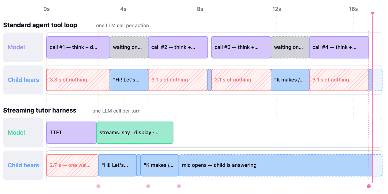
Is this all just illusion and confirmation bias? I don’t know. People are notoriously bad at judging their own learning and productivity. While there is an abundance of evidence on spaced repetition, the empirical evidence on Anki specifically is thin and drawn mostly from studies of medical students rather than from STEM fields. However, we make decisions with imperfect knowledge all the time. For me, this one has been worth it.
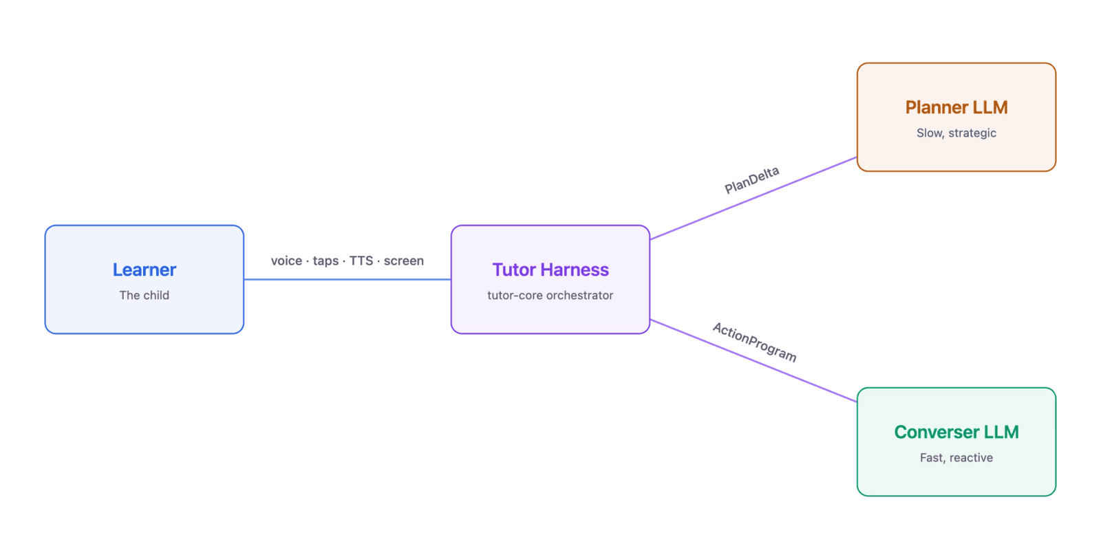
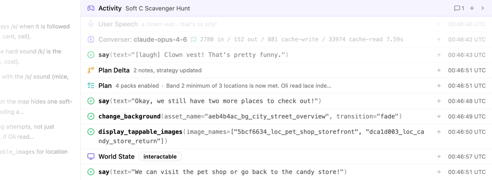
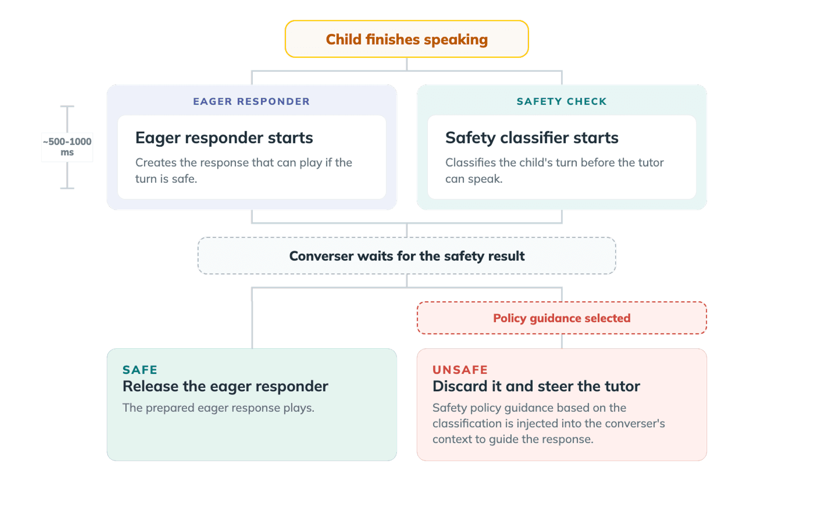
Resources

The Daily Front Page 22 of 32
Friday, July 10, 2026 The Daily Front No. 1 — Lessons, Human and Otherwise
article

Building a real-time AI tutor for 5-year-olds

by catalinvoss·▲ 145 points·394 comments·ello.com ↗
A child can't wait for a slow reply, can't read a chat interface, and can't unhear anything a model gets wrong.

EngineeringJuly 7, 2026

Teaching a child in <1000 ms: the architecture behind a real-time tutor

Ello app on a child's tablet.

We set out to build the first AI tutor to teach math and reading to kids ages 4-9. For AI to actually teach a five-year-old, pedagogy must be baked into the engineering. A child can't wait for a slow reply, can't read a chat interface, and can't unhear anything a model gets wrong. We wanted to share some of the learnings that shaped our architectural decisions building a real-time AI tutor.

A 2-second pause in conversation feels different to a child than to a developer, or even to an adult on the phone speaking to an automated agent. A couple of seconds is enough for a child's attention to wander and for learning to stop.

Good teachers manage this without pausing to think. They acknowledge a child immediately, even when they hold the answer back to let the child work. Teaching is matching the right approach to the current moment, and most approaches aren't answers.

When we set out to build an AI tutor for children ages 4-9, we wanted to build a tutor that actually teaches and not just a chatbot that responds quickly. We knew the constraint underneath would be hard, and that it wasn't optional: sub-second response on every turn. Most agents trade off speed for quality through reasoning budgets. Our architecture has to ground the tutor in pedagogy and respond to the child in real-time.

We threw out the standard agent loop.

A teacher is constantly deciding how to engage a student, whether to say something, draw on the whiteboard, play a game, or change topics entirely. The standard pattern for an agent today is a tool loop. The LLM outputs one or more tool calls, waits for them to execute, observes the results, and decides what to do next. So the straightforward way to build a teaching agent is to make a tool for each action a teacher could take.

But the tool loop has a latency problem. Frontier models take 2–3 seconds to produce their first token, then decode at around 30 tokens per second. Our actions average a few dozen tokens. Add round-trip latency and audio playback, and a standard loop means 3-4 seconds of downtime between each sentence or change on the screen.

Photo of child play testing with Ello

In one of our earlier playtests we watched it happen in real time. A six-year-old boy waited for the agent to think, then asked:

Why is he not doing anything? When is this starting. It's boring.

— Child, 6 years old

Another child in the same round of playtests figured out she only needed to pay attention part of the time and could still keep up. Latency had taught her to tune the tutor out. That was also the moment she stopped learning.

The convenient fix would be a smaller, faster model. That's where a scope problem shows up. Teaching is a broad task. A tutor might pick between dozens of actions in a single lesson, and the hardest call is often to withhold the answer and give a hint, ask a smaller question, or let the child struggle just enough that the insight is theirs when it lands.

Smaller models struggled to follow instructions across that breadth. An early version of our agent that used one was responsive yet constantly giving the answer away. Every time it did, it took away the moment where the learning happens.

So we built a custom harness to balance instruction following, latency, and a flexible action space. The model streams multiple actions in a single response. An interpreter parses and executes each action while the model is still generating the next ones. The child only has to wait for the first action about 30 tokens in, not for the whole response to complete.

Timing diagram of standard agent loop making action calls in sequence vs. streaming tutor harness with streamed actions.

Separating generation from execution buys us two more things. We can change which actions are available depending on the situation. For instance, when a question is on screen the agent gets instructions and options for scaffolding rather than answering. And we can validate each action without a latency hit on the happy path. Only if the stream produces an invalid action do we interrupt and re-generate, otherwise execution never pauses.

None of this is free. Owning the loop means we've had to build our own observability and tracing instead of leaning on a framework. And we're swimming against the current: frontier models are heavily post-trained on the tool-use pattern. If future models get fast enough, our harness is designed to be replaced by the simpler loop.

Lesson: Agent frameworks are building toward background work, where the tradeoff between speed and thinking is easy. Real-time learning sits at the other extreme. Teaching at conversation speed means owning the loop ourselves.

A good tutor predicts what the child will do next.

A real teacher both reflects on what a student just did and anticipates what they'll do next. Teach the same lesson a hundred times and you see the patterns. But you also know this child, where they've been stalling, what excites them, what's likely to trip them up today. You start the lesson with a plan and adjust it on the fly.

We call the agent that interacts with the child the converser. Our early experiments showed that a smaller action space led to better instruction following, so we built a second agent, the planner, to review the conversation against the lesson's objectives and manage the converser's context.

Block diagram of tutor harness orchestrating between the learner and planner-converser models.

The first version ran synchronously, which of course was too slow. Plans that expired after a fixed number of turns weren't reliable. Neither was having the converser ask for a new plan. What worked was an asynchronous planner that runs while the child is thinking or talking, the same way a teacher reflects and anticipates in the gaps of a conversation. Those gaps are where the judgment calls get made: challenge the child or let them succeed, stay on the concept or move on. A teacher makes them on intuition; a model has to reason its way there, and running async is what buys it the time.

Async also means two agents running at once, both reading and writing shared state without coordinating. So we store every turn, every tap, and every UI update as an immutable event on an append-only log. Either agent reads and appends without waiting on the other.

A session log of a child-tutor interaction

That trajectory format enables another kind of anticipation. Whenever the converser asks a closed-ended question (i.e. coming up with a fill in the blank question, playing I Spy, completing an equation etc.), the harness hypothesizes the child's likely answers and pre-generates a response to each one on its own branch, forked from the trajectory. When the child answers, we match it to a branch and play the response without waiting on a fresh model call.

The tradeoff is cost, and the occasional miscall. The planner runs on a more capable, more expensive model, and it runs on every turn. And a prediction is still a prediction. Sometimes a child who was ready to be pushed gets handed an easy win instead. It's harder to evaluate whether a converser error was a mistake or downstream of a faulty plan. We don't yet have a clean signal for when to trust the plan versus what's happening live in the moment.

Lesson: The child interacts with the app in real time while the agents run in discrete generations, so leverage the time the child thinks or talks. Let the planner reflect the past and anticipate the future while the converser handles the present, and the slow pedagogical reasoning happens concurrently with the real-time exchange. When the next move is predictable, generate it before the child even answers.

The safety check that nobody hears.

Most AI products build guardrails in serial with a model call or agent turn. A user won't notice when the token stream goes through a content filter and a developer is willing to wait for a CLI tool call to be auto-reviewed.

There's nowhere to hide in a real-time conversation with a five-year-old. Nor is there an undo: a child can't unhear what the tutor said. The safety system has to gate any action, on every turn.

Our safety classifier is an LLM that takes ~500-1000ms to run. Waiting to run the converser until that check completes adds a second of delay to every turn that we can't afford. Here’s another advantage of decoupling generation from execution in our harness.

The safety classifier blocks execution without blocking generation. As soon as the child finishes speaking, we dispatch both the classifier and a small model to generate the converser's first action in parallel. That model reacts quickly with an eager response that mirrors or acknowledges what the child said ("you like dinosaurs! me too").

While a rules-based check would be faster and cheaper, it wouldn't survive the ways a five-year-old actually talks. Every category we add to the safety policy adds tokens and requires re-tuning a non-deterministic classifier. Sometimes a transcription error spooks the classifier and triggers a false positive. We review these cases and use them to improve how the agent understands the child.

By the time that eager action has generated, the classifier has usually returned safe. That check unblocks the converser to generate while the eager action executes. The child hears one continuous turn despite the multiple model calls.

Diagram of safety classifier flow

But the harder problem than latency is what to do when that reflexive action is the wrong choice. Mirroring is great for everyday conversation with a child. Other times it's the opposite of what pedagogy suggests.

Take a child who mentions, mid-lesson, that a classmate called them a bad name. The same reflex that turns "I like dinosaurs" into "you like dinosaurs! me too" would echo the mean name back to the child.

So whenever the safety classifier flags the child's turn, we throw out the eager action. The converser is handled different guidance for this turn: don't repeat the name, acknowledge it must have felt bad, and suggest speaking to a grown-up.

Note: Our safety systems are governed by policies developed with child-development experts. How our safety system works in detail will be a separate article in and of itself.

Lesson: Gate execution on the safety check rather than generation to prevent a latency hit. Replace the reflexive response with guidance tailored to the child's situation whenever the check fails.

Three problem spaces that just scratch the surface. Building an AI tutor requires solving a whole lot more.

You can't build an AI tutor for children by picking the right model, prompting it, and calling it a day. Building an AI tutor for children requires much more. It's about engineering a real-time system that gives enough time to be both factually and pedagogically right — the time to withhold an answer when the answer diminishes learning, the time to choose the next action before the child finishes their thought, the time to second-guess a quick reflex before the child hears it.

These pieces seem small in isolation, but the magic isn’t until you have all these pieces work together that you a tutor that thinks ahead, recovers gracefully, and feels like it's with the child, and not catching up to them.

The Daily Front Page 23 of 32
Friday, July 10, 2026 The Daily Front No. 1 — Mathematics You Can Touch
article

Computation as a universal and fundamental concept

by simonpure·▲ 160 points·133 comments·ergo.org ↗
There are problems no algorithm can ever solve, no matter how much time or computing power we throw at them.

Tim Roughgarden begins with a deceptively simple question: is there anything computers cannot do? To answer it, he takes us back to 1936, when Alan Turing, a decade before actual computers existed, laid the foundations of computer science as a byproduct of solving an obscure mathematical problem. Turing's paper introduced the theoretical machine that bears his name and proved something startling: there are problems no algorithm can ever solve, no matter how much time or computing power we throw at them. The halting problem, which asks whether a program will eventually stop running, is forever beyond the reach of any computer.

From this foundation, Roughgarden pivots to a more subtle question. Among the problems computers can solve, which ones can they solve quickly? He introduces us to algorithmic shortcuts, clever tricks that let programs avoid examining every possible solution. Your phone's map application builds on Dijkstra's algorithm to find the shortest route without checking every conceivable path. Karatsuba's multiplication method beats the grade-school approach we all learned. These shortcuts seem almost magical, and they raise a natural hope: perhaps such shortcuts exist for every problem.

That hope crashes against the Traveling Salesman Problem. Despite looking nearly identical to shortest-path routing, TSP has resisted every attempt to find a fast algorithm. Roughgarden explains how this puzzle led to the theory of NP-completeness, one of computer science's most surprising discoveries. Thousands of seemingly unrelated problems (scheduling, puzzle-solving, network optimization) turn out to be disguised versions of the same underlying challenge. If anyone finds a fast algorithm for any one of them, all become easy. If any one is truly hard, all are hard.

This brings us to P versus NP, the most important open question in computer science and one of the great unsolved problems in mathematics. Roughgarden traces its history through figures like Hilbert, Gödel, and von Neumann, showing how two separate research traditions, one focused on what algorithms can achieve, the other on their limitations, converged on this single question. The course concludes by examining what the answer might mean for cryptography, artificial intelligence, quantum computing, and our understanding of computation itself. No prior background in computer science or mathematics is required.

You can watch the lectures below, browse the chapter index, or watch on YouTube.

Tim Roughgarden

Tim Roughgarden

Tim Roughgarden is a Professor in the School of Mathematics at the Institute for Advanced Study. He previously spent seven years on the computer science faculty at Columbia and 15 years at Stanford. His main interests are in the connections between computer science and economics, and in the design, analysis, and limits of algorithms.

He is the author of Twenty Lectures on Algorithmic Game Theory, Beyond the Worst-Case Analysis of Algorithms, and the Algorithms Illuminated series, as well as numerous research articles. His work has been recognized with several major awards in theoretical computer science, including the ACM Grace Murray Hopper Award and the Gödel Prize.

The Daily Front Page 24 of 32
Friday, July 10, 2026 The Daily Front No. 1 — Mathematics You Can Touch
show hn

Show HN: Wyrm – Solve algebra by touch, built on an open-source soundness engine

by dicroce·▲ 78 points·24 comments·github.com ↗
Legal moves are possible, illegal moves are impossible.

An exact, conditionally-sound symbolic algebra engine for building manipulative math interfaces — the kind where users solve equations by dragging terms across the equals sign, tapping a power to expand it, or pulling a shared factor out of two terms.

The core invariant: legal moves are possible, illegal moves are impossible. Equations are never validated — they are only ever transformed by rewrite rules, so every reachable state is sound by construction. And soundness is conditional: moves that are only valid under a condition (dividing by b requires b ≠ 0) or that can introduce extraneous solutions (multiplying both sides, squaring) are not forbidden — their conditions become first-class, visible Assumptions that travel with the equation.

Pure TypeScript, zero dependencies, zero DOM — runs in Node, browsers, workers, native webviews, anywhere.

wyrm-math is the engine behind Wyrm Math, a gesture-based algebra app for iOS and Android — try the in-browser demo or get the app. The engine is MIT; the app is how the project sustains itself.

import {
  parseEquation, Derivation,
  enumerateMoves, ruleById, layoutNode, exprToString,
} from "wyrm-math";

const d = new Derivation(parseEquation("2x + 3 = 11"));

// What can the user legally do right now?
const moves = enumerateMoves(d.current);

// Drag the 3 across the equals sign (the UI picks a Move; the engine
// guarantees it is legal — enumeration is precondition-checked):
const move = moves.find((m) => m.ruleId === "move-term-across")!;
d.apply(ruleById(move.ruleId), move.location, move.params);

console.log(exprToString(d.current.equation)); // 2x = 11 + -3

// Render it however you like: layoutNode gives positioned, id-keyed boxes
// and glyphs from static metric tables (no font measurement needed).
const layout = layoutNode(d.current.equation);

What's inside

The public API is src/index.ts, organized into ten documented groups — it reads as a table of contents:

Group What it gives you Expression trees Immutable AST with stable node ids. N-ary Sum/Product; no subtraction or division nodes (a − b is Sum(a, Neg(b)); division is a Fraction with numerator/denominator lists). Smart constructors maintain the structural invariants. Exact arithmetic Rational over bigint. No floating point anywhere — √2 is an undefined point, not 1.4142. Evaluation truthValue(equation, env) decides any relation (= < ≤ > ≥) at a sample point, exactly, or returns undefined where a side is undefined. Parsing & printing parseEquation("2x + 3 = 11")exprToString — round-trip property-tested. Implicit multiplication, fractions, powers, radicals; decimals rejected (the engine is exact). Judgments & assumptions The unit of state is { assumptions, equation }. Restrictions (moves that may LOSE solutions: b ≠ 0), Extensions (moves that may GAIN them: carry the original equation as an obligation, settled by checkSolution), Pinned (user what-ifs). Discharged assumptions are recorded, never deleted. Rules & derivations Rule.apply is the only way an equation changes. The derivation log is an append-only tree: undo moves a pointer, abandoned branches stay live, case splits and disjunctions fork into live siblings. Built-in rules ~25 rules covering linear equations, like terms, distribution, fractions, exponent laws, inequalities (sign-aware, relation-flipping), and quadratics (x² = 9 branches to x = ±3; zero-product). Every rule ships with a property test that it respects the solution set under its assumptions. Move enumeration enumerateMoves(judgment) returns every legal affordance with gesture anchors (handle, dropTarget). Sound for all rules, complete for the finite ones. Pin x = 0 and every divide-by-x affordance disappears automatically. Layout geometry layoutNode maps trees to positioned, id-keyed boxes and glyphs (fraction stacking, superscripts, radicals) from static metric tables. hitTest is a geometry query. Subtree geometry is context-independent up to translation+scale — which is what makes id-keyed animation possible. Rule-authoring toolkit Id-preserving rebuilds, the invariant-repairing splice, diff bookkeeping, and assumption-lifecycle queries for writing new rules.

ARCHITECTURE.md explains the invariants and contracts in depth.

Design commitments

  • Exactness. All arithmetic is bigint rationals. Points where an expression is undefined (division by zero, irrational roots) are treated as undefined, never approximated. The engine-wide soundness contract is truth-where-both-defined.
  • Stable ids. Every node has an id; operations preserve the ids of untouched subtrees. This is the currency of hit testing and animation: a renderer can match nodes across a rewrite and move them rigidly.
  • Conditional soundness. For ordinary and Restriction-emitting rules, property tests rejection-sample substitutions to those satisfying the result judgment's assumptions and assert truth preservation. For Extension-emitting rules the check weakens to one direction (solutions are never lost), with checkSolution covering the gain obligation.
  • Disjunction. Branching rules return several outcomes whose solution sets union to the original's (x² = 9x = 3 or x = −3); the derivation tree holds all arms as live, navigable states.

Development

pnpm install
pnpm test        # vitest + fast-check (property tests are the soul of this project)
pnpm typecheck
pnpm build       # emits dist/ (ESM + d.ts)

The engine must stay DOM-free: tsconfig.json has no DOM lib and test/boundary.test.ts scans the sources for browser globals.

License

MIT

The Daily Front Page 25 of 32
Friday, July 10, 2026 The Daily Front No. 1 — Numbers in Stone and Flesh
article

The mathematical secrets of Barcelona's Sagrada Familia

by Gedxx·▲ 136 points·36 comments·mappingignorance.org ↗
The basilica’s columns branch out, imitating the natural structure of a tree.

Authors: Sergi Muria Maldonado, Professor de Didàctica de les Matemàtiques, Universitat de Barcelona; Anton Aubanell Pou, Professor de l’Institut de Formació Continuada i professor jubilat de Didàctica de les Matemàtiques, Universitat de Barcelona, and Jordi Font González, Professor de Didàctica de les Matemàtiques, Universitat de Barcelona

Sagrada Familia

The basilica’s columns branch out, imitating the natrual structure of a tree.
David Herraez Calzada/Shutterstock

2026 marks 100 years since the death of Antoni Gaudí, the architect of the Basilica of the Sagrada Familia in Barcelona. While the temple’s beauty is extraordinary in its own right, it becomes even more profound when we explore the numerical patterns that lie behind its striking forms.

By contemplating the mathematical principles that underpin its structure, the visual harmony of the whole takes on a new dimension, endowing it with a renewed functionality, balance and coherence.

Mathematician Claudi Alsina i Català deeply studied the mathematics of the Sagrada Família. He undertook his initial studies in this field at the University of Barcelona, and supervised the doctoral thesis of Jordi Faulí, the architect currently in charge of the temple’s ongoing construction.

In his memoirs, Alsina stated:

Many had wondered whether the design of the Sagrada Família contained some module or system of proportions that guided the building’s metric relationships. (…) One Saturday afternoon, sitting at my desk at home, with all the data and documents on this mysterious proportional system – if indeed it existed – I discovered it. The 7.5-metre module and the ratios between the divisors of 12 (1:4, 1:3, 1:2, 3:4, 2:3, 1) seemed to explain a great deal.

12: the magic number

It is no surprise that the number 12 plays a prominent role in the structure of the church. Gaudí conceived the Sagrada Família as a synthesis of architecture and religious symbolism, and the number 12 features heavily in the Bible: Jacob’s 12 sons, the 12 tribes of Israel, the 12 apostles and the crown of 12 stars in the Book of Revelation are just a few examples.

But its significance is not merely symbolic. From a mathematical point of view, 12 is a number particularly well-suited to establishing proportions, as it has many divisors. According to Alsina, the relationships between these divisors account for much of the basilica’s proportional system.

The 7.5-metre module

Drawing on Alsina’s work, we invite you to take a brief mathematical tour of the Sagrada Família.

The temple’s dimensions are based on the number 12 and a module of 7.5m. It is 90m long (7.5 × 12) and 60m wide (7.5 × 8). The width of the main nave is 45m (7.5 × 6).

In terms of height, the highest vault is that of the apse, at 75m (7.5 × 10), followed by the vault of the transept at 60 metres (7.5 × 8). The nave vault is 45m high (7.5 × 6), the side aisle 30m (7.5 × 4), and the choir 15m (7.5 × 2).

The Tower of Jesus Christ is the central and tallest of the cathedral. It stands at 172.5 metres (7.5 x 23), close to the height of the landmark hill of Montjuïc. It is crowned by a four-armed cross, 17m high and 13.5m wide. Surrounding this are the four Evangelist Spires, which reach a height of 135m (7.5 x 18).

Sagrada Familia

The Star of the Virgin Mary sits atop the tower of the same name.
Canaan, CC BY

The 138-metre high Tower of the Virgin Mary is the second tallest in the basilica. It is crowned by a 12-pointed star, which rests on three supporting arms. This star has a diameter of 7.5m, and is made up of a regular dodecahedron, with pyramid-shaped pentagonal points rising from each face. Its reflections of daylight and night-time illumination lend this star a unique beauty.

Polyhedral towers

Polyhedrons also feature prominently in the towers of the Sagrada Família. The four towers of the Glory façade are topped by dodecahedrons, the four towers of the Nativity façade by truncated irregular octahedrons, and the four towers of the Passion façade by truncated cubes.

On each of the 12 towers, a spire rises above these polyhedrons. Those dedicated to the evangelists are crowned with regular icosahedrons containing spotlights that illuminate the large cross that sits atop the Tower of Jesus Christ. Just above each icosahedron is a sculpture that symbolically depicts each evangelist. There are numerous star-shaped polyhedrons throughout the church, particularly on the Nativity façade.

Sagrada Familia

The towers of the Nativity façade, crowned by octahedrons.
Yura Tarasovskyy/Shutterstock

A forest of towers

Catenary arches feature prominently as key structural elements of the church, as they are a highly effective way to transfer loads to the ground without the need for additional support. They can be seen in the system of sloping columns that support the vaults of the interior naves, the vaults and ceilings themselves, and the Nativity façade.

Inside the Sagrada Família, there are four different types of column. All are double-helix torsion columns – each has a rounded, star-shaped polygonal base, and is formed by the intersection of two opposing Solomonic columns. Above each one is a knot from which different branches emerge, similar to those of a tree, which very efficiently support the towers and the roof of the church.

The skylights in the roof are also one-sheet hyperboloids. Made up of straight lines, they are easy to construct, and optimise the capture and projection of light.

The symbolism of 7 and 33

The church has other deeply symbolic hidden features. Take, for instance, the canopy above the high altar, which forms a regular heptagon 5 metres in diameter, whose seven sides symbolise the seven gifts of the Holy Spirit.

A montage of Melancholia I by Albrecht Dürer, showing a numerical grid in the top right-hand corner, and the real-life magic square designed by the sculptor Josep Maria Subirachs.

On the left, Melancholia I by Albrecht Dürer, with a numerical grid visble in the top right-hand corner. On the right, the magic square designed by the sculptor Josep Maria Subirachs.
Jordi Domènech/Wikimedia Commons/, CC BY-SA

On the Passion façade there is a magic square in which the sum of all rows, columns and diagonals is 33. It appears to be inspired by the magic square featured in the engraving Melancholia I by Albrecht Dürer.

The mathematics that underpins the Sagrada Família makes it all the more beautiful. While the building itself is a sight to behold, a deeper understanding of the principles behind it inspires even greater admiration for the enduring genius of Antoni Gaudí.

This article is republished from The Conversation under a Creative Commons license. Original article.

The Daily Front Page 26 of 32
Friday, July 10, 2026 The Daily Front No. 1 — Numbers in Stone and Flesh
article

Life with Hazard Ratios

by surprisetalk·▲ 67 points·23 comments·dynomight.net ↗
Instead of staring at a ratio, a more sensible thing to do is think about life expectancy.

Life with hazard ratios

If you read anything about health or longevity, you’ll soon find yourself in a world of hazard ratios. Some study might say that eating more fiber might change your risk of dying by a factor of HR = 0.90. Another might say that occasional smoking might change it by HR = 1.30.

But how much should you care about that? Is HR = 0.90 or HR = 1.30 a lot? What if you don’t want to eat more fiber? What if you like smoking?

Instead of staring at a ratio1, a more sensible thing to do is think about life expectancy.2 But is it possible to convert a hazard ratio to a change in life expectancy? You might reason as follows: Baseline life expectancy is around 75 years. And HR = 0.90 corresponds to a 10% decrease in mortality. So perhaps that hazard ratio corresponds to something like 7.5 extra years of life expectancy?

Unfortunately, that’s completely wrong. To see why, imagine that humans only die by playing Russian roulette. They start playing this once per day at the age of 75, with a revolver containing two bullets and six chambers. If you were to remove one of those two bullets, that would drop the person’s risk of death by HR = 0.5. (One bullet versus two.) But life expectancy would barely change, because even with just one bullet, almost nobody would survive for any significant amount of time past 75.

For contrast, imagine again that humans only die via Russian roulette, but now they do this once per day from birth with a revolver with 2 bullets and 54,786 chambers. (Newborns emerge and instinctively reach for this gigantic gun.) You can show that these people also live 75 years on average. But now, if you remove one of the bullets, life expectancy doubles, because when someone is spared, it takes a long time before they get unlucky again.3

Neither of those is a good model for humans. We’re somewhere between the two, with heart disease and so on instead of revolvers and risks slowly rising as we age instead of suddenly starting at age 75 or staying constant throughout life. But you get the point: If you want to convert a hazard ratio for some intervention to a change in life expectancy, the impact depends on how “spread out” baseline mortality risk is over time. Baseline life expectancy is simply not enough information.

That’s one problem. Here’s another: What even is a hazard ratio? The technical definition is something like:

The hazard ratio at a given time is the rate of an event in the treatment group divided by the rate of that event in the control group.

Hazard ratios are often confused with their more beloved siblings, relative risks. Say you run a trial for 10 years and at the end, 10% of the control group died and 8% of the treatment group. Then the relative risk is RR = 0.8, nice and simple. But relative risks have problems, most notably that if you run a long enough trial, then no one will be alive at the end no matter the intervention, meaning RR = 1.0. That’s not helpful. Intuitively, you can think of the hazard ratio at age 40 as sort of like the relative risk for people between the ages of 39.99 and 40.01.

In real life, interventions have different hazard ratios at different ages. Chemotherapy tends to have better results in younger patients who are more able to endure the side-effects. Having a slightly higher BMI (25-30 rather than 20-25) is associated with an increased risk of mortality in young people, but a decreased risk in the elderly. You may remember from 2020 that COVID’s mortality risk had a different age curve than baseline mortality, meaning the hazard ratio of getting COVID was different at different ages.

This is important, because hazard ratios at different ages have different impacts on life expectancy. A hazard ratio of 0.9 at age 80 prevents more deaths than at age 20, because baseline mortality is higher at 80. But at the same time, if you save the life of a 20 year-old, they have more years in front of them. Beyond that, the hazard ratios at different ages interact: If some intervention decreases mortality at younger ages, that allows more people to reach older ages, increasing how much hazard ratios matter at older ages.4

If we knew the hazard ratio at all ages, we could account for those dynamics. But we don’t, because when estimating hazard ratios, people almost always assume that the hazard ratio is constant.5 We’re quasi-forced to do this because there’s not enough data to estimate a whole time-series of ratios. That’s why papers contain single numbers like HR = 0.90.

So even though Intervention A (say, more fiber) and Intervention B (say, light jogging) might have the same hazard ratio in a paper, those numbers could be the product of different underlying age-dependent effects, meaning those interventions could conceivably lead to vastly different changes in life expectancy.

So is this all hopeless? Are single hazard ratio numbers just too far removed from what we care about to tell us anything meaningful?

Surprisingly, no. It’s mostly OK. If we were a different species, it might be hopeless. But for modern humans in rich countries, mortality happens to be distributed in a way that produces a sort of lucky coincidence: When people estimate constant hazard ratio numbers, they’re implicitly sorta-kinda taking a weighted average of hazard ratios at different ages. And those weights happen to (sorta-kinda) reflect how much changes in mortality at different ages change.

So, I will argue, even if the true intervention has a varying effect, it’s sorta-mostly OK to just take a hazard ratio from a paper and convert it to a change in life expectancy using this curve:

dl_vs_hr_log

If a paper showed that eating more fiber produces a hazard ratio of HR = 0.75, that corresponds to an increase of around 3.7 years. If a paper says that occasional smoking produces a hazard ratio of HR = 1.25, that corresponds to a decrease of around 2.9 years.

This isn’t exact. If the intervention is better (or less bad) for older people this will tends to overestimate the increase (or underestimate the decrease) in life expectancy. If the intervention is worse (or less good) for older people, it will tend to underestimate the increase (or overestimate the decrease) in life expectancy. But as long as the hazard ratio doesn’t vary too much by age, it’s probably not off by more than around 30% in either direction.

The easy case

Say there’s some intervention (eating more fiber or whatever) that multiplies your risk of dying at age t by a factor of HR(t). Then it can be shown that this changes life expectancy by approximately

  ΔL ≈ ∑ₜ ΔHR(t) × P(t) × L(t).

Here, P(t) is the baseline probability of dying at age t. For males in the United States, it looks like this:

Meanwhile, L(t) is conditional life expectancy at age t. That’s the average number of additional years left for someone who reaches age t. For males in the United States, it looks like this:

Finally, ΔHR(t) is the decrease in hazard at age t. You can think of that as just ΔHR(t) = 1 - HR(t). Though if you’re OK with logarithms, there’s a somewhat better approximation that uses logarithms, which I’ve quarantined in a footnote.6

Let’s start with the easy case. What if your intervention has the same effect on mortality at all ages, so HR(t)=HR is just a constant? Then, the above equation simplifies into

  ΔL ≈ ΔHR × L̄,

where

  L̄ = ∑ₜ P(t) × L(t).

This makes sense! Again, P(t) is the baseline probability of dying at age t and L(t) is conditional life expectancy at age t. These are constant, so when you add them up, is just a number. For males in the United States, it happens to be 12.93 years. This quantity has a specific meaning: The average remaining life expectancy for US males when they die. That sounds a bit odd, but think of picking a random death and asking how many additional years people who reach that age live on average. That number is 12.93 years.

So, if an intervention has a constant hazard ratio, the mean change in life expectancy for US males is just

  ΔL ≈ ΔHR × 12.93 years.

Now we’re getting somewhere! If you prevent a fraction ΔHR of deaths, then you increase life expectancy by ΔHR times 12.93 years.

Now remember the naive calculation we started with: Life expectancy for US males is 75.8 years. You might hope that if eating more fiber drops your risk of death by 10%, that would save 7.58 years. Sadly, the above equation says that a 10% drop in risk only increases life expectancy by around 1.293 years—only 0.17 times as much.

This is essentially the observation Keyfitz made in his 1977 paper, “What Difference Would It Make if Cancer Were Eradicated?” Cancer is responsible for 18 percent of deaths, so does that mean eradicating it would increase lifespan by 18 percent, or around 13.6 years? Nope, Keyfitz says, it’s only 2.3 years.

If a cure for cancer were discovered and made available today, 350,000 cancer deaths would be avoided in the next year. The overall death rate would be lower by nearly 18 percent. If the cure were quick and inexpensive, a large fraction of the country’s hospital beds and medical personnel would be released for treatment of other ailments. Patients would be spared untold suffering. Such an implicit analysis underlies government proposals for eradication of cancer. The argument is sound for first effects on mortality but wholly misleading for the long term.

The first effects would soon be offset by more mortality from diseases other than cancer. As a result of the cancer cures, the population would include a higher proportion of people subject to other causes of death. […]

At the extreme, it might be said that everyone dies of something sooner or later, so that, when the effects of the eradication of cancer had shaken down, the same number of deaths would occur as before, and the only benefit would be the substitution of heart and other diseases for cancer. A cure for cancer would only have the effect of giving people the opportunity to die of heart disease.

Cheerful stuff! We can also write our approximation in terms of baseline life expectancy as

  ΔL ≈ ΔHR × 0.17 × 75.8 years,

which makes explicit that 12.93 years is only 0.17 times as large as a naive estimate using baseline life expectancy. The discount factor of 0.17 is sometimes called the “Keyfitz entropy”. You can think of it as measuring how close some population is to playing Russian roulette with 2 bullets in 6 chambers starting at age 75 (a discount factor of just above 0) and playing Russian roulette from birth with 2 bullets and 54,786 chambers (a discount factor of 1.0). It’s typically around 0.15 in rich countries today, though it was historically much higher.

Keyfitz entropy is also much higher in other species like mice (perhaps 0.45). You could argue that this explains why nothing that increases lifespan in mice ever translates to humans. Say caloric restriction or whatever produced the same constant hazard ratio in mice and humans. Then it’s mathematically guaranteed that the percentage increase in life expectancy will be three times smaller in humans, because Keyfitz entropy is three times smaller in humans. It’s harder to increase life expectancy when the baseline mortality distribution is more compressed.7

But that’s all assuming the hazard ratio is the same at all ages. Which it surely isn’t.

The interesting case

Here again is our equation for the change in life expectancy in response to taking some action that changes the risk of mortality at age t by a factor of HR(t):

  ΔL ≈ ∑ₜ ΔHR(t) × P(t) × L(t),

Basically, for each age t, we multiply together three numbers:

  1. ΔHR(t) is the decrease in the chance of dying at age t as a result of whatever intervention you’ve made (e.g. eating more fiber). This reflects that larger decreases in risk lead to larger increases in life expectancy.
  2. P(t) is the baseline probability of dying at age t. This reflects that the hazard ratio is a ratio, so you prevent more deaths when you apply that ratio to ages where the baseline rate is higher.
  3. L(t) is conditional life expectancy at age t. This reflects that you miss out on more years of life if you die when you’re young.

Now notice: The impact of a change ΔHR(t) at age t is the product of the baseline risk of death P(t) and remaining life expectancy L(t). So what really matters is their product, P(t) × L(t):

This shows how sensitive life expectancy is to changes in hazard ratios at different ages. It would be nice if this were constant. Then, the shape of HR(t) wouldn’t matter at all, only the average value. That’s not quite true, but it’s not terribly far from being true.

An equivalent way of writing our equation for the change in life expectancy is

  ΔL ≈ avg(ΔHR) × L̄,

where is still mean “life expectancy at death” (12.93 years for US males) and avg(ΔHR) is the average change in hazard, weighted by the P(t) × L(t) sensitivity curve at different ages.8 While that sensitivity curve isn’t constant, it’s not too curvy, either. Intuitively, it gives a lot of weight to ages between 50 and 90, somewhat less weight to ages between 20 and 50, and little weight to other ages.9

So that’s not too bad. But let’s remember our original problem: You see some number like HR = 0.90 in a paper, and you want to convert it to a change in life expectancy. If the true underlying hazard ratio were constant, then there’s no problem. But if it’s not constant, then what does that HR = 0.90 number even mean?

Numbers in papers

Unfortunately, you almost never get to see the underlying time-dependent HR(t), because there’s almost never enough data to estimate it. So it’s almost never possible to compute the weighted average avg(ΔHR). In reality what you have is probably a single number in a paper. Let’s call that number est(HR). The obvious thing to do would be to plug the change into the above equation in place of avg(ΔHR) and approximate the change in life expectancy as

  ΔL ≈ est(ΔHR) × L̄.

Again, you can just think of est(ΔHR) = 1-est(HR) as being the estimated reduction in hazard. Although, again, I’d prefer you use logarithms if you’re OK with logarithms.10 So the question is: Will that be accurate? How close are est(ΔHR) and avg(ΔHR)?

Well, how do people actually estimate those scalar hazard ratio numbers in papers? Somehow, they’re aggregating together information about hazards at different ages into a single number. But how? Well, it’s complicated. But if there’s a lot of data, you can show that the estimated scalar hazard ratio is approximately11

  est(HR) ≈ Πₜ HR(t)ᵖ⁽ᵗ⁾.

(Pardon the hideous typsetting.) That is, the estimated hazard ratio is the geometric average of age-dependent hazard ratios, weighted by the probability of dying at each age. It follows12 that the estimated change in hazard is approximately

  est(ΔHR) ≈ ∑ₜ P(t) ΔHR(t).

So ideally, we’d estimate life expectancy using avg(ΔHR), which averages the changes ΔHR(t) based on the weights P(t) × L(t). But we can’t do that, because we don’t have access to the ΔHR(t) numbers. What we can do is read a hazard ratio number in a paper, call it est(HR) and then compute the change est(ΔHR). The above equation says that if you do that, you are implicitly (and approximately) averaging the changes ΔHR(t) based on the weights P(t) alone.

The “right” weights used by avg(ΔHR) and the “wrong” weights implicitly used by est(ΔHR) aren’t the same. But they’re not that different. Here’s P(t) × L(t), the weights that we’d like to use to compute avg(ΔHR) and estimate changes in life expectancy accurately:

And here’s P(t), the weights you’re implicitly using if we take a hazard ratio number from a paper and compute est(ΔHR):

They’re different. In particular, the latter weights give more weight to people aged 80-95 and less weight to people aged 20-50. But they’re not terribly different.

Enough math, let’s try it

To start, imagine some intervention that decreases risk by HR(t)=0.9 for all ages.

Here are the results:

Thing Formula Years
Original life expectancy L 75.7769
New life expectancy L’ 76.4127
Exact ΔL ΔL = L - L’ 0.6358
Ideal approximation ΔL ≈ avg(ΔHR) × L̄ 0.6409
Use number from paper ΔL ≈ est(ΔHR) × L̄ 0.6409

Let me explain what’s happening here. I made a simulator that takes actuarial data for how likely US males are to die at various ages. From this, it’s a simple spreadsheet calculation to compute life expectancy L.13 Then I applied a hazard ratio to change the probability of dying at each age, and re-ran the simulator to compute a new life expectancy L’ and the exact difference ΔL. Then I’m showing two approximations of ΔL: The first is the “ideal approximation” using avg(ΔHR), which I’m including mostly to show that my math is good. Finally, I’m showing the approximation you get if you actually fit a Cox proportional hazards model and use the resulting number in est(ΔHR). This corresponds to what you’d get if you plug in a number from a paper.

So, with the above constant hazard ratio HR = 0.90, both approximations are very good. This remains true if you switch to some other constant.

What if the hazard ratio varies? At first, you might think that something like this would be very problematic:

But it’s basically fine:

Thing Formula Years
Original life expectancy L 75.7769
New life expectancy L’ 77.4373
Exact ΔL ΔL = L - L’ 1.6604
Ideal approximation ΔL ≈ avg(ΔHR) × L̄ 1.7451
Use number from paper ΔL ≈ est(ΔHR) × L̄ 1.7121

The reason this is fine is that the changes in the hazard ratio are relatively “high frequency”, meaning they sort of locally average out. To demonstrate this, suppose the hazard ratio is chosen randomly for each 1-year bin:

Then the approximations are even better:

Thing Formula Years
Original life expectancy L 75.7769
New life expectancy L’ 77.4218
Exact ΔL ΔL = L - L’ 1.6449
Ideal approximation ΔL ≈ avg(ΔHR) × L̄ 1.7059
Use number from paper ΔL ≈ est(ΔHR) × L̄ 1.7123

What causes trouble is if the hazard ratio varies systematically between the young and the old. For example, suppose the intervention is useless for newborns, but gradually becomes more helpful as you get older:

My “ideal approximation” would still be pretty accurate, if you could compute it. (Which you can’t, in the real world.) But using a number from a paper leads to an overestimate:

Thing Formula Number
Original life expectancy L 75.7769 years
New life expectancy L’ 77.9031 years
Exact ΔL ΔL = L - L’ 2.1261 years
Ideal approximation ΔL ≈ avg(ΔHR) × L̄ 2.0962 years
Use number from paper ΔL ≈ est(ΔHR) × L̄ 2.7645 years

This happens because est(ΔHR) is implicitly weighted by P(t) which is heavily weighted towards older people, whereas we’d like to use something more like avg(ΔHR) which is weighted by P(t) × L(t) which is somewhat less weighted towards older people. Even so, the error isn’t terrible.

Now, it is possible that plugging in a hazard ratio from a paper could give wildly inaccurate estimates of life expectancy. One such scenario would be an intervention which is amazing for people aged 85-95, but does nothing for anyone else:

Now, the hazard ratio looks good exactly at the ages where est(ΔHR) has the most weight, leading it to hugely overestimate the impact on life expectancy:

Thing Formula Number
Original life expectancy L 75.7769 years
New life expectancy L’ 76.1741 years
Exact ΔL ΔL = L - L’ 0.3972 years
Ideal approximation ΔL ≈ avg(ΔHR) × L̄ 0.3840 years
Use number from paper ΔL ≈ est(ΔHR) × L̄ 1.0989 years

Another nightmare case is an intervention that starts out harmful, but then switches to being helpful at older ages:

Now, using a number from a paper doesn’t even give an estimate with the right sign.

Thing Formula Number
Original life expectancy L 75.7769 years
New life expectancy L’ 75.5006 years
Exact ΔL ΔL = L - L’ -0.2764 years
Ideal approximation ΔL ≈ avg(ΔHR) × L̄ -0.2348 years
Use number from paper ΔL ≈ est(ΔHR) × L̄ +0.2709 years

That’s bad. But I think most interventions probably aren’t like that? My guess is that most real interventions vary somewhat with age, but they do so gradually and without switching sign. In those cases, it’s quite difficult to find cases where plugging in the number from a paper is off by more than 30% or so. If you don’t believe me, just try it.14

TLDR

If we were another species, it might be very hard to convert from hazard ratios to changes in life expectancy. But for modern people in rich countries, there are three lucky coincidences:

  1. Mortality risk happens to be distributed so that you can approximate changes in life expectancy through a simple weighted sum of hazard ratios at different ages, ignoring interactions.
  2. The statistical method that people use to estimate scalar hazard ratios can also be approximated as a weighted sum of hazard ratios at different ages, ignoring interactions.
  3. The weights that you need to estimate life expectancy (from #1) and the weights that are implicitly used to compute hazard ratio numbers (from #2) aren’t the same. But they’re fairly close.

These facts justify taking an estimated hazard ratio number HR from a paper and approximating the change in life expectancy as ΔL ≈ ln(1/HR) × 12.93 years or, if the hazard ratio is close to one and you hate logarithms, as ΔL ≈ (1-HR) × 12.93 years.

dl_vs_hr_both

The number 12.93 years is for US males. It’s the product of Keyfitz entropy (0.17) and baseline life expectancy (75.8 years). It will vary a bit in other populations.

If the true underlying hazard ratio:

  • …is constant across ages, then the above approximation will be extremely good.
  • …decreases as people get older, that approximation will overestimate ΔL. That is, it will make helpful interventions look better than they actually are, and it will make harmful interventions look less bad than they actually are.
  • …increases as people get older, that approximation will underestimate ΔL. That is, it will make helpful interventions look less good than they actually are, and it will make harmful interventions look worse than they actually are.

But as long as the true underlying hazard ratio isn’t too crazy, there’s probably not more than ~30% error in either direction.

Finally, two major caveats: First, the above discussion assumes that the hazard ratio was estimated by running a trial on people of all ages. In general, est(ΔHR) implicitly gives weight to different ages proportional to how many deaths occur at those ages in the baseline population in the trial. If there’s a minimum age of, say, 50 years old, that won’t change too much because most of the mass of P(t) is above the age of 50 anyway. But if there’s a minimum age of 70, or a maximum age of 50, that could make a huge difference if the true hazard ratio is different at the ages that weren’t seen.

Second, these are estimates for the life expectancy for a population. But you are not a population. In some sense, your genetics and lifestyle mean you have your own “personal Keyfitz entropy”, reflecting how spread out your mortality would be for you if you led millions random lives. If you drive safely and use an air purifier and eat well and get exercise and don’t smoke, that likely means your personal life expectancy is higher than average. But it also probably means that your personal Keyfitz entropy is lower than average.15 So, if you make your lifestyle even better by eating more fiber or whatever, even if that produces the same hazard ratio for you as for other people, it would still likely lead to smaller increases in life expectancy, for the same reason that the same hazard ratio produces smaller changes in lifespan in humans compared to mice. What we really need is some interventions strong enough to break the math behind these approximations and free us from Keyfitz tyranny.

  1.  

  2. I know, I know, you care about quality of life, not just years of life. I agree, some number that measures health and vitality, maybe disability-adjusted life years or quality-adjusted life years, would be better. But these are hard to estimate and so are rarely reported. Anyway, in practice most interventions that make you more vital tend to make you live longer and vice versa, so focusing on life expectancy isn’t too bad. 

  3. In this model, the number of days of life follows a geometric distribution with p = (number of bullets) / (number of chambers). So the mean life expectancy is 1/p days or (number of chambers) / (number of bullets) days. With 54,786 chambers and 2 bullets, that works out to 75 years. And if you drop down to one bullet, then it increases to 150 years. 

  4. If some intervention would have reduce mortality among people aged ≥ 60 in prehistorical tribal bands, that wouldn’t have increased life expectancy very much, because most people didn’t make it to 60. But compared to prehistorical tribal bands, we have in fact vastly reduced mortality at younger ages. And so, today, reducing mortality for people aged ≥ 60 will increase life expectancy a lot. 

  5. You might think this is stupid. Why change a relative risk into a hazard ratio if you’re just going to assume it’s constant? Isn’t that pointless? Well, no. Remember how relative risks always go to 1.0 for long enough trials as everyone in both the treatment and control groups departs our coil? That doesn’t happen with constant hazard ratios. 

  6. It’s usually (though not always) better to use ΔHR(t) = ln(1/HR(t)). This correctly reflects, for example, that if all hazard ratios go to zero, then life expectancy goes to infinity, yay. These two approximations are almost identical for hazard ratios that are close to one because ln(1/r) ≈ (1-r) when r is close to one. So if you are terrified of logarithms but you’ve made it to the end of this footnote anyway, you’re not missing out on too much. 

  7. There’s a degree of circularity to this argument. It assumes that hazard ratios transfer better between species than changes in life expectancy. That might be true, but it would be an empirical / biological fact, not something that’s guaranteed by logic. 

  8. To see this, note that ΔL ≈ ∑ₜ ΔHR(t) × P(t) × L(t) = L̄ × ∑ₜ ΔHR(t) × (P(t) × L(t) / L̄) = L̄ × avg(ΔHR)

  9. A pretty decent approximation turns out to be

      avg(ΔHR) ≈ 0.27 × avg₂₀₋₅₀(ΔHR) + 0.73 × avg₅₀₋₉₀(ΔHR),

    where avg₂₀₋₅₀(ΔHR) represents a flat average of the change over the ages 20 to 50 and avg₅₀₋₉₀(ΔHR) represents a flat average over the ages 50 to 90. 

  10. That is, it’s better to use est(ΔHR) = ln(1/est(HR)). This is close to 1-est(HR) when est(HR) is close to one. 

  11. If there is an infinite amount of data, the typical method reduces to solving

      ∑ₜ (P(t) + P’(t)) × π(t, HR) = ∑ₜ P’(t),

    for HR. Here, P’(t) is the chance of dying at age t after the hazard ratio has been applied, and π(t, HR) is the probability that, if a death occurred at time t, it was in the treatment group. Of course, the true probability that a death is in the treatment group is P’(t) / (P(t) + P’(t)). The standard “proportional Cox” model assumes that the hazard ratio is constant and so replaces this raw fraction with a model-based one, namely

      π(t, HR) = S’(t) × HR / (S(t) + S’(t) × HR).

    This reflects the fact that at age t, a fraction S(t) of controls are alive and each of these have some chance μ(t) of dying, so P(t)=S(t) × μ(t). Meanwhile, a fraction S’(t) of the treatment group is alive, and these each have a chance HR × μ(t) of dying, meaning that P’(t) = S’(t) × HR × μ(t). If you substitute these equations for P(t) and P’(t) into the second equation above, the factor of μ(t) conveniently cancels and you get π(t, HR) as written.

    In effect, the hazard ratio’s job is to attribute deaths to the treatment versus the control group. Now, if the true time-varying HR(t) is close to one, then it can be shown that the estimated hazard ratio est(HR) approximately satisfies

      ln(est(HR)) ≈ ∑ₜ P(t) ln(HR(t))

  12. The geometric average is equivalent to the condition that

      ln(est(HR)) ≈ ∑ₜ P(t) ln(HR(t))

    Using the “better” approximation that ΔHR(t) = ln(1/HR(t)) and *est(ΔHR)=ln(1/est(HR)), it follows that

      est(ΔHR) ≈ ∑ₜ P(t) ΔHR(t).

    You can justify interpreting that same equation using est(ΔHR) = 1-est(HR) and ΔHR(t)=1-HR(t) from the fact that these are almost the same when HR(t) is close to one. 

  13. This simulator pretends that people live for integer numbers of years. That’s not true in reality, of course, but it makes the simulator easier to implement and understand and makes little difference in practice. 

  14. In the simulation, “true ΔL” is what I called “exact ΔL” above, while “approximation (log)” is what I called “ideal approximation” and “Cox fitted” is what I called “Use number from paper”. 

  15. The way modern human mortality is distributed, even if your healthy lifestyle were to reduce mortality by a constant factor at all ages, that still has the effect of decreasing Keyfitz entropy. 

The Daily Front Page 27 of 32
Friday, July 10, 2026 The Daily Front No. 1 — Natural Materials, Unnatural Curves
article

Snails' teeth beats spider silk as nature's strongest material (2015)

by simonebrunozzi·▲ 224 points·163 comments·smithsonianmag.com ↗
Mollusks use these teeth to excavate rocks while they feed.

The discovery makes sense: Mollusks use these teeth to excavate rocks while they feed

Maris Fessenden | Former correspondent

February 18, 2015

limpet

Brandon Tabiolo/Design Pics/Corbis

Marine snails, commonly called limpets, cling tenaciously to rocks as waves batter them. They can clamp on with a force of 75 pounds per square inch, using their muscular mollusk "foot" and a chemical secretion. But even that feat isn’t as stunning as their ability to grind down rock as they feed, using a tooth-studded tongue called a radula. Now the snails have upped their tough-guy street cred with help from engineers based in the U.K., who discovered that these snails’ teeth are made of the strongest natural material out there.

Spider silk, often compared to kevlar, has wowed with its tough yet flexible powers. But when tested, the tooth material was, on average, about five times stronger than most spider silk, reports BBC News. This makes it the strongest natural material on Earth. Tests in the lab revealed that it can withstand pressure that would turn carbon into diamond. Thats’s comparable to a single strand of spaghetti holding up about 3,300 one-pound bags of sugar, the study’s lead author, Asa Barber of the University of Portsmouth, told the BBC. 

For Science, David Shultz reports:

Scientists discovered that the teeth are made of a mixture of goethite (an iron-containing crystal) nanofibers encased in a protein matrix. In spite of their amazing strength, the teeth don’t quite best the strongest humanmade materials like graphene, but the new material’s upper range puts it far ahead of Kevlar and on par with the highest quality carbon fibers.

The researchers published their findings in the Journal of the Royal Society Interface

If you're looking for the strongest overall material on Earth, diamond is a good guess, but again, man-made nano-materials beat it. And there are also two rare, natural materials that can withstand more stress than diamond, reports New Scientist

One of those—wurtzite boron nitrate—has a diamond-like arrangement at the atomic level. But while diamonds are made only of carbon, wurtzite boron nitrate also contains (as its name suggests) boron and nitrogen. The other—lonsdaleite—is all carbon but has a hexagonal structure. (Diamond’s cubic.) Lonsdaleite can be created when graphite-containing meteorites plummet to Earth, and it can withstand 58 percent more stress than diamond.

Hard and strong-yet-flexible materials offer attractive properties for engineers looking to build the next generation of materials, structures and even machines. Now they’ll be turning to the snails as the latest potential nature consultants on these projects.

Editor’s Note April 5, 2017: As pointed out by one of our eagle-eyed readers Tom Tonon, the terminology in this story could cause confusion for some readers. There are many different scientific terms used to describe an object’s capacity to resist bending or breaking apart, each of which has subtle differences. In this article, we use the terms toughness and strength to refer to the object’s tensile strength—the capacity of an object to resist pulling apart. This differs from compressive strength, which describes the amount of squeezing an object could withstand. The above discussion of wurtzite boron nitrate refers to not to tensile strength but the hardness of the material, which is its capacity to resist scratching or cutting.

The Daily Front Page 28 of 32
Friday, July 10, 2026 The Daily Front No. 1 — Natural Materials, Unnatural Curves
article

Triple Dragon Fractal (2020)

by nhatcher·▲ 70 points·16 comments·paulbourke.net ↗

Created by Paul Bourke
December 2020

This image is a visualisation of how the following series behaves for initial values z0 at each point on rectangular region of the real-imaginary plane.

The colour represents how fast the series converges to a fixed point, or diverges to infinity (which it doesn't actually to for points in the bounded part of the complex plane in the figures here).

The Daily Front Page 29 of 32
Friday, July 10, 2026 The Daily Front No. 1 — Interactive Cabinet
article

My Story of 3D Realms / Apogee Part I (2020)

by Michelangelo11·▲ 97 points·10 comments·joesiegler.blog ↗

My Story of 3D Realms / Apogee Part I

ADMIN NOTE (Jan 2026): The current owners of 3D Realms have taken down the “legacy” 3DR site (https://legacy.3drealms.com).  I link to a LOT of things there in this article which are now broken links.  I have to find some time to go through all of this article and link over to those things on the Wayback Machine.  Just letting you know ahead of time I know about that issue.

ADMIN NOTE (Jan 2023): In Jan 2023, this blog post became a problem for my site. It was 33,000+ words in a single entry.  When I wrote it in 2020, I did have some problems with the size, but it worked on the front end (even if I did have problems on the back end). Now as my site has grown, it can’t process the thing in one giant piece on the front end, so I had to break it down into several smaller parts.  This first one is in the same spot as full size original.  No content has been changed, just broken up into smaller pieces to help with the blog being able to render the pages!  There will be navigation links on the subsequent pages.  Don’t miss the other pages beyond this first one.

Those who know me (and have read my blog over the years) know that I spent quite some time working for Scott Miller & George Broussard of Apogee Software (later 3D Realms).  Was probably the single most fun job I’ve ever had in my life, and to this day, I still wish the old team was together.  I’m not getting into the why of that, just pointing out what happened in the past.  I worked there from Dec of 1992 through May of 2009.   I’ve talked about that part of my life in more detail elsewhere on this blog.  That’s not why I’m writing today.  I’m writing about the history of the company.

Apogee was founded back in 1987, and still exists today, although the path to get from then till now has a lot of twisty, confusing bits.  I always meant to lay this out, but the current incarnation of the company did  a really cool “Realms Deep” thing last month, so I thought I’d get around to doing this historical piece.  Back in the day I was the company archivist, and moreso than anyone else there I seemed to care more about the legacy and history of the company.  So that’s what I’ m doing today.  Diving into the history of the company that I was a customer for, worked at for almost 17 years, and still maintain a relationship with today.

A side note: I started writing this as Realms Deep was still going on (5 Sep), and I didn’t release this until early November, so it took far longer to put together than I thought it would – ha!

One final comment before I get into it.  This is my personal thoughts and observations.  This isn’t meant to be an official document for Apogee Software Ltd / 3D Realms.  This is me looking back on everything.   With that out of the way….

(The spinning logos are leftover images from our 1990’s website designs.  Also, all the contents of this article are © 2026 Joe Siegler except for game screenshots and trailers.)

Some Personal Stuff

If you ordered a game from us in 1992 – it shipped from this desk.

I originally started work for Apogee on 14 Dec 1992.  I’ve told this story elsewhere before, but my first association with Apogee was as a BBS operator back in Philadelphia.  I used to have a BBS named “The Arsenal of Freedom” (first on Apple //, then on PC – both named after an old episode of Star Trek: The Next Generation).  The PC version would distribute Apogee shareware, as it was very popular at the time.  I was a customer, and bought many Apogee games from this era myself (Secret Agent, Commander Keen, the original Duke Nukem, etc…)   Once Wolfenstein 3D came out (which I also bought), there was a version that came out that claimed to be a “new porn update for Wolf3D”.  I alerted Scott Miller to that, and it was removed, and not long after that, Scott asked me if I wanted to be a beta tester for Apogee.  I of course immediately said yes.  During this time, the first ever employee hired by Apogee (other than Scott’s family) decided to leave Apogee.  This was Shawn Green, who left Apogee to go to id Software.  Scott asked in the beta group if anyone wanted to come work for Apogee, and I jumped on it.  After a few chats, I decided to move from Philadelphia to Dallas to work for Apogee. I was working for AT&T at the time, so jumping halfway across the country to work for a company with about 20 employees from a place with about 70,000 was a major culture shock.  After a time, I realized I was there to replace “Employee 1”, so I go WAY back.  In those earliest days, I did phone support, which could be a challenge at times (RIP Debbie Flowers).   I was on phones to have me learn the products, and then I moved into online support.

Something interesting, in looking for a document for another part of this article, I happened upon the original message that Scott Miller posted in the Apogee beta group asking if anyone wanted to come down to Garland and work for Apogee.   I kept it, although it’s not in the greatest shape almost 30 years later.  The message wasn’t dated, but it would have been early fall, as I was formally hired in October, had another trip to Texas in November, and moved permanently in early December.  If you want to see the letter that got me to move 1,400 miles away to work for Apogee, I’ve taken a pic of it.   You can click it for a larger version, which is easier to read.

Anyway, once I got there, I noticed a few of the things in place then were in a disorganized state.  That’s not to say the company was a mess, but certain areas that I had direct responsibility over were.  I was always one for organization and record keeping – even back then.  One of the first things I did was organize the online distribution files.  I don’t know how many of you reading this were around back then, but in early 1993, the distribution method for video game shareware (something pioneered by Scott Miller) was a bit of an odd distribution.  There were many hub BBS’s around – the home one for Apogee was then Software Creations.  They weren’t the only ones by far (others like Exec-PC come to mind), but all the shareware from before my time there from Apogee was a hodgepodge of various compression formats (both arj, pkzip, and arc), versions, and the like.  Size of the downloads was definitely thing in this era of dial up modems. Make your file too large, and some people would check out.  That happened in 1994 with Monster Bash – it was our first game to be over one megabyte for a download. We felt it was too large, and made a “lite” version of the shareware which was smaller. So space considerations were very real when a large part of your customer base existed on 300 & 1200bps modems in the mid 90’s.

Anyway, I organized all of the products, collected the entire distribution line, repackaged them into a uniform format, and made sure things were kept up to date with the latest compressions to make the files as small as possible.  Having the official product line all line up and look the same in terms of compression, naming, and whatnot was something I thought it should be.  Thought it looked better that way.

An example of a file_id.diz error – our earliest form of DRM.

Back in those days, I did something which is commonplace now, but in 1993, it was unheard of.  Scott & George decided they wanted someone to be what is now known as a “Community Manager”, but back then nobody did this.  They pioneered online support, too.  The person doing that online support was me.   Things were different then, because there was no social media.  We had things like CompuServe, GENie, Prodigy, Delphi, etc…   If you were super techy (like John Carmack), you had .plan files – the precursor to twitter, in some ways.   But it was my job to “be Apogee” online.  It was a dream job.

I also introduced the old concept of “file_id.diz” to the Apogee distribution files.  I didn’t create the format, but I did introduce it to our company in a unified format.  We did have it in one or two games before I started, but it wasn’t consistent.  The version I introduced had a similar format across all our games.  It was also my idea to use file_id.diz as an early form of DRM on our registered games (to the consternation of some).  My idea was this – if we had problems with people uploading the full/commercial versions of our games to BBS’s, I thought we could stick a file_id.diz in the full game directory, so if someone zipped it up and uploaded it, the BBS would then add the description that it was an illegal upload to the BBS listing and presumably be seen and removed.  You couldn’t remove the file_id.diz file from commercial games, because the game would no longer run without that.  Don’t know how many of you remember this about the Apogee games from back then, but this was totally my idea.

What one of the commercial file_id.diz files would show if you uploaded it to a BBS.

One of my other ideas then was to index the company’s output.  Now back in 1993, we didn’t have a website yet (that started in the summer of 1995).  However, everything that the company released from the moment I started working there I kept track of (with one or two exceptions that slipped through the cracks).  Major releases, point releases, all updates, freeware, etc…  I maintained that file until the day 3DR and I separated in 2009.  I also kept track of it PAST my end of employment, and continued to updated it.  It’s still maintained to this day (by me).  That’s something I’m quite proud of.  It has turned into a true historical document that I’ve been told people have used when researching our game history.  The original is still available online, but what I’m doing with this blog post is expanding on the original basic list of games and dates.  There will be additional info, like personal remembrances, screenshots, current availability, etc….

Me with the SW ’97 Gold Master CD package

I was also the guy who uploaded all new shareware releases and patches.   As is well known, our distribution network was housed at Software Creations, the major BBS run out of Massachusetts.   However, they weren’t the only place.  When we released something, I would spend a lot of time uploading our files to various major BBS’s around the country, so the packaging and distribution of our shareware was a big thing to me.  FTP was also a thing around then, so I handled that too.    I was the person who mastered floppy discs (and later CD’s) for mass duplication.   Most of our CD’s had a /goodies directory on them – the majority of the time, I would gather random things and just throw them on the CD to have some other fun stuff to discover.   That was all me.   There’s a pic to the right of me holding the Fedex box in my office with the gold master CD for Shadow Warrior in 1997.   There was a very famous picture of George Broussard in my office pointing at my computer on the first actual upload of Duke Nukem 3D to Software Creations on 29 Jan 1996.  I’m sure you’ve seen it.  I took that picture, too.  ;)

My official company bio photo from 1993. I was trying to imitate James Hetfield at the time – my hair wasn’t long enough though.

Two other fun things I did with the 3D Realms site back in the day which were mostly unheard of at the time were the Virtual Tour, and the webcam.    While the virtual tour is available on old copies of the 3D Realms website at archive.org, it doesn’t include the pictures, so it’s not something that’s worth seeking out.  It’s not like a Virtual Reality tour in 2020.  This was just a bunch of still pictures that you went to the next one by clicking something and it would load another page.  Primitive tech by today’s standards, but nobody else was doing this in 1998 on the web.  I had a fun easter egg in the tour, too.  If you remember the old Infocom game “Zork”, there was a phase “It is dark, you are likely to be eaten by a grue”.  Well, if you went into that area in the game, you were stuck in a maze.  In my virtual tour, I mapped out that grue maze and replicated it.  If you went down the wrong side of the offices, you’d get stuck in my grue maze in the tour.  Always got a laugh out of that.  Somewhere I have the actual hand drawn map I used to lay it out, but I couldn’t find it in prep for this article.

UPDATE 9 May 2022: Today I found the virtual tour scratch work including the Zork maze.  I threw a few images on Twitter.  You can see that tweet here, or view the images here, here, and here.

The webcam was a live camera – again not like 2020 standards, but it did have regularly updated photos.  What I did was take a 1990’s era camcorder, and set up software on a specific machine which would take a still shot from the webcam once every 30 seconds.  It would then FTP the image to our web server, overriding the existing photo, so the website would see the new one instead of the old one.  Again, old tech, but nobody was really doing that in 1996.   That camera got moved around a bunch, and we put it where things were going on.  It lived in the lunch room for awhile, in tech support, in some of the developer’s offices,  and we would sometimes use it to send messages to developers we were hiring (go look at the webcam, Martin!) – haha.  However, the one most people remember was we put it in the room we shipped Duke Nukem 3D orders out of, so people could watch us packing orders.  Sometimes it would crash too, and you’d end up with weirdness.   I’ve included a couple of examples from both the tour and the cam in the gallery below.

1998 Tour – Prey Office

1998 Tour – Hallway

1998 Tour – Conf Room

Webcam – Tech Room

Webcam – Shipping Duke

Webcam – Late night Lounge

One last one was something I did on the 3DR website for over a decade.  That’s the “Camera Captioning Contest”.  I’d post random goofy pictures taken around the offices, have people send in their ideas for a caption, and the winner would get a free game sent to them.  Was a lot of fun – all the old entries and winners are still online, too. The contest ran from Dec 20, 1996 through Jan 12, 2006. It was revived for a time on social media with the new 3D Realms, but it didn’t last terribly long. Fun memory from the past, too.

Me as Sebastian Krist for Rise of the Triad 1994.

I’ve written about my time at Apogee many times on this blog, and there’s some good stories to read if you want a deeper dive.  Some of them are game specific, and I’ll link to them in the relevant game sections below.  Some of the less game specific ones here are..

  • Pearle Scarboro – My meeting with the mother of the late 3DR programmer William Scarboro.
  • Happy Trails Duke Nukem – This was something I wrote on the last day that 3D Realms had the rights to Duke Nukem on 31 Dec 2015, it was about Duke Nukem in general.
  • Duke Nukem Swag – A detail of all the various bits of Duke Nukem swag I had collected over the years.  It’s not about any one game, so I’m listing it here.  I also threw in my much smaller collection of Shadow Warrior stuff too.
  • Nuking a Lobby Floor – A story about the creation and later destruction of the really badass looking lobby floor we had in the NW Highway 3D Realms Offices.
  • Goodbye Duke Nukem – This is a very personal journey that I wrote on the last day I was working for Gearbox.  At the time I thought it was the end of my connection to Apogee, 3D Realms, & Duke Nukem.

The Name

Before I get to the timeline of releases, I wanted to speak for a minute about the names “Apogee Software” & 3D Realms.  There’s been a bunch of confusion over that over the years.  I’ve explained it from time to time, but never put it down in blog form, so here goes.

The Apogee Logo at Quakecon 2012.

Back in 1987, Scott Miller founded Apogee Software.  Kroz is generally regarded as the first “Apogee” game, and it was released in November 1987.  There were a few rogue games that Scott used the name Apogee before then, but 1987 is more or less when the “company” was founded, because that was the first game that used “The Apogee Model”.  Those earlier games (which I’ll detail below) were released differently.  Anyway, back in those days, things were small.  It was just Scott and his family in his parents’ house in Garland.  A couple of years ago I wrote a story about that original location for the (now replaced) modern 3D Realms site.  You can read it here.  I did write a second part for the most famous location – the Broadway Blvd location.  That can be read here.  Never finished the series with the third and fourth locations.

A couple of years after that, George Broussard was brought on, things expanded, the company got larger, and while it was still before my time there, they created “Apogee Software Ltd.”  That was (and still is to this day) the legal name of the company I worked for for almost seventeen years in the 90’s and 2000’s.  “Apogee Software Ltd” was what was on my paychecks.

Some time after that, they also created another company called “Action Entertainment Inc”.  Action Entertainment legally owned Apogee Software Ltd.  The idea being if someone sued the company, they’d be suing AEI, and not Apogee (and therefore its employees) directly.

In 1994-ish, Scott Miller had the idea that we needed branded names.  His stated idea at the time was that with the name “Apogee” had become diluted, and you didn’t know what type of game you would get when you got an Apogee game.  I personally thought it was fine the way it was, but we ended up creating the 3D Realms name here out of this.  Officially, 3D Realms is a “dba” name (doing business as), but after the release of Terminal Velocity, and then Duke Nukem 3D, the 3D Realms name took a front seat.

In 1996, we released the final game under the Apogee name – Stargunner.  We used the 3D Realms name exclusively after that to identify ourselves, but legally we were still “Apogee Software, Ltd” (a name that still exists in 2020).   We also had a second dba name around this time, that being “Pinball Wizards”, but only one game (Balls of Steel) was ever released using this name.

The original 3D Realms logo as created by Steve Hornback.

As was written about elsewhere, in 2009, the original Apogee (dba 3D Realms) ceased to exist as development studio, and laid off all their staff (including me).  However, despite popular belief, Apogee/3D Realms never ceased to exist – ever.  They remained in their offices through the beginning of 2011, then had offices in the Gearbox Software building in Plano TX for a time.  Apogee/3D Realms continued to exist to maintain various intellectual properties they owned, but no active development was going on during this time.

Fast forward to 2014, when the original Apogee was sold to Interceptor Entertainment (now known as Slipgate) and moved the headquarters from Texas to Denmark.  That is how it was presented to the public, but legally, “Apogee Software Ltd (dba 3D Realms)” was sold to “SDN Invest ApS” – a holding company that itself was owned by another holding company (MDN Holding ApS) who also owns Interceptor/Slipgate.  The holding company is owned by the same people that run both 3D Realms and Slipgate, so this is similar to what Scott & George did years ago with “Action Entertainment Inc” (which is still legally in play, btw).  Somewhere between the original purchase and now, The “SDN Invest ApS” holding company was shifted to a newer holding company, named “3D Realms Entertainment ApS” – who is also owned by “MDN Holding ApS”.

I realize all the holding company stuff is confusing, so…. the bottom line is as of 2020, the original Apogee Software still technically exists.  Here goes…

The “name summary”…

Apogee Software Ltd is a wholly owned subsidiary of Action Entertainment Inc.  Apogee Software Ltd has two dba’s – “3D Realms” & “Pinball Wizards”. Action Entertainment Inc, and all its assets are owned and controlled by “3D Realms Entertainment ApS”. 3D Realms Entertainment ApS is owned partly by MDN Holding ApS and partly by Slipgate Holding ApS.

A goofy image Tom Hall drew one day. ;)

Still confused?

To simplify that even further…..  “The guys that own Slipgate/Interceptor also own 3D Realms”.  That’s the bottom line.  ;)

I miss the days back when I started working at Apogee when it was just “Apogee Software” and nothing else.  It was less confusing for sure.  :)

Also…  In April of 2021 a “New Apogee” came into existence. I don’t have anything to do with this version, although I know most everyone who works there.. It’s headed by Scott Miller, who founded the original (the original legally is 3D Realms in Denmark now). I have a short section about this version further down towards the end of this article.  This new Apogee refers to itself as “Apogee Entertainment“, and in some places I also call them “Apogee Software LLC” – they’re the same thing.

This is an image we used to have at the top of our news section of the Apogee website in the late 90’s.

The Game History

Now I get to the history of the individual games.  As I posted above, there is a straight linear list of the release history for Apogee/3D Realms on the Legacy 3D Realms site.   I always wanted to expand on that and make it a bit more intersting than a straight list.  That’s what I’m doing here.  This will have some screenshots, links, info to current stuff and remakes (when relevant), and my own memories of that title (assuming I have some).  The original list had them in chronological order, and for the most part that will happen here, but the initial release and all the point releases will be mentioned in the same place there vs a straight list in the original.  I was around for the majority of this stuff personally, and for the stuff I wasn’t, I know just about everyone involved.   So here goes…

ADMIN NOTE: A lot of links on this listing of games are FTP links to the original Apogee (later 3DR) FTP archive I maintained for the better part of 20 years.  All that stuff still works, however..  Most modern browsers these days (Safari, Chrome etc), disallow FTP links, so you can’t directly access them in your browser, you’ll need an actual FTP client to download them, but they ARE still there.  And those of you who are fans of rogue browsers like Mullvad, Vivaldi, and Arc…  I know those exist, some do work with FTP links, but I’m not creating a sub article on modern browser functionality.  Basically if you click on one of the FTP links in this article, and it doesn’t work, that’s why – you’ll need an FTP client.

ADMIN NOTE UPDATE (Feb 2026): The aforementioned removal of the legacy 3D Realms site also included the FTP server, so those old links are broken for now.

While the generally established history has the first proper Apogee game in the fall of 1987, there was some activity before then.  A handful of titles were released earlier, not using the same “Apogee model” that the company became known for.  The true release dates of these 1986 releases is lost to time.  Unfortunately, none of us really remember what the proper dates are now.  If for some reason you happen to have verifiable info proving the date of any of them, please let me know.

The Puzzle Fun Pack

Release Date: Unknown 1986

This was a “pack” of four small puzzle games all written by Scott Miller.  The individual titles were Asteroid Rescue, Block, Five, Maze Machine & Phrase Master.  Was discontinued ages ago, but is available as freeware from our FTP site.

By the time I found out this existed, I was already working for Apogee, and computers were already too fast for this game.  A lot of these early games didn’t adapt themselves to faster computers than they were designed on, and as such are instantly unplayable.  The same goes for the next entry on the list here.

Current Status: Freeware
Puzzle Fun Pack Links: [ Freeware – 3DR FTP | Internet Archive ]

The Adventure Fun Pack

Release Date: Unknown 1986

Another “pack” of four small games all written by Scott Miller.  The individual titles were Night Bomber, Raiders of the Forbidden Mine, Rogue Runner, and The Thing.   The one I have a screen shot from here is “Raiders of the Forbidden Mine”.  It really reminds me of Dig Dug. Other than researching for this article, I’ve never played any of these games, although I was aware of their existence.

This has the same speed problem with modern computers that the entry before this does.  Was discontinued ages ago, but is available as freeware from our FTP site.

Current Status: Freeware
Adventure Fun Pack Links: [ Freeware – 3DR FTP | Internet Archive ]

Beyond the Titanic

Beyond the Titanic Start Screen

Release Date: Unknown 1986

Beyond the Titanic was a text adventure game in the vein of the original Zork games written by Scott Miller.   If you liked the old Infocom games, you probably would like this.  It still holds up in 2020, as it’s a text adventure game, so there’s no speed problems or graphics issues with modern computers.

Here’s the actual text for Beyond the Titanic from one of our super ancient catalog files we would distribute with games..  “It’s a text adventure game that mixes elements of science fiction, action, fantasy and rollicking adventure. The story begins with you standing aboard the Titanic just seconds before the ship sinks! In this story of riveting survival you’ll discover a long forgotten undersea mystery, travel to the Earth’s future, fly a shuttle to a floating city and be chased by a slobbering, three-armed creature–and that’s just the believable part!”

Was discontinued a long time ago.  Re-released as freeware on 10 Mar 1998.  Re-released a second time as freeware, only with the source code on 20 Mar 2009.  Still available on the 3D Realms FTP site.

Current Status: Freeware
Beyond the Titanic Links: [ Freeware – 3DR FTP | Internet Archive ]

Supernova

Release Date: Unknown 1987

We released another text adventure game similar to the prior year’s Beyond the Titanic.  this one was called “Supernova”.  Supernova was written by Scott and his friend Terry Nagy.  Between Supernova & BTT, Scott learned that releasing the entire game in shareware was not the way to go, and a new concept was needed, and what the company became known for (“The Apogee Model”) was born with the next release.  However, like Beyond the Titanic before it, Supernova will appeal to fans of the old Infocom text adventure games.

Here’s the actual text for Supernova from one of our super ancient catalog files we would distribute with games.. “Our best adventure game requires an entire 360K disk! Has as many features as even the best commercial adventure games, and then some. Like a 16-color screen, ASCII graphics (that even work on nongraphic systems), 1000+ word dictionary, over 160 game locations, scores of sound effects, a “hint” command, and more.”

The game was discontinued ages ago.  Was released as freeware on 26 Mar 1998.  Later re-released again as freeware with source code on 20 Mar 2009.  It is still available on the 3D Realms FTP site.

Current Status: Freeware w/Source Code
Supernova Links: [ Freeware – 3DR FTP | Internet Archive ]

Kroz

****Release Date: 26 Nov 1987

This is where Apogee starts formally.  That’s because it was the first game to use “The Apogee model” where the first episode was given away for free, and the rest had to be paid for – aka “shareware”. Scott did a a total of 7 Kroz episodes, and this is the bulk of the early product for Apogee from this point for the next year or so.  Here’s some detail on the 7 episodes:

  1. Kingdom of Kroz (1987)
  2. Caverns of Kroz (1988)
  3. Dungeons of Kroz (1989)
  4. Return to Kroz (1990)
  5. Temple of Kroz (1990)
  6. Final Crusade of Kroz (1990)
  7. The Lost Adventures of Kroz (1990)

The first three were packaged as “The Kroz Trilogy”, and the second three as the “Super Kroz Trilogy”.  There was to be 8th episode of Kroz released in 1991 (The Underground Empire of Kroz), but it was never released.  I asked Scott in the creation of this article how much he’d actually done towards the 8th Kroz, and he said “I think I did a few little things but no actual levels.”  So there’s no lost game waiting to be found.

There’s some additional detail on the Kroz games over here on Wikipedia.  Some of the Kroz games had alternate names, too (such as Dungeons of Kroz being called “Kroz II”) – all of that is on the Wikipedia page.  In researching this article I found something we used to distribute, a document called “Kroz: The Entire Domain”, detailing the episodes, their original prices, and some other info.  It is shown below.

At the time it was new, the source code was available for an additional purchase.  All of the various Kroz games were discontinued ages ago, but were re-released as freeware (with source code) on 20 Mar, 2009.

Current Status: Freeware w/Source Code
Kroz Links: [ Freeware – 3DR FTP ]

The Daily Front Page 30 of 32
Friday, July 10, 2026 The Daily Front No. 1 — Interactive Cabinet
The Daily Front Page 31 of 32
Friday, July 10, 2026 The Daily Front No. 1 — Colophon

That's the Front for Today

Issue No. 1 — Friday, July 10, 2026 — went to press 2026-07-16 at 11:27 UTC.

About This Magazine

The Daily Front is a daily digital magazine assembled from the stories that reached the front page of Hacker News on Friday, July 10, 2026. Headlines, points, and comment counts are recorded as they stood at press time. All articles remain the property of their original authors — every piece links back to its source and its discussion thread.

How It Was Made

Fetched, cleaned, and typeset by an automated pipeline. An editor model laid out the pages, chose the highlights, and briefed the cover illustrator — 31 model calls and 296k tokens in total. Set in Jacquard 12, Playfair Display, Source Serif 4, and IBM Plex Mono, all served via Google Fonts under the SIL Open Font License.

The Cover

The cover illustration was commissioned with this prompt:

A semi-abstract watercolor painting for an editorial magazine cover, with no text, no logos, no letters, no numbers, no readable symbols anywhere​.

Depict a quiet suburban room at night, but keep it dreamlike and painterly rather than literal. A faint human silhouette stands near the center, seen from behind, facing a softly glowing wall. The wall appears partially transparent, with pale WiFi rings, radar arcs, and watercolor signal waves passing through it. Outside the suggested window are blurred drone-like shapes, painted like dark moths suspended in mist.

The room should be recognizable but simplified: a loose chair shape, a dim lamp glow, a desk with blank papers, and a small train track curving across the floor. Above the desk, delicate circular loops and interlacing lines hover like a mathematical proof made of light. In the distant background, softened house-like shapes appear as a repeating neighborhood pattern, hinting at proxies and hidden observers.

Style and medium: semi-abstract watercolor on textured cold-pressed paper, wet-on-wet washes, pigment blooms, soft edges, transparent glazing, subtle ink or graphite linework only where needed. Elegant balance between recognizable forms and abstraction. Palette of deep indigo, smoky gray-blue, pale mint green, muted violet, warm amber lamplight, and soft silver highlights. Poetic, mysterious, unsettling but beautiful, refined editorial cover composition, lots of negative space, contemporary gallery-quality watercolor.

Absolutely no text, no captions, no logos, no readable characters, no UI elements anywhere in the image.

Production Ledger

StageModelCallsTokens InTokens Out
extractgpt-5.5 29 178,345 88,391
layoutgpt-5.5 1 18,971 4,785
covergpt-image-2 1 156 5,488

The Publisher

Published by Johnny.

Support the Press

If The Daily Front brightens your morning, consider supporting its publisher.

Credits & Contact

All content — articles, posts, comments, and the images within them — belongs to its original authors and is reproduced here to point readers back to the source. Full credit goes to those creators; every item links to its original and its Hacker News discussion.

If you are an author and would like your content removed from an issue, write to hi@johnnys.page and it will be taken down.

Feedback is always welcome at the same address: hi@johnnys.page.

Credit where credit is due.

Every page of this issue began as someone else's work — these are the original sources, linked in full.

  1. QuadRF can spot drones and see WiFi through my wall by speckx — jeffgeerling.com·HN discussion ↗
  2. Good Tools Are Invisible by theanonymousone — gingerbill.org·HN discussion ↗
  3. In Emacs, everything looks like a service by kickingvegas — yummymelon.com·HN discussion ↗
  4. Train sim created by just one person is being called the best ever made by oumua_don17 — kotaku.com·HN discussion ↗
  5. The tech of 'Terminator 2' – an oral history (2017) by markus_zhang — vfxblog.com·HN discussion ↗
  6. Late Bronze Age Collapse by dmonay — acoup.blog·HN discussion ↗
  7. Lost city discovered beneath Egypt's desert with ancient church by Bender — dailymail.com·HN discussion ↗
  8. New York City to ban deceptive subscription practices by randycupertino — theguardian.com·HN discussion ↗
  9. EU Commission: addictive design Instagram and Facebook in breach of the DSA by jeroenhd — ec.europa.eu·HN discussion ↗
  10. An update on residential proxies and the scraper situation by chmaynard — lwn.net·HN discussion ↗
  11. AI-generated videos to maximally drive a target brain region by smusamashah — nevo-project.epfl.ch·HN discussion ↗
  12. GPT-5.6 Sol Ultra produces proof of the Cycle Double Cover Conjecture [pdf] by scrlk — cdn.openai.com·HN discussion ↗
  13. Inference Optimization for MiMo v2.5: Pushing Hybrid SWA Efficiency to the Limit by theanonymousone — mimo.xiaomi.com·HN discussion ↗
  14. Apple Silicon Exec Explains Mac Mini AI Demand and On-Device Future by tosh — macrumors.com·HN discussion ↗
  15. How the terrorist group Boko Haram uses frontier AI by imustachyou — casp.ac·HN discussion ↗
  16. After 7 years in production, Scarf has reluctantly moved away from Haskell by aviaviavi — avi.press·HN discussion ↗
  17. Write code like a human will maintain it by ScottWRobinson — unstack.io·HN discussion ↗
  18. Successful companies go blind by speckx — ianreppel.org·HN discussion ↗
  19. Parental device use and the adolescent-caregiver attachment bond by hbcondo714 — frontiersin.org·HN discussion ↗
  20. A love letter to flashcards by surprisetalk — lesleylai.info·HN discussion ↗
  21. Building a real-time AI tutor for 5-year-olds by catalinvoss — ello.com·HN discussion ↗
  22. Computation as a universal and fundamental concept by simonpure — ergo.org·HN discussion ↗
  23. Show HN: Wyrm – Solve algebra by touch, built on an open-source soundness engine by dicroce — github.com·HN discussion ↗
  24. The mathematical secrets of Barcelona's Sagrada Familia by Gedxx — mappingignorance.org·HN discussion ↗
  25. Life with Hazard Ratios by surprisetalk — dynomight.net·HN discussion ↗
  26. Snails' teeth beats spider silk as nature's strongest material (2015) by simonebrunozzi — smithsonianmag.com·HN discussion ↗
  27. Triple Dragon Fractal (2020) by nhatcher — paulbourke.net·HN discussion ↗
  28. My Story of 3D Realms / Apogee Part I (2020) by Michelangelo11 — joesiegler.blog·HN discussion ↗
  29. War Atlas: An interactive cartography of every named war in human history by NaOH — waratlas.org·HN discussion ↗
  30. Combustion engine web-based simulator by mytuny — combustionlab.net·HN discussion ↗

Browse all issues in the archive →